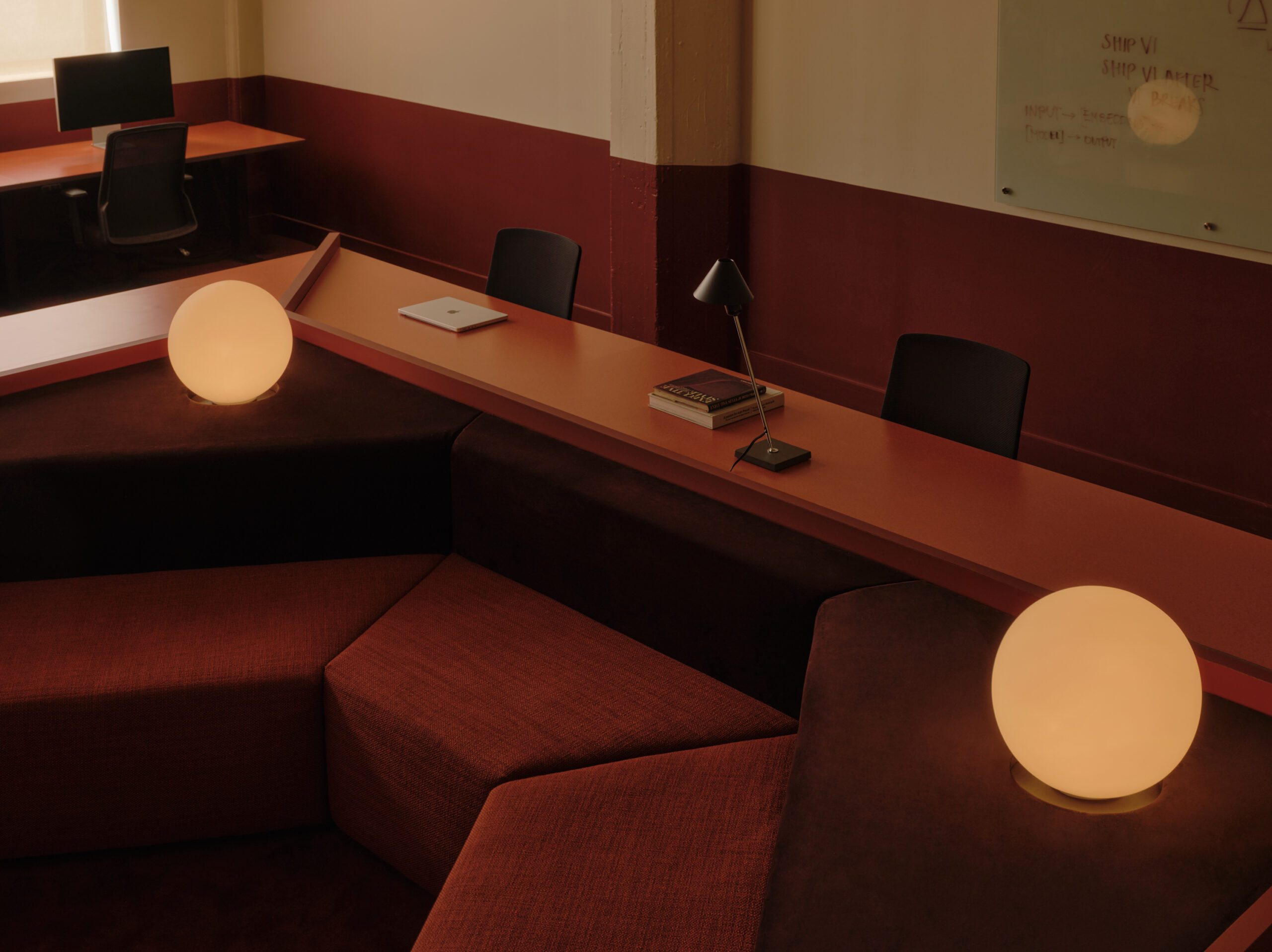
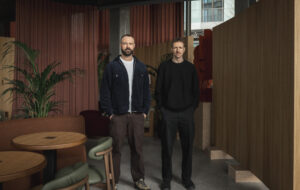
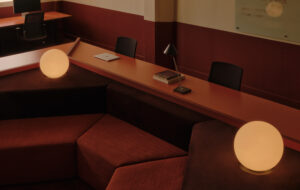
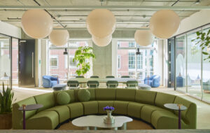
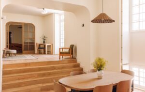
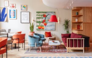
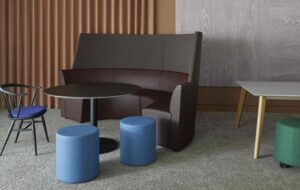
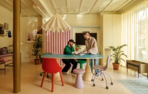
 Adobe’s downtown San Francisco office, an ‘edgy’ sibling to its global HQ|There are two seats for every person, out at a desk, the other elsewhere|The office space contains a mix of standing and sitting desks|Booths within the kitchenette feature videoconferencing facilities|Team Relax, one of two loungey spaces at either end of the office|The Multipurpose town hall space. Furniture can be quickly reconfigured||
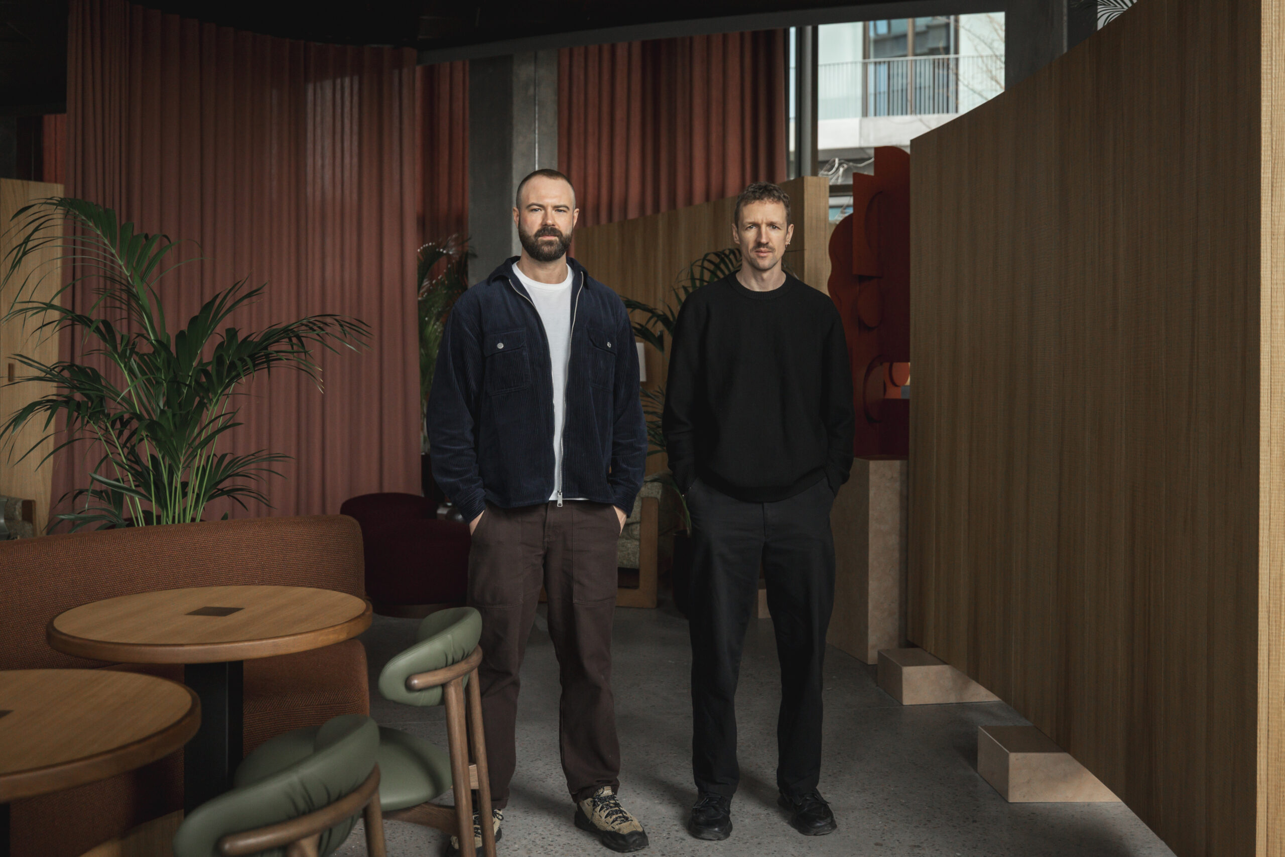
Valerio Dawalt Train designed Adobe’s San Francisco office to reflect two cultures – that of the company and that of its location.
A successful workplace is usually the physical representation of a company’s culture, but what happens when said company has multiple offices? Rolling out the same design over a number of cities or even countries is cheating, because though the brand identity is the same, the people working there are very different. Hence architects such as Valerio Dewalt Train, with its client Adobe, are designing offices that cater to two cultures – that of the company, and that of its location.
This is 410 Townsend, the latest addition to Adobe’s offices in San Francisco. Compared with its big sister, the global corporate headquarters 55 miles south in San Jose (onoffice 78), the sibling resemblances are evident but not absolute. Like San Jose, there are almost two seats per staff member – one at a desk and another in a meeting space, lounge or breakout area – to support agile working. In aesthetic terms, there is the familiar Herman Miller furniture, colourful upholstery and carpets, and corporate graphics. But the backdrop is less polished, more industrial. Typical of its location in the SOMA district of San Francisco, it is housed in an early-20th-century brick and timber building, the architectural details of which Valerio Dewalt Train has accentuated to add local identity.
“These buildings have a lot of warmth and character,” says William Turner, principal at the firm, “so we tried to use these features as a differentiator from Adobe’s other locations, while adding a punch of colour and texture.” He explains that Adobe wanted consistency throughout their buildings, but also wanted to tailor each office to its employees. “The San Francisco offices have a little more edge than San Jose. It really reflects the fierce, independent character that its people have always had; they’re liberal thinkers.”
410 Townsend is actually a satellite office located a few blocks away from the main Adobe San Francisco office. Recently leased by the company to accommodate its growing workforce, it occupies just two-and-a-half storeys of a long and narrow building. Hence it was vital that the interior felt visually connected with the flagship offices, so as to create a “cohesive campus” and not to seem disparate – a “destination” for its 270 staff (presumably so they didn’t feel like outcasts).
This presented a challenge, particularly at the entrance to Adobe, found halfway into the building and reached via a long corridor. “We wanted to create a focal point that draws you in,” says Turner, “a mysterious and enigmatic element that pulls you into the space.”
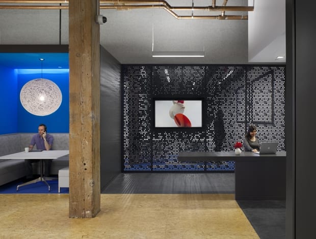
Valerio Dewalt Train’s solution is a dark charcoal grey wall that ribbons through the lobby, fronted by an illuminated cut-out Adobe logo, which announces the entrance with a boldness and drama that straight away distinguishes itself from other Adobe offices. The wall creates rectangular archways filled in with glass, one of which opens to the reception area. Here, the dark grey theme continues, backed by a perforated metal screen. “The darkness of this entry portal gives an edgier feel to the space,” says Turner. “The materials and colours have a bit more grit to them than they would in San Jose.”
Past reception is the main hub of the office, a town hall-type area (which, hopefully ironically, the Adobeans have entitled Hipster). Used as a lunch room day-to-day, it’s home to a bar, booths and a large open floor dotted with canteen tables and chairs, which can be quickly tidied away or rearranged for events, such as an art showing, lecture or hackathon, according to Turner, who says it’s “a flexible space with different personas.”
The majority of the workspace lies on the two upper floors, stretched across a long, slender floor plate, with the only windows at each end. Banks of open-plan desks are therefore placed closer to the centre, while common areas – lounges, kitchens, breakout spaces – are located near to the windows, giving everyone equal access to the natural light and panoramic views. Common areas are in abundance, and vary broadly in how they can be used. Two lounges, one at each end of the building, are named Team Relax. Furnished with a homely sofa and pendant light, and enclosed by glass walls (made more private by closing the curtains), they are intended for more casual team meetings. Another group area uses the Rise system by Allsteel, a collection of stepped seats, which can be tessellated in different configurations to create lecture or group-work spaces.
In the kitchen areas are meeting booths with videoconferencing facilities, similar to those in San Jose. In another more social lounge, “where employees can blow off steam,” says Turner, is a TV and mini fridge, and a portrait of Bay Area poet Robert Frost wearing sunglasses. “We used graphics that reinforce a connection with the location, but aren’t necessarily so in your face, like a photo of the Golden Gate Bridge, but a more subtle local tie.”
Further into the building are more private meeting and work areas, such as phone booths and small conference rooms plus an ‘ideation room’. Staff can work in small teams, or push the desks together for one big chat; they can brainstorm ideas on the digital whiteboard, then save those notes digitally – yet another way for Adobe staff to diversify their working day.
“One of our overriding principles for Adobe’s workplace was that, with wireless technology and collaboration, you don’t need to be at your desk to work,” reflects Turner. “People can work where they feel comfortable, in a space that’s conducive to them. In theory, you could have every conference space occupied and nobody sitting at their desks.”

