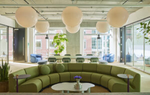
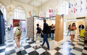
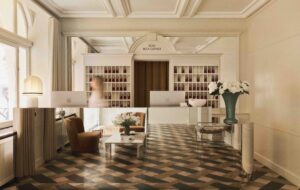
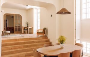
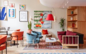
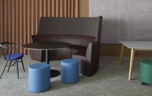
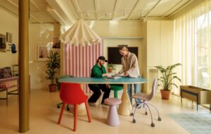
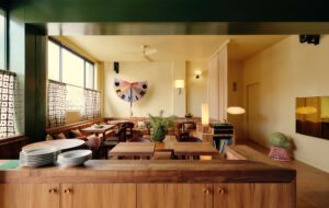
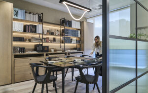
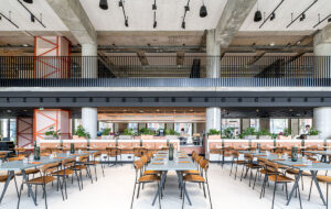
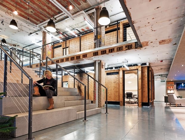
 The staircase – created by cutting an enormous hole in the ceiling – is wide enough for informal meeting spaces|At the top of the main staircase a production screen can drop down for larger presentations|Flanking the lifts are two booths for private time that could easily go unnoticed|The area belonging to direct marketing specialists Elvis is home to picnic tables and astroturf|And there are garden sheds – seemingly a staple of the modern-day creative working environment|Front doors in a range of colours and textures form a ‘streetscape’|On the third floor a snug space is given over to Chesterfield sofas, rattan chairs and task seating|Pendant lamps are created by delicate strips of wood forming a bulb shape|Desks are arranged haphazardly rather than in regimented rows|The designers wanted to contrast the rough with the smooth – shown here with chipboard and polished tiles||
For an object lesson in the dangers of judging a book by its cover, look no further than the offices of communications group Esprit de Corps (EdC), just off London’s Great Portland Street. The number 101 on the outside of the building is in a font ugly enough to make an art director cry and the main reception on the ground floor is identikit corporate. But as the lift doors open on the third floor, everything changes. Here’s where the workplace design story begins. Two concrete pillars, stripped back and left in their raw state, much to the horror of the contractors, frame a beautiful brand new staircase. David Atkinson, the CEO of Interactive Space – which oversaw the whole project – says: “This was a really challenging project. In engineering and technical terms alone, we cut an enormous hole in the ceiling to create a central feature staircase that links the two floors, essentially opening up the space.” The stairs are also wide enough to accommodate informal meeting spaces, while a projection screen can drop down at the top for larger presentations. Back down in the main entrance, the ceiling is lower, to provide a natural break between the reception and the rest of the open-plan office environment. A signpost directs the visitor to the various agencies that are housed here. Bringing those separate entities together was part of the brief – as Gregor Angus, the president of EdC Europe, explains: “Coming under one roof together helps us take our group to the next level, thriving and growing in this entrepreneurial base.”
Formerly known as the Cossette Group, EdC has been rebranded and renamed to coincide with the move. This space is home to advertising agency MCBD, design and branding company Identica, digital agency Dare, direct marketing specialists Elvis and PR agencies Brando and Band & Brown. To the right of the reception, visitors can wait on soft furnishings in muted shades of grey and cream; and, flanking the lifts, two booths for private time could easily go unnoticed – which, I suppose, is the point. “The building was the old John Lewis headquarters and had this H shape, which naturally gives the different agencies their own space around the perimeter of the office, but also provides a natural hub,” says Racheal Cadey, the managing director of Edge Architecture + Design, which worked with Interactive Space on the project. Walking round anticlockwise, visitors first come to Elvis’s area, with its astroturf and picnic tables. Behind this is one of the best, and most fully stocked office kitchens I have ever seen. Further on, a striped carpet emphasises the natural circulation route while the desks, as with elsewhere in the workplace, are arranged haphazardly rather than in strict rows. Many original workstations have been kept and simply modified using chipboard. Not that the staff seem to spend much time at their desks, given the plethora of meeting space available.
There are garden sheds, for starters. Of course there are – these days I think a creative workforce would down Pro Tools if there weren’t. Then along one side, there’s a “streetscape” featuring a row of different coloured and textured front doors.“Every one has a different light too, they’ve all got their own character,” adds Cadey. Elsewhere, other larger meeting rooms are more conventional, the idea being that these are a blank canvas for EdC to dress to suit a particular client and blinds that pull down – presumably for that Don Draper “seal the deal” moment. Adjacent to one of these on the third floor is a snug space given over to Chesterfield sofas, rattan chairs, task seating, easy chairs, pouffes and quite gorgeous pendant lights with delicate strips of wood forming a bulb shape. To me, it is furniture overload, but it is well used enough to not look like a showroom. And it embodies the desired boutique effect, acting as a counterbalance to the corporate office features that remain, such as the chilled beams. And just so staff can fully appreciate what they have in terms of a comfortable, contemporary workspace, they can look down at lower floors and see the standard-issue furniture specification their neighbours have. They may be separate in name, but the firms operating out of the this office all have scope for a good deal of co-operation – if you’re an advertising agency, why would you look elsewhere if you want some direct mail expertise; if you’re a PR firm, I bet it’s pretty handy having a digital agency as a neighbour and vice-versa. As Angus puts it: “There is nothing that can replicate the accidental encounters that occur when creative people bump into each other in a stimulating environment.”
As well as breaking down brand barriers, the traditional workplace hierarchy has been challenged too. There are no management offices, and pretty much everyone has a seat near a window. Upstairs, where two guys are engaged in a pretty enthusiastic game of table tennis, it’s more of the same: more sheds, more exposed services and exposed steel beams and more pendants to cleverly break up the line of sight across the floor. The designers wanted to challenge the perception of what a typical “meeja” office would look like. And aside from that astroturf, those ping-pong boys and the fact they’ve named meeting rooms after staff phobias, one of which is the font Comic Sans, they’ve pretty much achieved that. “There’s a lot of neutrality and the space feels like it hasn’t been overdesigned,” says Cadey. The aesthetic has been dubbed “new urban”, contrasting the rough with the smooth. There’s the rawness of the metal-tiled flooring contrasting with some vintage lighting and furniture, for instance. And what’s this: an actual bar behind the stairs? OK, I’m jealous. As we reach the end of the tour I’m surprised to see some church pews positioned next to an Ikea table on the other side of the reception. Cadey explains this was about transforming what was a standard corporate office layout into something far more unexpected. “We based our pitch around all not being what it seemed.” From the sheds to the streetscape to the staircase, I couldn’t agree more.


