 Nokia’s UK design team had become increasingly frustrated with its Farnborough location – it may be useful to be alongside the other company divisions, but it feels a long way from designer London.
Like all UK designers they were itching for a piece of Soho to work in, a location teeming with other creatives, and a concrete feeling of competing in the wider market.
Over in Finland, a different scenario was arising. There was an urge in the company to bring Nokia’s Helsinki designers – based in a satellite office – into the same HQ as the rest of the departments, to physically and figuratively centralise their role.
Meanwhile, Nokia designers in Copenhagen, though remaining in the same location, were preparing to move across the site campus.
MoreySmith was brought on board to open up consultation sessions and help relocate each design division successfully, listening to the needs of each user group. This began with extensive feedback sessions across all three sites, and the formulation of wish lists, as partner and project director Nicola Osborn explains.
“Whereas some name-dropping took place – of companies such as Imagination – it was clear that as well as beautiful and creative offices to work in, the designers were all geared towards a real functionality of space,” she says.
Obviously there were cultural differences to take into consideration. “The Finnish wanted space for moonboots and wet rooms for jackets and were against the idea of carpet of any kind,” laughs Osborn. “The English, on the other hand, like their bit of tweed, for cosiness and warmth.”
MoreySmith worked on concepts and schemes for all three offices; taking on the London office itself and passing plans to local architects to implement in Helsinki and Copenhagen.
“We wanted the ethos behind the schemes to be related,” Osborn explains, “and elements of each fit out to be reflected in the others, while retaining the cultural connections and aesthetics in each.”
While the London-based designers were concerned with the aesthetics and creativity of the space and were more laissez-faire about the furniture, the ergonomically minded Finnish were insistent on adjustable desks and chairs. Height-adjustable K&N benching was specified across each of the projects, to provide for designers moving across offices for certain projects.
“Who reports to who is a really global concept; designers work with different people according to the different markets and user groups they are designing for,” Osborn outlines. “Nokia is viewed as a whole, rather than by its various locations, and designers move across offices accordingly.”
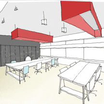
In London, a building behind Piccadilly Circus was located for the move. A key facility needed by the London designers was large group meeting rooms that could be allocated to projects that might be ongoing for up to four months.
“Designers wanted a place where they could leave work and ideas on the walls, and keep returning to them, to wander in and get inspired,” says Osborn. “On each project, members from a number of different design groups will be involved, looking at colour, logistics, technology and marketing, for example. They may need to bring in members to consult on technical and environmental issues.
“Putting all these people in one building creates a feeling of cross connectivity; each group now breakfasts together, lunches together; the generating of ideas is not reliant on email, phone calls or meetings scheduled across various locations.”
The project rooms include big, sliding timber doors, which can be closed to create work environments for meetings to take place in, and opened up to showcase designs to the rest of the floor or for carrying out group critiques. A white Jennifer Newman table on wheels in the centre of the room, along with the use of stackable chairs, really does make the room a flexible space; furniture can be wheeled out and people brought in, or vice versa.
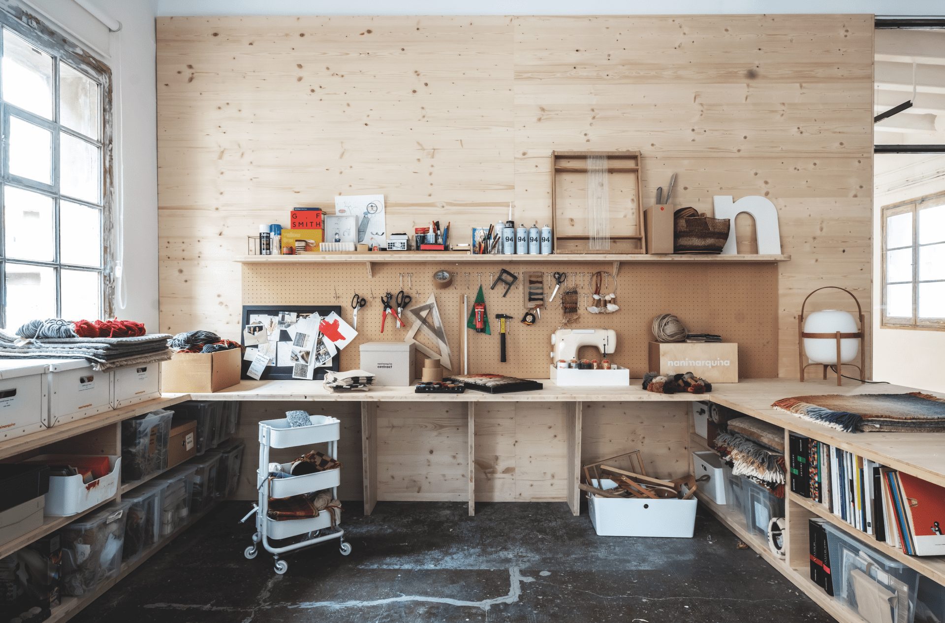
“Because the work people do here is colour-orientated, the designers wanted a neutral workspace,” Osborn explains. “We used timber to keep the space warm and natural, but not to be at conflict with the ideas that may be put forward in the space.”
A whiteboard the size of the room and an adjacent floor-to-ceiling fabric pinboard means that every wall becomes usable as a display surface. Large foam boards, 2.4m by 1.2m, create additional transient surfaces on which to display new ideas in the space.
Contrasting with the large meeting rooms are “quiet rooms”, which Osborn claims evolved from the idea of tiny phone booths. “They are a sanctuary, almost, from the open-plan design and meeting areas,” she says, “and we have given them a cosy and more homely feel, with thick rugs on timber floors and domestic lighting. Whereas the project rooms are presentation-orientated, these are more intimate settings for meetings. Two people can come in and set up their laptops in here, for example.”
Lighting helps to accentuate the different feel of each area; every light and circuit is dimmable so the space can be customised for almost any purpose.
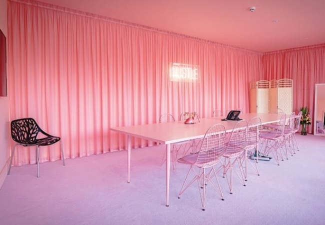
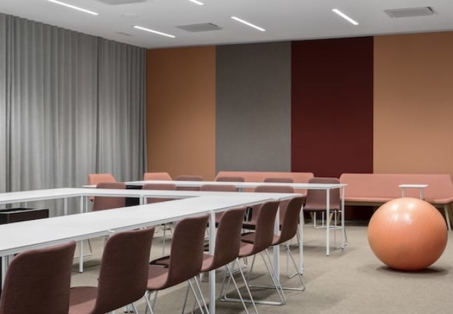
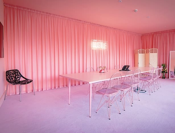
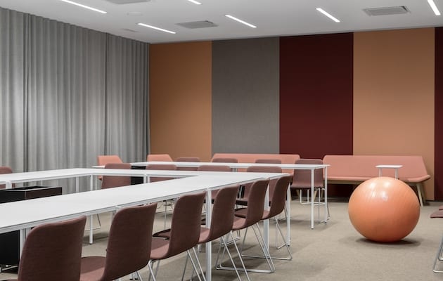
The two main office spaces are spread across two floors – the third and fourth floors of a building owned by Nokia, part of which it rents out. The two floors are identified by different colour schemes; one using lime greens and blues and fresh accent colours and the other one boasting warmer shades of pinks, oranges and reds.
Osborn informs us that the one message that was received quite unanimously from the people working in the office was that “working in branding, they really did not need Nokia colours or logos on the walls to remind them of where they were coming to work each day”.
As many of the rooms are glazed to full height to improve connectivity, it was required by company policy that some form of logo or signage was used – to stop people from walking into sheer panes of glass, if nothing else. “It seemed only sensible to bring Nokia designers on board for this, to come up with graphics and fonts they felt comfortable with around the office,” says Osborn.
Being a designer’s residence in London, it was also felt to be mandatory to leave some of the ceiling areas exposed, creating a warehouse type of look. “The lift lobbies, especially, we kept raw, to give the building a creative feel,” she enthuses. “In the open-plan sections we dropped in a suspended ceiling to delineate the functions of the space.”
On the fifth floor is the cafe and reception area: large pivoting acrylic doors create another flexible space that can be used for launches, events, parties or client presentations. While the reception area is paved in stone slates, broadloom carpet creates a gradual transition to this presentation space, which has an AV wall at the ready when required.
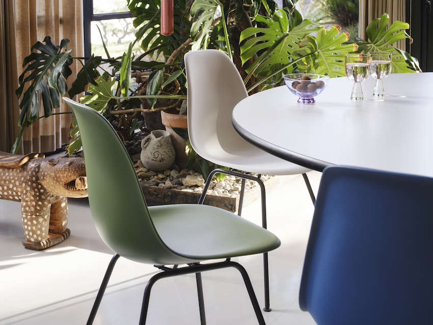
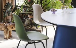
Arper chairs appear in different versions throughout the fit out. “We have cafe chairs in the refectory, lounge versions in reception, polypropylene versions in the project rooms and lacquered shell/upholstered seat versions in the hot-desking areas,” Osborn explains. “We didn’t want the same chair to keep reappearing, but we liked to keep the same family throughout.”
These models reappear in the other two fit outs in Helsinki and Copenhagen, though the designers there were also given a degree of freedom in their interpretation of the design scheme. However, while mirroring textures and surfaces are to be seen in all three locations, don’t expect to find moonboots.