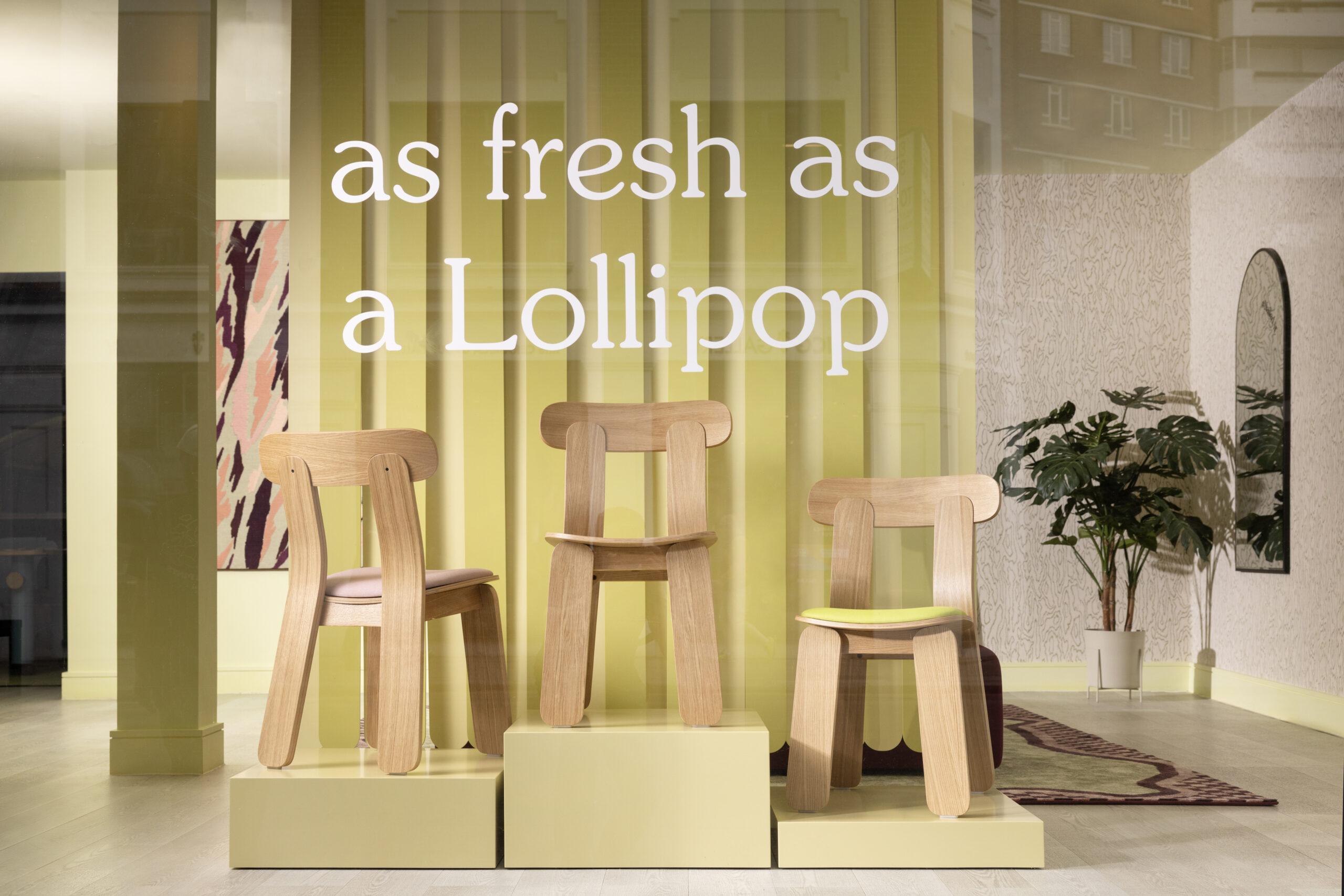
Designer and colourist Tekla Evelina Severin’s second rug collection for Layered is a crowning glory, playing with saturated hues, geometrical shapes and spatial references
Who remembers Annika Settergren, Pippi Longstocking’s loyal, mild-mannered friend and neighbour, who was always dressed just so, to the wonderment of the haphazardly wardrobed Pippi? To those who grew up in Sweden, Annika is also remembered for her signature colour scheme of yellow and pink, boldly combined in the 1969 adaptation of Astrid Lindgren’s classic story. So what does all this have to do with rugs? It so happens that Annika and her candy-coloured blocking was the subject of an early conversation between Tekla Evelina Severin, the Swedish designer and colourist (known also as Teklan), and Malin Glemme, the founder of the Stockholm-based rug brand Layered, and it became the starting palette for their latest collaborative drop of tufted wool rugs.


Colour is always part of the conversation with Teklan. A graduate in architecture and design of Konstfack University of Arts, Crafts and Design, she has carved out a niche within the interior industry that is governed entirely by colour – whether it’s teaming tones or pairing the unexpected in photography, set, interior or product design. It’s a calling that came by chance when a postgraduate job in a small architecture office in Stockholm was failing to excite her – an early iPhone, a basement material library and a social-media platform in its infancy came to her rescue. “I wasn’t feeling the creative spark. There was something about the conformity at that time in terms of colour and material – this New-York-loft kind of style, all marble and greige,” she recounts. “But we had this beautiful material library in the cellar with lots of variety of textures and colours. I started to put small mood boards together and take visual notes – just for myself. It was at the time of this new app called Instagram, so I started to put my notes there, mostly for the cute filters as I didn’t really understand the community back then.”

That was in 2012 and, breaking out on her own, she continued to explore colour in combination with shape through set design and photography. It wasn’t long, however, before the design community came calling, keen to employ her expertise in ‘CMF’ (colour, material, finish) for furniture collections. In 2015 she set up her own studio, and has become increasingly in demand for her chromatic adventurism. Teklan has worked across colour consultation and collections for the likes of Montana Furniture, Quintessenza Ceramiche tiles, Pani Jurek lighting and recently Ikea, where she has turned her attention to small-scale electronics and cables.

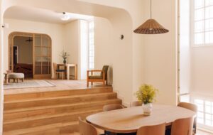
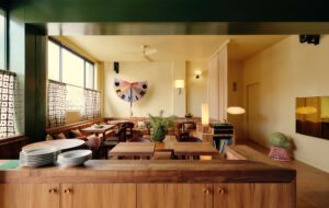
The Layered rug collaboration has given Teklan a unique opportunity to explore shape, dimension and colour through a flat, yet textured, surface. After their first meeting over an oyster platter at an Ett Hem opening party (when their shared love for Pippi Longstocking was established), Gemme and Teklan came together for an initial series of wool rugs that veered towards a playful, Memphis Milano-inspired scheme. In this second collection of rugs – which comprises three designs that are each explored in two different colourways – Teklan pushes further into optical illusion, using a more nuanced palette of colours to interpret three-dimensional architectural themes in soft, two-dimensional form.

The first design, Fregio, was inspired by the sort of friezes you might see in an Italian palazzo – a contrasting border to a room’s flooring that frames the space. “I’m obsessed by these kinds of architectural details,” says Teklan. “I wanted to bring them to the rugs in a playful, colourful way.” The yellow and pink of Annika’s outfit was the springboard for the first of the Fregio colourways, and the second was an exploration around deep olive green – a scheme that Teklan had been eager to dive into for some time. Testing hundreds of combinations, her final choice was a soft, blush salmon hue and burgundy.

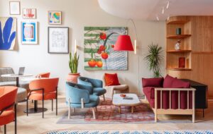
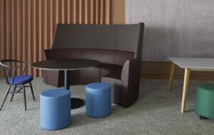
The Labyrinth rug represents a graphic structure, with the colours (burgundy and coral in one, mulberry and sand in the other) used to create the illusion of light and shadow, which brings a three-dimensional aspect. It references the architecture of Carlo Scarpa and, in particular, his Brutalist monument La Tomba Brion in northern Italy. “I try to play with optical illusions in everything I do, no matter if it’s spatial design or set design,” Teklan explains. “I call it everyday surrealism.” Similarly playful is the last of the three themes, Diagonal, which tilts the stripe – a motif recurrent in Teklan’s work – and contours it with a dark outline to suggest shadow. One colourway combines blue and burgundy, the other is a warm palette of toffee tones.

Teklan describes her career in colour as a journey that she is still on. What began with a development of analogous colour schemes (harmonious tones close to each other on the colour wheel) has shifted towards bold colour-blocking. Layered represents the point she is at now, with a colour-combining philosophy that she calls “something flirty, something dirty” – an earthy, deep or dull colour teamed with something light, bold or clear. As an influencer of the first order when it comes to colour (her approach filters through the whole of the design industry), she is bringing us all on that journey with her.
Photography by Andy Liffner / Layered
This story was originally featured in OnOffice 173, Winter 2025. Discover similar stories by subscribing to our weekly newsletter here