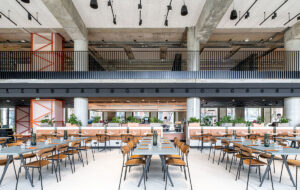
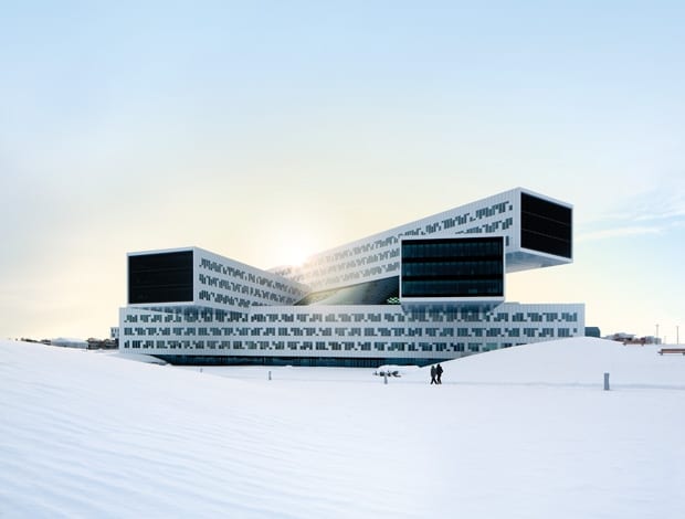
 A-lab’s sublime ‘groundscraper’ for Statoil basks in the Norwegian sun|Connecting bridges sprout from the tower to all corners of the office|The ‘communications tower’ is the hub of the central atrium space|Only 30% of the facade is glazed, to shade interiors from the sun|The curving glass roof can withstand a 3m blanket of snow|The stairs are so popular with staff that no one bothers with the lifts|The chilly fjord surrounding the building|All-white workspaces match the exterior and put the focus on the view|Oak-clad walkways contrast the futuristic aluminium and glass||
To quote that singular thespian of our times, Keanu Reeves, “Whoa!” Ordinarily, it’s skyscrapers that stupefy, at least in the workplace design world, but A-Lab’s monstrous Jenga-block building for oil giant Statoil is the equal of any glittering glass tower. There are few businesses with the financial muscle or indeed the will to construct such an office but the rangy theatrics of its deconstructed form are too disparate to be viewed purely as a vanity project. In this case, form has followed function with the pertinacity of a nodding donkey. That the building emulates the engineering of oil platforms only makes for a purer representation of the industry it serves.
The story began back in pre-economic-crisis 2008 when Statoil, seeking to unify its Norwegian offices in one building, held an open competition, which asked those taking part to propose not just a design but a site as well. Architects stampeded to land the €200m job. Forty-five practices applied in total and A-Lab triumphed in February the following year with its stacked horizontal ‘groundscrapers’. In truth, the Oslo-based firm had a number of things working in its favour. Firstly, the building forms part of an expansive plan (ongoing since 2001) to turn the Fornebu peninsula, former home to Norway’s main airport, into a IT and telecoms hub along with housing developments nearby. A-Lab was already heavily embroiled in the masterplan, recently completing the Portalbuilding (which features what looks like an oversized orange Dustbuster) for developer IT Fornebu. The architects found themselves in an unusually strong position, having access to a prime location, a good relationship with the developer and a well-thought-out office design. “We couldn’t lose,” says A-Lab director Odd Klev.
On first impressions, the sheer scale is problematic (there is nothing quite like walking underneath a 30m cantilever to make one aware of one’s own fragility). Though the building shares its origins with the same computer programs and matrixes that spawned swooping parametric curves, this is the antithesis of form-making architecture. Moreover, it has more in common with the structuralist approach of Herman Hertzberger – the user experience, if you can call it that, is paramount.
Neither has A-Lab attempted to camouflage the building’s presence through some clever landscaping. It does, however, make significant concessions to the green space it inhabits. Previously, the site was occupied by the airport car park, swiftly flattened and replaced with a three-storey underground version. Similarly, the five 140m-by-23m modules, each one three storeys high, are hoisted skyward to greatly reduce the building’s footprint on what is now a landscaped park. Here, A-Lab was called on to create harmony between Statoil’s vaguely paranoid relationship with the outside world and an architect’s duty to ensure they were addressing the wider needs of the site. “That was the starting point. By stacking and cantilevering the masses we could give generous space back to the municipality.” At the centre is a huge central atrium. Somewhat surprisingly, given the extreme reluctance of Statoil to even discuss their new home, the general public can wander right up to the office. “They started out wanting a 30m perimeter around the building, but it should be more transparent. There should not be this big wall,” says Klev. “The security should be in the facade. Of course, it can handle all kinds of blasts and bullets.”
A-Lab began by stacking four volumes on a rigid grid, with the fifth running parallel to the two ground-level structures making the top floor. By twisting the easternmost block to open up the grid and orienting the top floor north-south, the architects sought to give as many workers as possible a view of the park and fjord. “This formation will allow the most light to penetrate the building and everyone will have sightlines out from the atrium,” says Klev. The elongated cantilevers are undoubtedly impressive, but the span across the central void proved more challenging owing to the flexibility of the interior programme. Even accounting for Statoil’s 15-year lease there was no guarantee the company would need all the space further down the track, so it made good sense to design the building so it could be sub-let. By virtue of a specially designed ceiling, the office floors can be divided into tiny 3m-by-3m boxes, which had to be fully powered, heated and cooled. While this allows for a tremendously adaptable workspace, having so many pipes running through the concrete inevitably weaken it. The strain is taken by the steel superstructure and four concrete cores rammed through each corner of the building that deliver the technical infrastructure and fire stairs. “They are very similar to the drilling shafts on oil platforms of the 1970s and 80s; they stabilise the cantilevers and have to withstand a lot of vertical forces,” says Klev.
The aluminium facade is painted white – aeroplane coloured, to chime with the site’s former function as an airport, something Oslo’s politicians were keen on, apparently – but is also intended to lighten the building’s presence. To shade from the sun only 30% of the facade has windows, which are recessed 220mm. Despite the apparently random pattern, reminiscent of an old music roll, the openings allow staff to cop an eyeful of the view whether sitting or standing. When the sun is at its most potent, solar screening inside the building closes up: “All of the volumes will be white so from a distance it will look like abstract white blocks.” At each gable end, 180 automated vertical laminated glass lamellas react to the movement and strength of the sun. The effect is a seemingly impenetrable black visor. Uniting all five elements is a curving glass roof covering the central atrium, which either provides a pleasing contrast to all the straight lines or dilutes the purity of the geometry, depending on your disposition. What is undeniable is the rigorous engineering (by Arup, of course) that enables it to withstand a 3m blanket of wet snow.
Dominating the central atrium like some Lovecraftian beast is the ‘communication tower’. Connecting bridges and walkways sprout from a central stem to all corners of the office. Also hidden within the shiny steel casing are six lifts that are reportedly gathering dust, such is the popularity of the stairs. “We didn’t think it would be so popular, so actually the stairs are a little too narrow,” says Klev. Every staff member must first pass through a slightly humbler reception before they reach the communications tower, which decants them into their part of the office. “Statoil really wanted to bring communication to the centre of the building. They might lose a little bit of time but they will meet people in the company they have never met before.” It’s the defining architectural moment of the interior, transforming what might have been a dead plaza into a buzzy, social hub.
In terms of materials A-Lab stayed true to its Scandinavian roots, laying down warm oak floors that play off against the cool white aesthetic. The workspaces are a mixture of open plan, breakout spaces and private meeting rooms populated by jellybean-soft furniture and more formal office set pieces. The majority of the desking is arranged around the perimeter with private spaces toward the centre of the floorplate. It is, from what we can see, a salubrious place of employment.
However tempting it might be to view the Statoil building as an exercise in engineering as much as it is architecture, examining the method of construction should stay the rush to judgment. For a profession that is at times reduced to the role of consultant, it is most heartening that the architects here were firmly at the centre of the web of developers, engineers, contractors and money. Using four-dimensional BIM systems, A-Lab plotted out the development of the building with tremendous accuracy. Indeed, the facade comprises 1,600 prefabricated elements: integrated windows, insulation and solar shading with minimal joints, which ensured a high-degree of air tightness. When the alternative is building on site in -20˚C, this proved invaluable both in terms of efficiency and speed of construction: the whole project took just 20 months. “This building could not have been made 10 years ago,” says Klev. “The technology was not ready because all these forces coming onto the lamellas, the glass roof turning in different directions, it was very complicated. We took the responsibility for all the pieces and put them together in our model in the office. We needed a great deal of computer power and it was not easy, but we, the architects, were back in the lead.”
Klev may see this experience as a way of wresting power back from the developers but the building makes a wider point that cuts to the heart of 21st-century architecture. The complex algorithms that produce so many iconic but impractical forms have here been directed towards making a building that improves the everyday lives of the people in it and engages in a positive manner with the wider community. As recent experience has shown with the farcical 20 Fenchurch Street or ‘Walkie Scorchie’ – a building that demonstrates the dubious skill of melting car bodywork and setting fire to shop carpets – this is not always a given.


