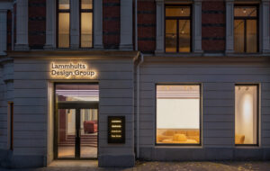
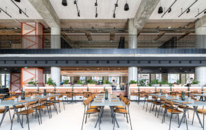
 Pelli Clarke Pelli’s reflective mountain of a building on Buckingham Gate|The corner entrance, showing Stuart Haygarth’s spectacle-lens artwork|Quality materials and finish – but will it attract the right tenants?|Derwent London’s latest office, initially built as a factory in the 1930s|The top two floors, with mezzanine level and slanted bank of windows|Polished brass and concrete play off one another in the reception||
The internet transformed the way we lead our lives completely and permanently. Suddenly, everything from groceries to a package holiday to Marbella was no more than a couple of mouse-clicks away. Work changed, too. The dotcom boom produced a slew of DIY office spaces that owed more to Alton Towers than Frederick Taylor. While these ‘fun’ environments offered an alternative way of approaching work many proved too personalised to force a revolution. Therefore mainstream office design remained anchored to the BCO guidelines in which suspended ceilings, air-conditioning and strip-lighting reigned supreme.
Recently, the balance of power has slowly shifted away from finance and towards the TMT sector, and the new wave of billionaires are as likely to be decked out in trainers and hoodies as they are a shirt and tie. Slowly, the differences in personalities are manifesting themselves in office design.
Pelli Clarke Pelli’s new office building in Victoria for developer Land Securities, 62 Buckingham Gate, is your classic BCO animal. The 11-storey building is a mountainous mix of angles, the landmark structure in a masterplan to turn dreary old Victoria into a vibrant community of young go-getters. The accompanying press material makes a huge play of the presence of Jimmy Choo and promises cutting-edge offices and revitalised public space in the inevitable form of a “managed estate” and new “dining concepts”.
The site, which sits at the corner of Victoria Street and Buckingham Gate, presented various differences in scale for the architects to contend with and to their credit, the team, led by Lawrence Ng, has tried to respond to each through a series of folding planes on the facade. For instance, Ng tackled the intimate scale of Buckingham Gate by angling the glass away so it almost disappears when viewed from the street. “It became clear from the very beginning that a box would not solve the problem,” he says. “The strategy was to allow the building to fold in different directions. One image that has always been clear in my mind was the wonderful campanile at Westminster Cathedral. I thought it would be a wonderful idea if we could create multiple reflections of this landmark in the facade.”
At street level, Ng has attempted to fashion a softer curvilinear edge to the building in order to help make a success of the shops and cafes that constitute the ground floor. Joining Victoria Street with Spenser Street is a narrow thoroughfare used as a shortcut by those in know; by building a kaleidoscopic canopy and similarly fruity seating blocks here, the architects hope to encourage passersby to slow down, sit and presumably spend some money. At the corner of Buckingham Gate and Victoria Street, the building resembles the prow of a great glass ship with a double-height reception filling the void behind the apex. In this space the architects have dangled an enormous light installation designed by Stuart Haygarth constructed from 80,000 reclaimed spectacle lenses, which sway and twist in the air.
The developer has ploughed a wad of cash into this building, as demonstrated by the silver travertine floor and reception desk. We jump in the lift, which appeared to be suffering from minor electrical niggles, and rocket up to the 11th floor – the most desirable space in the building. Here, Ng cut out a section of the facade to create an outdoor terrace that commands incredible views of Victoria and the Square Mile. On the other side, the view stretches all the way to Battersea Power Station and beyond. The quality materials continue from reception to each lift lobby and the offices and toilets can easily be divided up to suit multiple occupiers.
But who is it for? Land Securities say it expects a mix of corporate, financial and perhaps some trading; fuel distribution firm World Fuel Services has moved in to the 8th floor. “They’re looking for something different to attract younger talent. Everyone is a student of their surroundings and they want something unique,” says the project’s interior designer Debra Lehman-Smith. However, a brief study of one floor’s suspended ceilings, integrated lighting and sealed windows suggests the opposite is true. While the architecture and the view may be attention-grabbing, the interior – artwork in the lobby withstanding – is as generic as it comes.
On the other side of town is a very different beast. The Buckley Building on Clerkenwell Green (left and top) equals 62 Buckingham Gate in terms of quality finishes and is also a speculative effort, but it feels far more attuned to the prospective occupiers. Indeed, the architect, BuckleyGrayYeoman, is a master at revamping ageing structures and has retained the soul of this former factory, built in the 1930s, without it feeling like a rough-and-ready east London dwelling.
The building is another addition to savvy developer Derwent London’s portfolio of attention-grabbing projects, which includes Shoreditch’s Tea Building and the Angel Building in Islington. Architect Matt Yeoman explains: “The Tea Building is very Shoreditch, very raw. Angel is very much more grown up, sophisticated. Here, we kept the exposed brick and steelwork and existing windows, but did it in a slightly refined way.”
There were significant architectural additions, however. Yeoman was astonished to find, upon entering, the original atrium, which swallowed up a great deal of floorplate: “We filled it up right away, it was useless.” The entrance was shifted from Aylesbury Street to the corner facing Clerkenwell Green. Like Buckingham Gate, the double-height reception features an artistic installation – this time a motorised Newton’s Cradle that moves at glacial speed. The floor is a polished concrete of the kind you find in a gallery, which plays off nicely against the polished-brass banister. Behind the concrete reception desk is a Richard Serra-inspired backdrop of sheet steel. The space oozes quality and money.
One of the first things BGY did was rip out the remnants of the 1980s fit out. First on the block was the suspended ceiling, which was vanquished in favour of some hanging lights. In one corner, the architects offered their own interpretation as to how the office could be kitted out with a contrasting mix of glass meeting boxes, bookshelves, canteen chairs and such like. They even painted the metal raised floor ochre just to see what it looked like. “I can’t believe we hadn’t tried that before,” says Yeoman. It handily illustrates the contrasting approaches to these two projects: at Buckingham Gate, Lehman-Smith expressed dismay that the polished metal floor would eventually be obscured by carpet; for BGY, it was potentially a finish.
The top two floors, already bagged by advertising firm WPP, are split-level, with a mezzanine joined by a spiral stair. A bank of slanted glazing spans the north-facing facade, reclaiming outdoor space previously filled with plant. On the very top is a glass roof and a terrace. The whole place feels less earnestly ‘authentic’ than a crumbling studio space in the East End; you can imagine hipsters graduating here once Shoreditch gets a bit too much. In a way, this is exactly the point. Derwent’s buildings appeal to the heart first and the head second. “They don’t worry about someone coming round with the BCO Guide and asking if you have done this or that,” says Yeoman. “They just want a CEO who will walk in and say, ‘this is us.’” Ultimately, it is not that BGY and Derwent have done anything unique, but together they are bold enough to allow tenants an opportunity to make it their own. And if that means replacing the suspended ceiling, then so be it.
The contrasting fortunes of the financial and TMT sectors mirror the changing demands in office space. As banking appears to wane, the Googlers and Facebookers command wages that would embarrass the greediest of city bankers. TMT workers were once periphery characters languishing in technology parks in places like Reading, but the dotcom boom and the endless start-ups it spawned found their spiritual home in the crumbling warehouses and office blocks around Old Street. The office, so long a buttoned-down world of suspended ceilings and strip-lighting, suddenly turned into a student rec room as college graduates – unshackled by preconceptions of what an office should look like – went wild.
Inevitably (with the notable exception of Google) things calmed down, but the boundaries had shifted. Today, the Buckley Building commands rents of £50 per square foot, equal to some parts of the square mile, but the similarities end there. The stripped-back feel of Derwent’s property is a world away from the overspecified, prescriptive BCO-style fit outs churned out in the City. The BCO has been commendably steady in its resolve set rigorous baselines for office design: too rigorous, say many architects I speak to, who feel the guidelines need relaxing so as not to stifle creativity.
Part of the problem is that for many property agents, the BCO Guide is the seen as an essential selling tool, and when you have one point of reference for what an office is supposed to be like, everything will end up looking the same. It is interesting to draw comparisons with the office furniture industry. Many companies clearly no longer believe that it’s possible to survive with a catalogue of desks and task chairs, and even the most conservative manufacturer is now keen to push its version of third-space soft seating or privacy booths. What the furniture makers have grasped is the need for reactive, adaptable pieces that suit the business they support. For the most part, we have not seen the same progress in office architecture.
Derwent is currently exploring the idea of a looser fit new-build that scoops the best bits from pre-war buildings – high ceilings, openable windows, rawer finishes – and fuses them with 21st-century technology, in its White Collar Factory concept (read more about it on p90). It is just possible the WCF project, which does not prescriptively follow the BCO’s specifications, points the way to a new type of space: one that allows developers cost-effective construction and occupiers the freedom to interpret the way they see fit.

