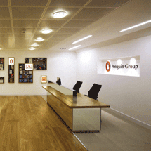
 Workplace design firm AOS Studley has created a new space for the Penguin Group, with a potentially controversial move from publishing’s traditional, hierarchical offices to contemporary open plan.
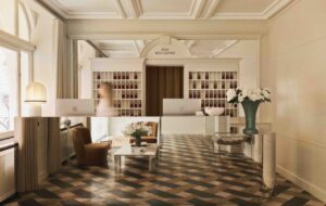
As you might expect for a publisher, there’s no shortage of books at Penguin’s revamped headquarters on the Strand. They appear in some pretty inventive guises too, especially in the reception. As I’m waiting to look around, I can see some really old children’s editions I remember from my great aunt’s hand-me-downs beneath the glass of some custom-built coffee tables, while behind me various tomes appear to be floating on the wall (this magic trick is later revealed to come courtesy of the humble L bracket).
“The reception is all about displaying the books. It wasn’t intended as a design experience,” says John Symes of AOS Studley, the workplace designers responsible for the scheme. In contrast to the grandeur and, dare one say it, fustiness of the marble and granite entrance to the main reception of number 80 on the Strand, senior design manager Scott Colman explains that the brief for Penguin’s own reception was very clear: “They didn’t want it to be too corporate. They wanted it to be on a distinctly more human scale. It utilises mirrors to maximise the space, which is actually smaller than the original, and the artwork is quite subtle without complex illumination.”
The low ceiling height and warm wood flooring does indeed make it more of a cosy space. The reception desk is less imposing than the average oversized blue chip offering, which was a deliberate move to lessen the barrier between receptionist and guests. The display
area on the adjacent wall to the desk, which shows Penguin’s various brands and imprints – from Rough Guides to Ladybird books – can be changed around as desired. To show Penguin has moved into the digital age, there is a workstation to the other side of the reception with excerpts from its back catalogue available to read on screen. Colman continues, “Penguin wanted to let the product do the talking, including playful elements such as the book tower on the workstation, and we used reclaimed wood for the table from storm damaged trees.
It’s not meant to be slick and engineered.”
The building was originally fitted out for Penguin in 2001. This time around, the brief, explains Symes, was two fold: “One aspect was to release the fifth floor in order to cut operational expenditure.” This meant going from 14,860sq m to 11,150sq m after handing over the fifth floor to parent company Pearson to rent out. Making sure over 1,100 Penguin staff could fit across four floors was a real driver in terms of completing the project by the end of year.
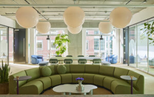
“Equally significant was improving the working environment for everyone,” Symes continues. “We knew at the outset that this would mean a complete rethink of the way the building was going to work by opening up the space. There were 147 offices – now there are none.” This latter element was no easy job given the nature of Penguin’s business, as operations director Deborah Wright explains: “Publishing as a business is quite traditional, and we were the first to go from cellular to completely open plan. It has changed the way we work, encouraging a non-hierarchical approach – even the chief executive is open plan. We conduct our business in a very consultative way and so the design was a very consultative process. We now have a much better workspace.”
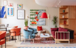
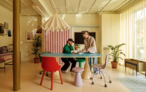
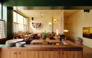
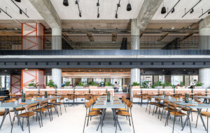
Originally the front of the building was laid out as desks, but this has been given over to what is now known as the River break-out space, with another smaller break-out space overlooking the Strand. With their colourful diner seating and cafe-style chairs and tables, these areas have been affectionately dubbed “noodle bars” by staff. Other meeting areas have been reconfigured into corners or at intervals along the corridors. All areas in Penguin now have access to Wi-Fi to facilitate roaming and visitor touchdown, and some managers use DECT cordless phones to help the transition to open-plan working. To personalise the space for Penguin, its own art collection has been deployed around the scheme.
Wayfinding was also a big issue and to this end, as you exit the lifts, the signage on each floor includes a large number indicating the number of the floor plus details of which side of the building is where – the riverfront uses a green colour, the Savoy side is represented using yellow while the side nearest the Adelphi theatre is an aquamarine colour.
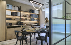
One of the major structural changes entailed putting in a raised access floor, as previously power and data points had been strung along the wall in trunking. For most of the workstations, Vitra’s Joyn benches, supplied by Crib 5, have been specified. Wright says, “The bench system gives us the flexibility to move people around more and staff are surprised at how much space they have been given.” KI’s sidefilers were reused across all floors, but mainly only the two- and three-high units to maintain the low landscape. White laminate tops were added to the cupboards to match the Vitra benches. Penguin’s commissioning editors also each have a table where they can meet their authors and bespoke bookcases to display their authors’ work.
Storage was an issue that AOS Studley had to handle sensitively, engineering specific solutions for each team. These ranged from the cute ABC Book Towers, also by Vitra, at individuals’ desks to a reference library to store the mix of regular books, review copies and dummy books. Each of the printer pods – there are three on each floor – is engineered to lock away confidential copies as well as decreasing the ratio of printers to people to reduce waste and encourage staff to get up from their desks. “People now send fewer emails, adds Wright finally. “They are more likely to go and speak with others and are much more attuned to what the business is doing.”


