Designers no longer have to “make do” with products that disrupt their vision, instead a fully compliant and aesthetically pleasing solution is available
Accessible washrooms have historically been seen as purely functional spaces. Their job has been focussed on meeting regulations, providing the essentials of safety and accessibility but rarely expressing the same design intent and aesthetic consideration as the rest of a building.
For specifiers working on luxury hotels, stylish restaurants or contemporary workplaces, the lack of aesthetic choice made accessible washrooms feel like an afterthought rather than a fully integrated part of the design.
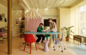
Today, that is changing. Architects and designers are increasingly focused on creating environments that are not only compliant but also beautiful, inclusive and reflective of contemporary style.
In this piece from Armitage Shanks, they explain why this is happening and demonstrate how you can create washrooms that allow aesthetics to shine through, even when accessibility is the priority.
The origins of Doc M packs
Why did Doc M packs come about? Accessible washrooms existed before the 1990s but there was little consistency in design, layouts or fittings, which could make them confusing or difficult to use. For example, the Chronically Sick and Disabled Person Act 1970 was the first major piece of UK legislation to address accessibility in public buildings but it did not specify any design requirements. Doc M packs were introduced to provide a fully compliant, standardised solution for accessible washrooms, meeting the requirements of the UK Building Regulations.
However, early designs prioritised function over form, with white sanitaryware paired with dark blue grab rails to provide the high visual contrast that partially sighted users require. This combination quickly became the standard in hospitals, schools and other public buildings, establishing a clear, recognisable look for accessible facilities while ensuring safety and usability for all.
So what changed?
The flexibility to move beyond the traditional blue and white aesthetic comes from updates to the standards that guide accessible design. While Approved Document M was last revised in 2015, the most significant change arrived with the 2018 update to BS 8300.
Mike Smelt, Product Manager UK – Armitage Shanks sanitaryware, said: “Instead of prescribing specific colours, the guidance now focuses on achieving a measurable level of visual contrast – typically a 30-point difference in Light Reflectance Value (LRV) between fittings and their surroundings. This shift has opened the door for more design-led finishes, with colours now including charcoals and blacks which deliver both compliance and contemporary style.”
The return of colour to modern bathrooms and washrooms
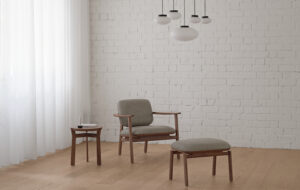
The past decade has seen colour and contrast make a confident return to modern bathrooms and washrooms. After years dominated by minimalist whites and chrome finishes, designers are now embracing deeper tones, richer materials and a more expressive aesthetic. While coloured ceramics have played a part in this shift, it’s advances in tap finishing technology – such as physical vapour deposition (PVD) – that have truly brought colour back to the forefront.
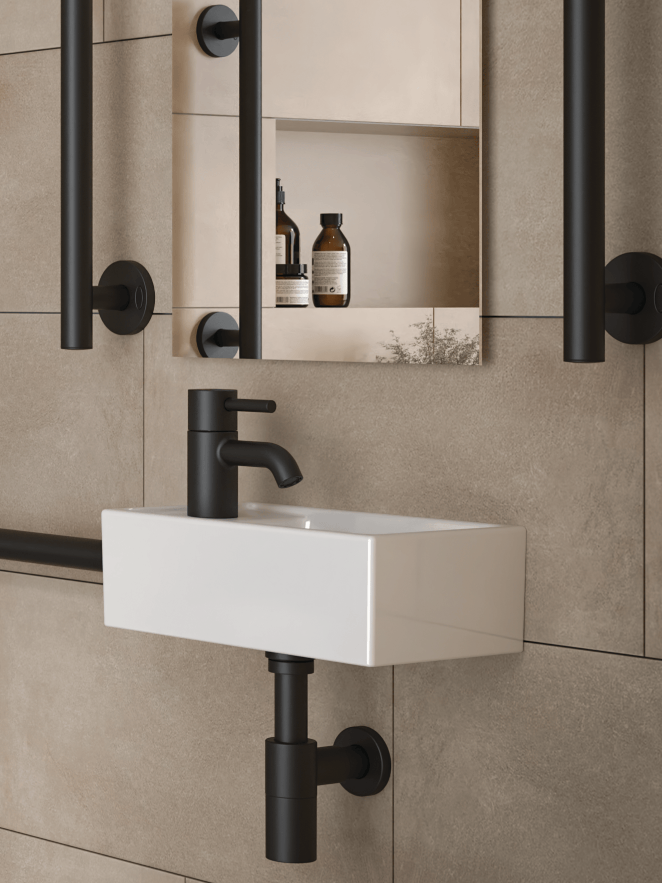
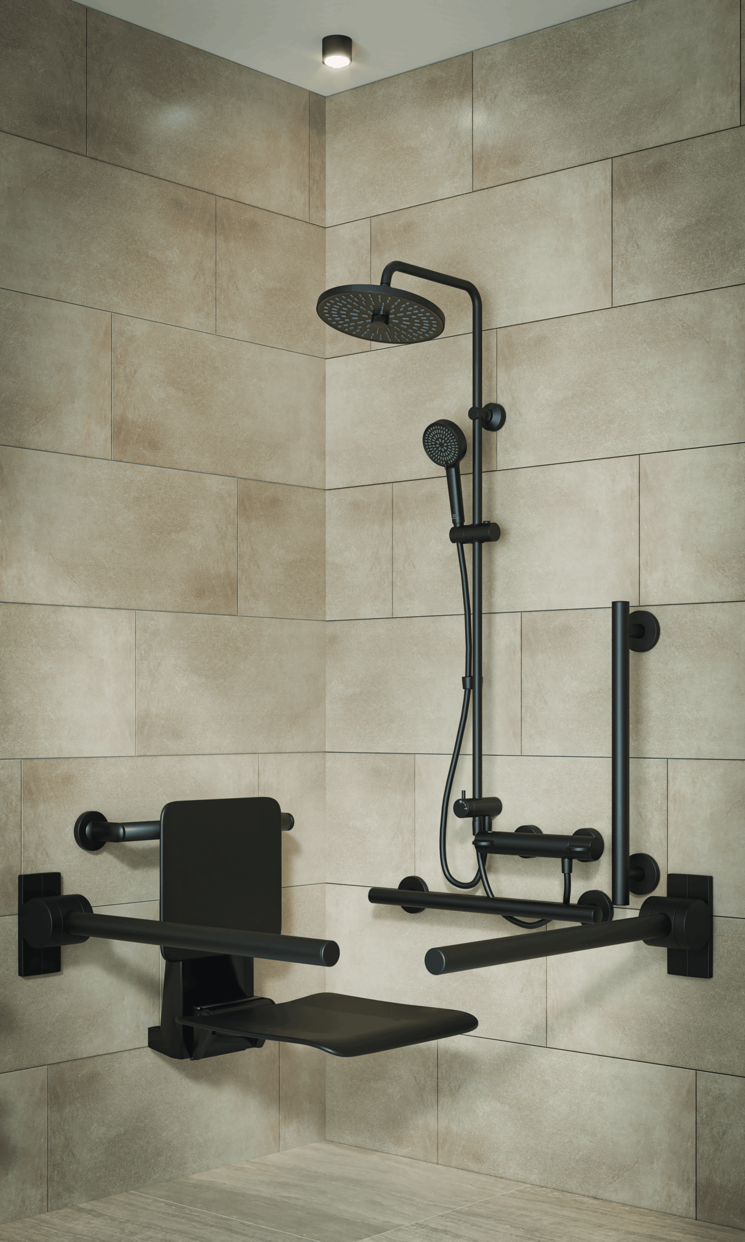
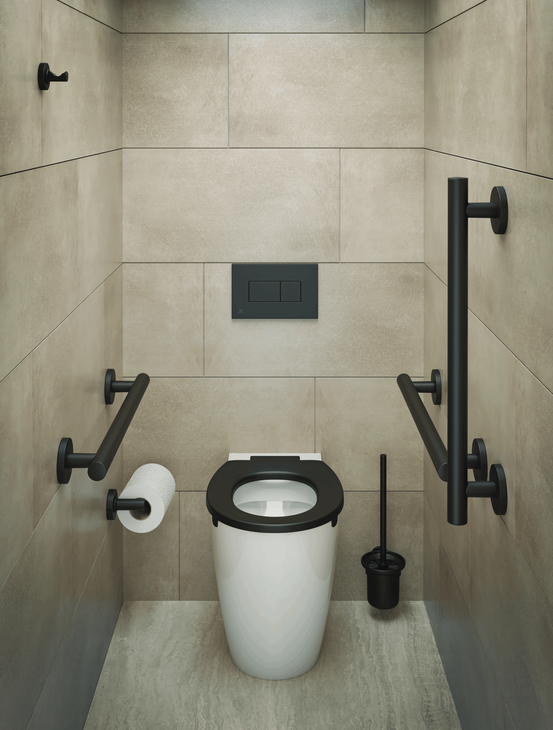
Today, brassware and fittings are leading the way, introducing refined finishes that elevate both form and function. Armitage Shanks’ Contour 21 taps in Silk Black and Silk Black Doc M packs exemplify this movement, bringing depth and distinction to contemporary spaces. The dark finish provides a bold contrast against white sanitaryware and natural materials like wood and stone, while helping designers create accessible washrooms that don’t compromise on visual impact. The result is a look that feels both elegant and enduring, offering inclusive design with unmistakable modern confidence.
Silk black in accessible washrooms
The Silk Black Doc M range makes it possible to extend this trend into accessible washrooms without compromise. Designers no longer have to “make do” with products that disrupt their vision – they can specify a solution that is fully compliant while also enhancing the overall aesthetic.
Anil Madan, Non-Residential Marketing Manager for Armitage Shanks, said: “It’s natural for design trends influencing aesthetics in premium commercial and hospitality settings to have an effect on accessible washrooms too. This, combined with the changes to Part M and BS 8300, has led to manufacturers introducing more colour into their Doc M packs. Architects and designers are responding by challenging expectations about how an accessible washroom should look, starting in hotels and restaurants but we are also seeing this in public washroom settings too.”
Ensuring you can design with everyone in mind
Inclusive design is ultimately about creating spaces where everyone feels valued. It’s not just about meeting legal requirements, but about designing environments that express equality, dignity and care. In the context of washrooms, that means ensuring that every user – regardless of ability – experiences the same quality of space.
Armitage Shanks’ Silk Black Doc M range embodies this philosophy. By moving away from the starkly clinical and towards the elegantly contemporary, it makes accessible washrooms feel like a natural, integral part of modern interiors. It signals to users that their needs have been considered with the same care and attention as every other element of the building.
“Accessibility should never feel like an afterthought,” said Anil. “With solutions like Silk Black, we can make sure it becomes part of the design conversation from the very beginning.”
Read the full blog piece from Armitage Shanks here.