 |||
|||
Last December, London-based practice Jonathan Clark Architects was chosen to fit out technology firm Rubik Financial’s new headquarters in Sydney. The design for the 1,500sq m office fit-out comprised a reception and waiting area, boardroom, meeting rooms, cellular offices and a kitchen and breakout area within an open-plan office space. The transglobal fit-out finished in April – just three and a half months from inception to completion.
Rubik’s office was the first Australian project for the practice, after work in London that saw it selected in 2014 for a £5 million scheme for Battersea Dogs & Cats Home, the biggest development in the charity’s 154-year history. And regardless of the challenging time frame, it was the huge distance between client and design on this recent project that can be credited for ensuring its success.
“Strangely enough, it was [successful] because it was on the other side of the world,” explains practice director Jonathan Clark. “We collaborated super fast with our partners on the ground in Sydney, speedily progressing a works schedule 24/7. All our queries were submitted by end of day UK time and by the start of our next day we had feedback and responses to our proposals that had been efficiently progressed during the night.”
 The kitchen/breakout area features timber and grass-effect vinyl
The fit-out space was located on one floor within the oval-shaped Westfield Tower, right in the heart of Sydney’s Central Business District. Westfield was designed by Melbourne practice John Wardle Architects and is now a landmark tower in Sydney, occupied by leading corporates including global investment banks. Once Rubik Financial had decided on the location – the only available space in the tower – for its headquarters, the company sought a more contemporary and youthful approach for the office’s interior, setting it apart from some of the neighbours.
“They wanted a young, edgy, slightly industrial feel to it, rather than a polished, slick, commercial theme,” says Clark. “It’s right in the CBD area of Sydney, the business district. They liked the kind of work that we’d done previously on various projects and wanted to see some of that in their space.”
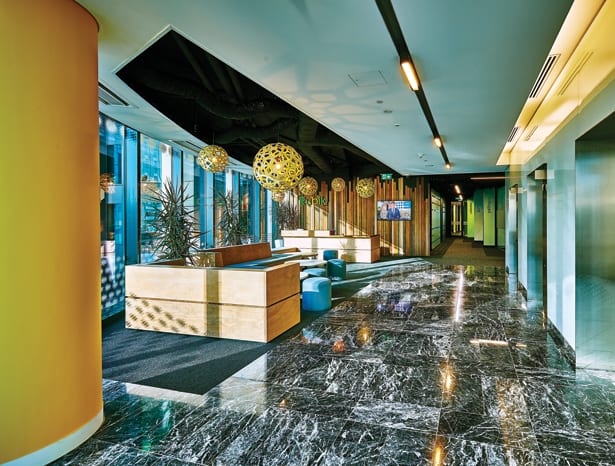
It’s a vibrant design, with a colour scheme that promotes the young culture of the brand as well as its local heritage. Clark’s team selected fresh Australian colours for the interior: Eucalyptus greens, sandy yellows and sky blues. The colour scheme is also used to identify the individual meeting rooms and different zones within the open-plan spaces of the office.
 Vibrant Australian colours identify the meeting rooms
The designers used a simple palette due to the limited budget but did so cleverly and efficiently. Sections of the ceiling were pulled out and the unappealing surfaces below were sprayed black to “add another dimension” to the space. Avoiding a reflective, lighter ceiling provided an economic way of opening up the design and creating a greater sense of space. Black-framed office partitioning
was introduced to provide more clarity and privacy to the design.
Knowing that many of the current floor tiles would have to be raised for cabling, the practice ordered extra tiles but in a darker colour. The contrast between the darker and lighter tiles was used to create a playful pixelated effect across the floor and to further define the different areas.
Timber was used throughout the space, in the reception as well as the breakout and kitchen area. “It’s not necessarily what you would expect to see in a polished office space like that, so it kind of roughed it up a bit,” says Clark. Various types of reclaimed timber were selected by the contractors, with the choice of material giving “more of a natural feel throughout” and complementing the earthy colour scheme.
 Meeting rooms reflect a simple palette of materials
A highlight of the design is the half-height timber surround that spatially defines the kitchen and breakout areas. The adaptable seating area it houses provides an all-encompassing breakout zone: a place to gather during break times, an auditorium for staff presentations and training sessions – thanks to its stepped seating – and at the end of each working week it provides the location for a company-wide meeting. Catering for gatherings of such varied tones, it is a definitive multi-use space.
A hardwearing floor was selected that would be able to withstand the use of 140 people in the kitchen area. The firm chose a vinyl floor, imported from the UK, which was printed to look like grass – tying in the flooring within the breakout area to the warm, natural themes throughout.
An elegant, open reception area allows visitors to get a feel for the company, but in a controlled manner. The cellular offices and boardrooms are visible but the busy, open-plan office space is only accessible by staff.
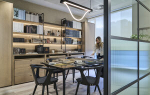
 Clean-lined storage is matched with plants to create a fresh look
Jonathan Clark Architects’ current work ranges from commercial to hospitality spaces, as well as high spec private residential work – the projects are always “very design based”. For Clark, the ability to put his team’s mark on the Sydney office space and the trust given to him from the client was a highlight.
“It was really nice to have a fairly open brief,” he says. “We were able to develop the idea, pitch it to them… and go with it. It was a fun project. It’s nice when you get to play around with things. Quite often when you’ve got very little time to do it, that’s when you come out with some of your best designs. You are very, very focused.”
The communication between architect and client certainly shows in what is a modern, assured and colourful interior – one that reflects local culture and the youthful, international company brand.
 The central focus of the office is a busy, open-plan workspace
This vibrant fit-out proved a surprisingly easy puzzle for London’s Jonathan Clark Architects to solve

