 |||
|||
What constitutes “sophisticated madness” and how can this be applied to workplace design? According to architects Ujjwal Sagar and Sanjana Mathur, the duo who founded New Delhi-based design consultancy Studio Bipolar, it’s a conscious move involving colour and impactful user engagement. “We would define ‘sophisticated madness’ as something that evokes a sense of awe, as well as engages the audience, and something that makes them laugh and think at the same time,” explains Mathur.
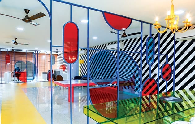
In its recently completed headquarters for the New Delhi nightclub set up by US men’s magazine Esquire, Mathur and the team have in some ways turned this definition into an office – creating a colourful display out of the publication’s inner workings. Completed late last year, the 111sq m project features an abundance of digitally printed vinyl wallpapers, quirky spaces and branded storytelling in its workplace for the new club.
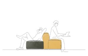
 Studio Bipolar’s sketches explore the colourful space. Images: Suryan Dang
“The office at first glance is a mix of colours, but a closer look will showcase the simple yet powerful forms we have incorporated and the historical references used,” she continues. The design brief had three pillars: firstly, to reference the Esquire brand and encapsulate its historical past; secondly, to accomplish a balance between sophistication and playfulness; and lastly to reflect the New Delhi surroundings and its latest venture into nightclub ownership.
Founded in 1933, with its first headquarters in Chicago, Esquire is the pinnacle of menswear fashion. Now with more than 30 international editions, it has successfully marked itself as a beacon for the stylish and intellectual man around the world.
Most recently, the magazine acquired its own branded nightclub in the heart of the Defence Colony Market in New Delhi. This location, built in the 1960s for ex-defence service people, is an affluent locality brimming with restaurants, coffee, shops, high-end retail and is popularly known for its exotic cuisine. In this prime location, the new office needed to serve as a hub for the creative owners of the new nightclub business and also to adhere to Esquire’s trademark sophistication in a “quirky way”, while fitting the style of its new evening venue.
 Art deco curves refer to the style at Esquire was founded
“The space had to reflect the brand ethos and vibe for the nightclub they were trying to create,” says Mathur. “We drew inspiration from Esky, the magazine’s mascot since 1934; Esky stands for fashionable sophisticated gentlemen everywhere, but their eyes keep wandering on the lookout for the next big thing. We wanted the space to make the inhabitants look around constantly and engage with each other. We used distinctive elements like the Memphis-style partition, as well as the striped wallpaper, but as a space it all comes together.”
As well as a huge influx of brand representation, the design pays homage to the art deco era – a movement where traditionalism gradually converted into modernism, and one that heavily influenced architecture, product design, jewellery and fashion. Mathur explains how “arches and asymmetrical shapes were synonymous with the art deco movement”, and shows how the design of the new Esquire office echoes this.
The composition of this era is evident throughout the entire space: tinted distorted glass partitions, conflicting wall patterns and wayfinding achieved through decorative flooring are a few of the elements that make up this extrovertly unusual space.
 The 1980s Memphis movement was one of the design inspirations
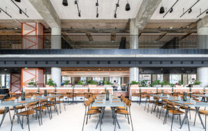
In terms of functionality, the space has various uses and areas for different types of work – be it an informal meeting, private call or a light lunch break with colleagues. In fact, part of the brief revolved around the requirement for several cabins. There are four executive directors who all need their own space, plus a conference room, space for a team of six to hold a meeting, a reception and a breakout area. “Our task was to make sure that people were not locked up in a glass box all day, and that they would still be forced to look around and talk to each other and collaborate,” says Mathur.
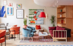
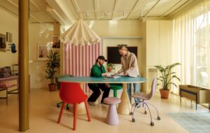
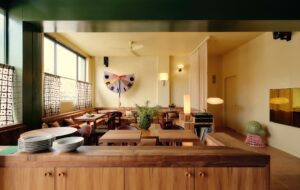
Entering the building, the guest is greeted by a large open space occupied by the reception area, filled with a desk, colourfully coordinated seating and a coffee table. The same large space features the team table, where the staff will work and perch throughout the day. As the main focus of the area, this large zone also incorporates the breakout space, with beanbags, a floor lamp, bar counter-style work table and gallery of magazine covers – a place to switch off from that desk-working mindset and get inspired.
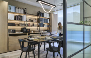
 A clear yellow-tinted boardroom table gives a feeling of space
As far as the materiality of the office is concerned, glass was used in abundance. For the creation of the partitions, glass panels were fitted into mild steel sections, with adhesive film then pasted on at the end of the process. Tinted toughened glass was also used to create the conference table, which Mathur says was “completely custom-made from scratch”. The use of glass imparts a sense of openness and lightness to a space that would have otherwise been overbearing if wood or gypsum had been used.
While some may find this design bold, others might find the colour palette rather garish and intrusive. This resonates with obvious implications, such as the idea that this would be a place full of distractions rather than an attractive place to work. Questioned why such a loud visual narrative was chosen, Mathur responds stating how she and the team decided “colour and pattern can become very activating forces in a space”. They also took close care to make sure that the workspaces were far from visually heavy, so “not a single seat is facing the striped wallpaper head-on,” and that there is always a mixture of spaces for work. She continues: “We would say that while it is a ‘mad’ space, we did make sure that people have a variety of spaces to sit in according to the type of work they want to do.”
 Framed Esquire covers line the workspace
Overall, the design and input of colour has been a highly positive outcome, and one that has even been seen to increase employee energy. “There’s no need for that morning cup of coffee,” jokes Mathur.
“The main purpose of the space was to showcase the Esquire brand to potential partners and investors, and our clients feel that it is very easy to do that with an office like this,” she says. “Since its launch, the inhabitants have told us that it is a wonderful space to work in, because no matter where they look there is something to inspire them. The whole space encourages them to think differently, which is a huge change for them as they are used to working in the standard cubicle format.”
It’s clear, then, that colour choice and a flexible layout influence productivity levels within the working environment – and perhaps we can use this latest addition as an example to those thinking of updating the office in line with wellbeing. Mathur concludes: “Here the employees have the freedom and flexibility to work in the way which suits them best, and that leads to an increase in employee productivity.”
When Esquire magazine set up a nightclub in New Delhi, it made sure that its offices had the same nightlife vibe


