 The warehouse district in downtown Toronto is cool. Not crowded with suits and shoppers, its streets are the domain of young urbanites and the places they inhabit. Television production houses, design studios, multimedia outfits, restaurants and bars; this is east London’s Hoxton crossed with New York’s SoHo.
The buildings themselves are late 19th century, which is old for Toronto – brick and stone, with a strong presence to match. As such, they need to be occupied in a manner that is sensitive to their history but which can stand up to the industrial aesthetic.
The new office for The Juggernaut is a perfect example of interior design with the balls to impact upon this macho warehouse environment. Designed by Canadian architect Giannone Associates, it is inspired by The Juggernaut’s desire for a space that reflects its work as a post production, design and animation studio. The architect has interpreted this as a multi-layered, interactive world and created an interior charged with energy.
However, from the outside you only catch glimpses. “There were some restrictions with respect to changes to the exterior of the building,” says Giannone Associates principal Pina Petricone, “but we embraced the contrast between inside and outside as a tool, to defy expectations upon entering. The total containment of the new insertion as a kind of suit lining also echoes our cocoon idea – a light-protective wrapping that slowly unravels.”
Petricone and partner Ralph Giannone share a keen instinct for urban culture and the city, a passion for fashioning complex surfaces and an ability to search out unconventional uses of forms and materials to ensure freshness and richness of meaning. “We do many custom interiors, especially for organisations looking for a change or definition of identity, or a boost to their corporate structure,” says Petricone.
Giannone Associates’ work often encompasses some type of layering, while colour and texture play an important part. This is evident in the layout of The Juggernaut’s space. The designer has created four private studio suites, utilised a corridor to provide open workstations and transformed a reception area into a space that offers itself as a social hub, a lunchroom, meeting space and entertainment venue.
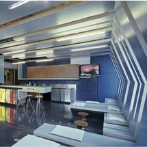
The existing building structure has been left pretty much intact: brickwork interior walls are exposed and large structural elements such as timber columns and beams become feature elements. “There were no restrictions stating that we couldn’t alter the internal fabric of the building. The ribbons were born purely out of this ‘scrim’ idea – a kind of porous obstacle in front of the windows,” says Petricone. This defining aspect of the project – a new lining of plywood ribbons, laminated on either side with light blue rubber and yellow plastic laminate – swoop around and over the main reception space, before morphing into seating and a workspace.
The ribbons wrap the 75sq m reception space like giant filmstrips, even obscuring the windows. “Our idea for the new space really warranted this bold gesture,” explains Petricone. “The client needed no convincing. Once they understood what we were trying to do, they trusted it was the right device. They love it now. And it’s uncanny how daylight becomes objectified in the space, and how the spliced view to the outside resembles the media frames on the monitors and light boxes.”
Because controlled light is an integral aspect of The Juggernaut’s working environment, Giannone Associates made it a thematic element, shaping many aspects of the design. The sequence of workspaces subtly unravels from the dark and controlled studios to the light-filled reception. Inspired by the rows of computer monitors required for editing work, Giannone also punctured the walnut cabinetry of the workspace and reception desk with steel-framed light boxes that display custom-designed artwork and sequences by The Juggernaut. The screens offer multiple views of the same image, and then collapse into a single frame, adding a kinetic and spectacular effect to the architecture.
“By day, light streams through the ribbons, igniting the glare of the polished epoxy floor, only to be absorbed by the matt rubber surfaces,” explains Petricone. “However, at night the situation is reversed, as the light boxes and monitors radiate light through the ribbons and out into the city with a dreamlike luminosity.”
The interior combines a real mix of materials and textures – eroded layers of drywall, ceramic tile, stainless steel and walnut cabinetry. This approach ensures that passersby are intrigued, the ribbons offering thin framed views of a dynamic interior from the outside, while giving glimpses of the raw building fabric of timber and brick from within.
Furniture has been carefully chosen to complement the various areas. The reception area bar has Covey Stools by Jeff Covey, with Eames Walnut Stools from Herman Miller between the ribbon seating elements and chairs in the corridor designed by Jean Pauchard for Tolix.
“I really enjoyed the project but I can’t really identify one element as my personal favorite,” says Petricone. “They all kind of work in concert but I really enjoy those moments when a simple ribbon morphs into a counter, or returns as a small object shelf in the depths of the plaster wall.”
The resulting design is unashamedly quirky and fun to experience. It is light-filled yet a little secretive at the same time, while the combination of new additions and existing shabby-chic will only grow more natural with a bit of wear and tear.

