 Two years ago, Angus Pond Architects took on the fit-out of Stella McCartney concessions in Harvey Nichols stores, first in London, then New York, Tokyo and beyond. Elaborately decorated with oversized aluminium spray-painted petals, they are at the showy and flamboyant end of retail fit-out.
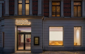
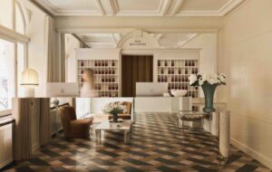
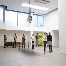
This year, the architects put the finishing touches to the Established & Sons gallery on Duke Street, central London, and the company’s new HQ on Wenlock Road, north London. Both are clean, refined and understated spaces.
Overseen by Established’s chief executive, Alasdhair Willis, and director Sebastian Wrong, the Wenlock Road project was more intricate and involved than could have been imagined at the outset, with “far sharper and crisper results”, according to Angus Pond’s project manager, Iain Mackay.
A nondescript business unit from the outside, the space inside was initially an empty bunker-like shell. But it was spacious and close to London’s East End creative hub. “You have to go industrial to get the volume space you desire in this location,” says Mackay. And it was the curved industrial concrete wall, dividing the building from the car park that backs on to it, that, in the end, made Willis fall for the space.
The raw concrete surface remains untouched, forming the backdrop to the HQ’s gallery area – an important selling tool for the high-end British furniture company. The other concrete columns that support the unit have been meticulously clad and plastered over in white.
“Originally, we intended to have more unfinished surfaces exposed,” explains Mackay. “But too many rough finishes look messy. As the project progressed, we increasingly wanted the space to look more finished and more defined. That’s it [the wall]. That’s the statement.”
The gallery floor, which appears to be concrete, is made of large ceramic tiles. “Lots of people have done concrete floors – the White Cube art gallery, for example. But to have a pure level concrete polished floor is difficult to achieve. With tiles, there is so much more precision. It is a given quality.”
An 8mm shadow gap – where the plasterboard comes down and hovers above the floor – meant the surface had to be “level and exact”.
The same effect is achieved with the columns, which appear to float through shadow gaps in the ceiling. This measure is “practical as well as aesthetic”; air is extracted, circulated and blown back through the gaps, minimising the need for services in the ceiling.
As well as the curved concrete wall, the space offered a lot of opportunity to work with different volumes. “[This is] something architects always try to play with,” says Mackay. “Spaces tend to suggest ideas to you. When we saw the unit, we imagined mezzanines and various space heights. We played with this by building up, from the entrance on the far right to the gallery on the left.”
The side entrance to the building is quite small, and leads on to a mezzanine that overlooks a ground-floor office. The far section of the wall is punched through completely, giving a full-height gallery. A viewing room is cantilevered over into this space, something that was “quite difficult” to execute, but impressive to experience – a meeting room suspended in an exhibition space.
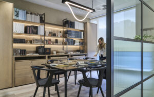
There are three meeting rooms in total. The boardroom, positioned through the gallery space, has frosted and clear glass sides, creating a “clouded box” in which to have meetings. The kitchen, a continuation of the studio office space, with a long table for congregating or having breakfast at, offers a less formal option.
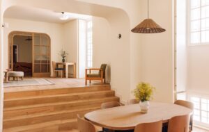
The focal point of the project is the staircase that leads from the lower-floor office and gallery floor, to the mezzanine office and reception. Angus Pond had to have the 60mm-thick precast concrete creation made in Holland. “We needed a company that could carry out sophisticated concrete work,” says Mackay. “Here, people who manufacture in concrete make large industrial items. We were asking for something highly engineered – closer to a piece of art.”
Hibex, which won the contract, has also carried out sculptural work in black concrete for Rivington Place, in Hoxton, east London.
The pale concrete finished product is slender and delicate looking; the stairs bounce very slightly as you either ascend or descend them. “Once in, it had to be manoeuvred down the ramp, through the doors and weaved round the columns – a nail-biting process,” explains Mackay.
Especially after the first attempt, when, following a three-month wait, the first model arrived from Holland. “It reached the pavement outside the unit and was lifted out of the truck, only for the crane to fail, letting the structure fall to the pavement – and crack,” says Mackay. “It arrived in one piece and stayed like that for about half an hour.”
Fortunately, a more refined version was turned round in just a month. “We couldn’t hold the rest of the project back, so it was a case of logistics when it arrived.” It now elegantly links the building’s two levels.
Apart from concrete, ceramic and plaster, a key material employed on the project is dark oak. It is used mainly for the floors, but also for a wall and storage system.
“Willis really pushed for that,” explains Mackay. “We began with quite a neutral palette, but the dark surface against the white walls creates a great contrast.”
The distance of the light from the suspended ceiling gives the whole space a wash of pure white light. “The 3.6m-long linear fittings are dimmable and German made,” adds Mackay. “The light is very white and natural, and there are tracks for spotlights.”
In the studio office, Established & Sons’ Tank lights are suspended from the ceiling, looking like part of an art installation. “They are used for evening events,” says Mackay. “They have a softer yellow light and offer a lot of atmosphere.“The great thing about doing a fit-out for Established & Sons is that you know the furniture that goes into it will never let you down.”
What appear to be panelled walls along the back of the office space are, in fact, sprung units, creating maximum storage in a minimal fashion.
The delivery point from the car park is in the middle of the building, between the office space and the gallery, creating a dramatic intersection where one sheer frosted glass wall opposes a large metal corrugated shutter.
As with its furniture and the space in which it exhibits, Established & Sons loves to blur the lines between furniture and art, and art and design, pioneering limited-edition furniture pieces that are sold as collectors’ items and museum pieces.
The Duke Street store, positioned opposite art auctioneer Christie’s, is “less showroom, more art gallery”, according to Mackay.
In this project, the gallery and office space inform one another, providing a workplace that is calm and spacious, and a gallery space with a functional and industrial edge.

