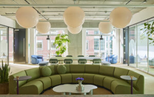
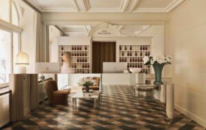
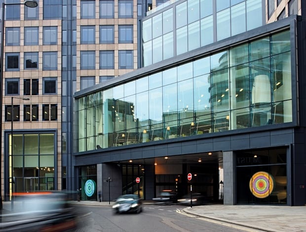
 It is hoped the bright neon colours – particularly when reflected on rainy pavements – will entice passers-by|Artwork by Rob and Nick Carter dominate each of the two lobbies|Light is used in innovative ways throughout the building – as shown here on the reception desk|An acrylic lighting installation gives the journey from the reception to the first floor a new dynamic|Linda Morey Smith’s experience of residential work inspired this Bizazza tile mosaic|The business lounge is set behind a glass screen that features a geometric floral design|How 200 Aldersgate looked before the renovation – complete with the single cascade in the centre|The double-height business lounge space, accessible from both wing, forms the heart of the building|Of the wide array of views the towers offer, that of the dome of St Paul’s is among the most spectacular||
Linda Morey Smith’s solitaire necklace catches the weak February sun. On the neck of any other woman, you might doubt this is the real thing, but after 20 minutes talking materials with Morey Smith, my only wonder is if she mined the diamonds and ground them into shape herself.
After all, in 200 Aldersgate, Morey Smith, and Graeme Montague, the director at MoreySmith have taken on a stone so rough that many others have tried and failed to give it lustre. “People have gone bust on this building,” Morey Smith says. “It’s had a history of ownership since Clifford Chance left. People have tried to do different things to it, but it’s always stood empty. It’s a pretty tall order.”
MoreySmith was the architectural firm brought in to renovate the building. The brief given by developer Helical Bar to a team of four – Andrew McCann and Nicola Osborn along with Montague and Morey Smith – was exactly that: brief. They were to rebrand and create an image to attract tenants. Their remit included everything except lettable office spaces and the health suite. They had an absolute budget, and less than a year.
It is a daunting prospect: the highest tower is 21 storeys, and there are more than a dozen towers of various heights in the two wings. “Every time we came, at the beginning, we found another floor,” Montague recalls. “Wayfinding was really important. It’s a maze,” he adds. The team have defined the interiors using wall coverings ranging from leather to high-gloss lacquer and burnt oak to create distinct spaces and aid navigation.
On paper, 200 Aldersgate has a lot to offer: it’s on the edge of the City, within easy reach of the West End. Its office areas would suit any size of company, with floor plates from 560 to 4,000sq m. But there were drawbacks. Built in 1992 for law firm Clifford Chance, the building was unsuitable for multiple tenants as it was served by one atrium in a glass cascade – a feature that was dated and, with no dividing walls, led to acoustic problems. Montague explains: “If someone spoke loudly on the first floor, you could hear it all the way up to the fifth. I don’t like to criticise other people’s work but some of the spaces didn’t make sense.” Restructuring the cascade was a priority – and a huge challenge, says Montague: “We wanted a big expanse. Everything about the building is big.” Filling in floors, creating a 24-metre span, working with huge pieces of glass, Montague and the subcontractors gave the building a facelift so drastic that some of the spaces from inside the cascade are now on the exterior. He praises the teamwork, saying: “Everyone kept cool. [Facilities manager] MITIE were brilliant. They had a very, very good plan and stuck to it. And Waterman Structures, the structural engineers, did quite a job.”
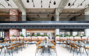
Now, the revitalised glass-fronted atrium houses the new business lounge and cafe-bar. The double-height space, accessible from both wings, forms the heart of the building. Even the journey from reception to first floor has been given a new dynamic, with an acrylic lighting installation overhead. For Morey Smith it was time to start transforming the interior: “Previously, it was a very harsh environment. As soon as you came in, you wanted to leave. Everything needed depth and texture.” This is where Morey Smith excels. Installing a Bizazza tile mosaic, she drew from her experience of transforming high-end residential interiors. The walls and ceiling have end-timbers that are warm and comforting, insulating the clientele from the busy road where traffic races by a few feet below. “We wanted a cafe with a better image, and a better coffee product than what’s available in the street,” she says.
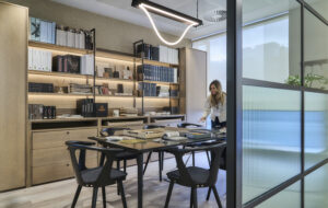
Beyond a geometric floral design on a glass screen is the business lounge. “It’s a huge volume of light, space and glass. Creating the spatial volume was inspiring,” Morey Smith says. Each area was given a sense of intimacy by judicial use of light and furnishings, with rugs, seating and lamps that would befit a town house. The area is functional but welcoming. “I think it needed to be a bit feminine in places, because of the brutality of the architecture,” says Morey Smith.
Morey Smith is enthusiastic about working with light, and uses it to create variety. “They say you should have an even spread of light, which creates a supermarket feel. I really hate that,” she says. As with the acrylic lighting over the escalators, light is used to give direction as well as interest. The exterior also needed a light touch: “One of the major issues was that people outside the building didn’t know where to enter,” says Morey Smith. “We had to highlight that there are two office entrances, and they’re different to the retail.” Two huge light installations were commissioned: “We wanted colour, we wanted it to be a little bit organic, something that was moving and changing,” she adds. Rob and Nick Carter’s art dominates the two lobbies and enlivens the frontage – neon colours reflect on the rainy pavement and entice passers-by to peer in. When people do look in, they will see a space that has changed beyond recognition. “It was a forest of scaffold for months. Lots of people wondered, ‘what on earth is going on in there?’”, says Montague. There’s even more that passers-by won’t see. There are two underground floors, one of which is home to a cycle store with space for 220 bikes. There’s a swimming pool, too. But the best-kept secret of the building are the views, which vary from floor to floor. Looking past the dome of St Paul’s from the 16th floor, the cityscape is bewitching. “We’ve seen the museum of London change their roof, and watched the Shard grow,” says Montague. After last month’s opening party, viewings are booked back-to-back. Has MoreySmith made this diamond in the rough shine? It certainly sparkles, but only time, and tenancies, will tell.

