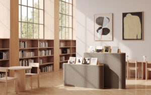
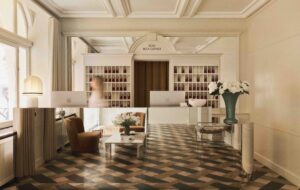
 The reception. The manager’s office is next to the stairs|Glazed walls separate working spaces from the corridor|Large skylights ensure the timber-clad meeting rooms are well illuminated|The black steel of the reception desk is representative of the project’s simplicity|In its former life, Oficina was a car workshop|A black steel staircase and walkway connects the two floors|The austerity of the Campaspero stone in the director’s office seems a deliberate reaction against the greed of banks||
Pereda Pérez Architectos plumped for cool minimalism in place of corporate branding to create a Spanish bank founded by architects for architects
The northern Spanish city of Pamplona was a fave of big Ernie Hemingway due to its foolhardy displays of machismo by indigenous and international braggarts during the annual running of the bulls festival. It may be most famous for this ancient and, it has to be said, bonkers tradition, but there’s much more to the city than avoiding death by rampant bull. The urban fabric pits beautiful medieval churches alongside a post-war modernisation that took root in the 1950s and continued unabated throughout the next two decades.
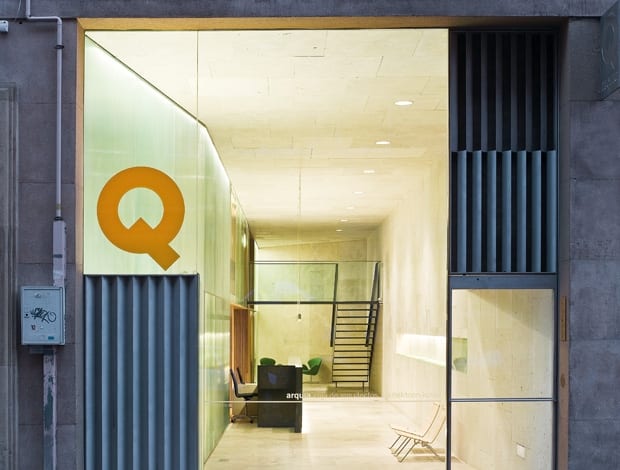
Located somewhere between these contrasting districts is the Oficina Caja de Arquitectos by local practice Pereda Pérez – a bank founded by architects for architects. As part of an expansionist drive, client Arquia Caja de Arquitectos is in the process of setting up a bank in each provincial capital of Spain.
As you would expect having architects as clients, replicating the dreariness that characterises most local branches would not come close to cutting the mustard. In order to guard against this type of homogeny, each office is designed by a different architectural practice, and Oficina was no exception.
The site, a former car workshop in Iturralde y Suit street, was in a pretty sorry state. Thankfully, what the practice did have going for it was carte blanche on the design.
“We had total freedom because the company trusted in the design,” says Pereda Pérez architect Teresa Gridilla Saavedra – a statement likely to a cause the most battle-worn of architects to drool.
Perhaps surprisingly, the client resisted the urge to throw some of their own ideas into the mix. Stretching back from the road, the elongated building needed to house offices, a meeting room, a rest area and a defining core for management types.
To achieve this the practice split the building in two, with workspaces on one floor and an operations centre and hall on the other. Upon entering the building, visitors travel down a long corridor constructed from large square blocks of Spanish Campaspero stone on their right-hand side, while a faceted glass wall runs opposite.
“Oficina’s black steel reception desk is vaguely reminiscent of Arthur C. Clarke’s monolith, if some cheeky ape had tipped it on its side”
Directly behind the reception is a timber-clad informal meeting room, while the business advisors and deputy director sit further back. Lurking near the stairwell at the rear of the building is the director’s lair.
Reception desks can explain a great deal about a company’s ethos, from streamlined, curved affairs representing speedy dynamism to sturdy, old-timey wooden numbers. Made from black steel, Oficina’s is vaguely reminiscent of Arthur C. Clarke’s monolith in 2001: A Space Odyssey, albeit if some cheeky ape had tipped it on its side.
It is simplicity personified, and perhaps a deliberate response to the perceived opulence and greed of banks. This theory is held up by the austere stone blocks and the warmth of the timber-clad office spaces, but it is a conclusion that Saavedra resists: “Maybe it is a response to the greed, but this is our line of design and we try to shun fads.”
Corporate branding was also shunned, kicked into touch by the cool minimalist design. At the building’s rear, a black steel staircase allows access to a mezzanine floor via a small footbridge and concrete floorplate that crosses the reception space below. Here the space is turned over to the more mundane essentials such as washrooms and cleaning facilities, in addition to a large meeting room and break-out lounge hidden behind the faceted glazed wall. Large skylights above both the director’s office and meeting room ensure that despite the building’s great depth there is an abundance of natural light.
The practice had to perform a careful balancing act with this feature. Too much transparency would destroy any notions of privacy, while a repeat of the Campaspero stone would result in a gloomy space. “The use of glass is not only to split the space,” says Saavedra. “We wanted to avoid too opaque a surface. In addition, glass allows light to come in from two skylights sited in the office space.” Notoriously exacting in their profession, architects can be difficult to please – so what does the client make of it?
“I think they must appreciate the project because they have used one of the photos of it as the front page of their brochure,” says Saavedra. Well, you can’t say fairer than that.