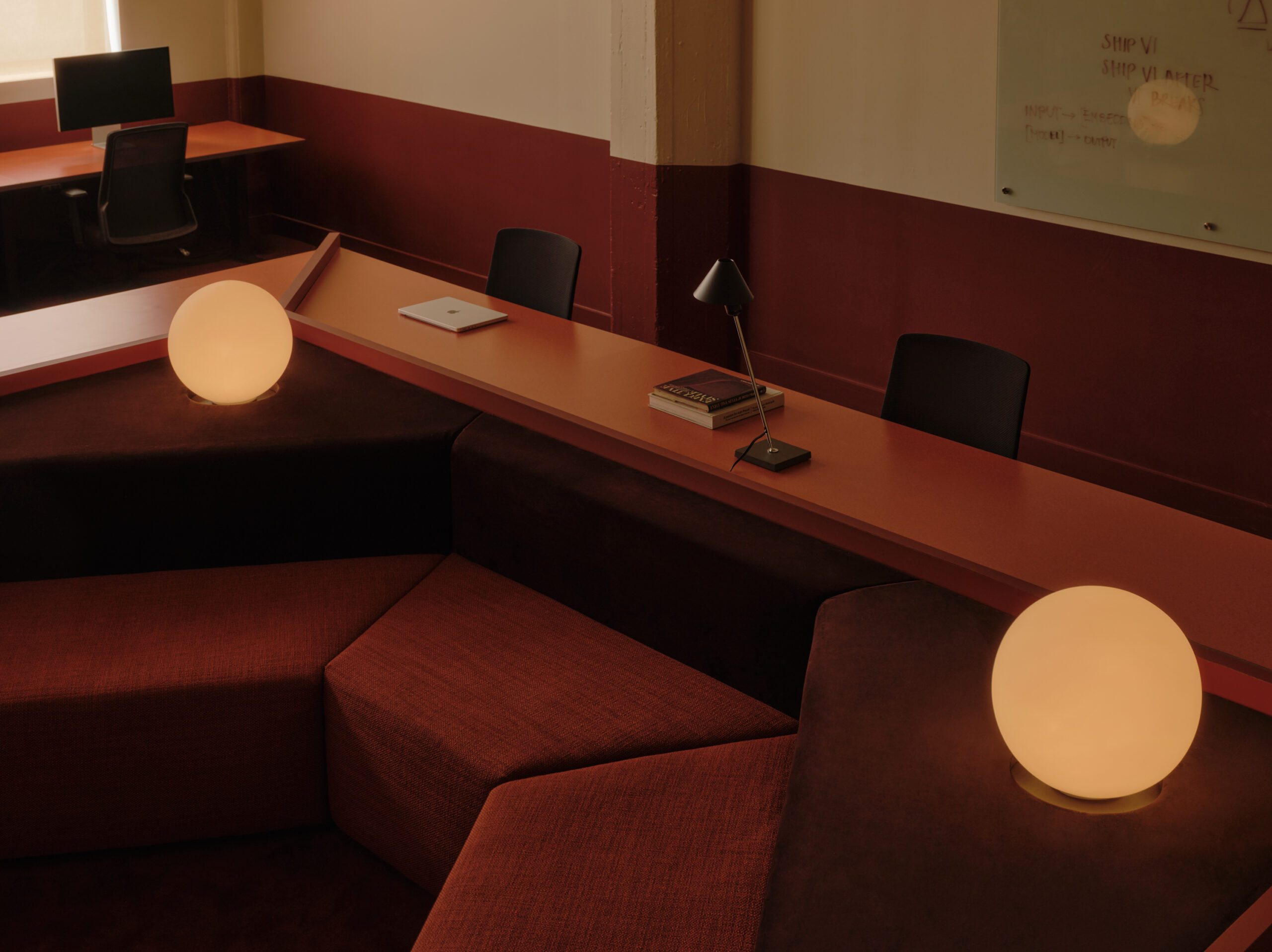
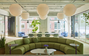
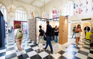
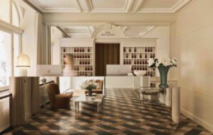
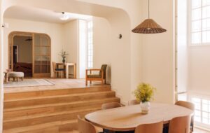
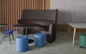
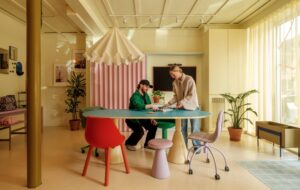
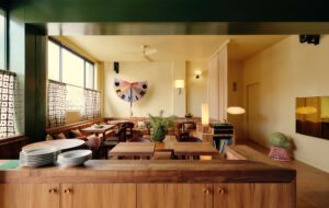
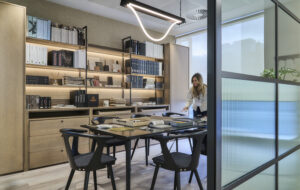
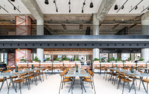
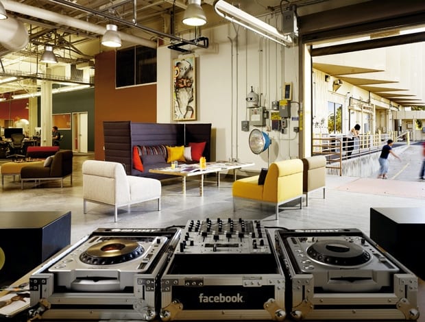
 The building is an old laboratory research facility, with the loading dock now a lounge area and breakout space|Facebook’s instantly recognisable branding is prominent throughout|Different coloured carpet tiles from Milliken Contract, define the various departments of the building|Conference rooms each have their own style, and were given their names by staff|Staff are encouraged to personalise the office by adding their own artwork|The furniture was recycled from Facebook’s former offices, which were scattered throughout the city|An orange crane, left over from the office’s previous life as a lab, now supports a conference table|Exposed concrete walkways are the roads through this ‘mini city’|Huge expanses of whiteboard in one of the meeting rooms create the mother of all brainstorming hubs||
Facebook’s rough and ready HQ in downtown Palo Alto shows the company is determined to stay true to its roots
Tucked away 35 miles south of San Francisco, Palo Alto is base camp for many of Silicon Valley’s established technorati. In the last five years, these venerable old-timers – household names like Hewlett Packard and Xerox – have found themselves sharing the city with a younger, funkier upstart, the hugely successful social networking site Facebook.
Launched in February 2004, the company grew organically across a variety of different locations in Palo Alto – little offices developing here and there with their own identity and community, a patchwork structure that neatly mirrors the platform itself. The upshot of this was a multi-headed hydra of a company with 700 employees in ten different offices across the city.
In search of a focal point, Facebook decided to move these disparate elements into one central office. Despite its mega-bucks, the company resisted the temptation to go corporate, preferring to make a disused research facility on Stanford Research Park the new HQ.
Facebook tasked San Francisco-based interior designers Studio O+A with the job of creating a workplace that retained the individual character of each office, but in one all-encompassing space.
“It was probably quite exciting in the beginning, but I think being based all over the place was hurting their interaction,” says Primo Orpilla, the design team leader. Studio O+A was a logical choice for the fit out. The studio cut its teeth in the dot-com boom of the early 1990s, designing sophisticated office spaces for the start-up companies of Silicon Valley. Recent clients have included PayPal and Soma Magazine.
Palo Alto’s high proportion of eggheads may have given the city an enviable reputation for specialist technical knowledge, but neighbouring ’Frisco pretty much owns it in the cool stakes.
“There are parts of San Francisco where you get a lot of these start-up companies that are a little bit underground, a little bit independent, explains Orpilla. “There isn’t a whole lot of that in Palo Alto and I think our goal was to bring that cool urban vibe to the site.”
To this end, Studio O+A left the building’s interior “pretty raw”, ripping up old carpets to expose existing concrete and converting laboratory cabinets into kitchen units. Many walls and spaces were left in a state of flux, with employees encouraged to add artwork, write on the walls and move furniture as needed.
“It was about recreating the feel of a Facebook page. We left a lot undone so they could add to it,” Orpilla says. “It is really like a mini-city in there with the different neighbourhoods incorporated into the overall plan.”
These neighbourhoods are defined by changes in colour and interior spacing, but are linked by overarching common finishes and graphics that run throughout both floors of the building. Existing walls were left off-white, replicating the neutral backdrop of the online Facebook page, while new ones reference page add-ons with splashes of colour. In recognition of the building’s industrial past, a bright orange crane, left behind by the former occupants, was reworked by San Francisco sculptor Oliver DiCicco to support a conference table from its hoist. Elsewhere, an undulating felt canopy edges up one wall, fleshing out a central meeting area and doubling as an impromptu auditorium.
“It is really like a mini-city in there with the different neighbourhoods incorporated into the overall plan”
“They didn’t want it to look like they had spent a whole lot of money,” says Orpilla: when you consider the enormous amounts of cash at Facebook’s disposal – revenues came in at $300 million last year – it’s clear that the company was desperate to keep it real.
This is drilled home by the fact that staff are actively encouraged to scoot between departments on rip-sticks (kind of like a skateboard, in case you’re wondering). California and sustainability should be natural enemies – the state is one of the biggest energy consumers in the US – but Palo Alto has some of the most progressive green legislation in the country.
Naturally, Facebook was keen to push the green envelope, and through the use of energy-efficient lighting and recycled furniture and carpets, it was the first commercial project to be completed under the city’s Green Building Ordinance. The Facebook staff “practically live in the building,” according to Orpilla, therefore it was important to bestow all the creature comforts of home. Kitchens and cafés provide sustenance at all hours and, if shooting hoops is your thing, there’s an outdoor basketball court. Almost every aspect of the building is personalised to some extent. Conference rooms have monikers like Donkey Kong Chutney, supposedly because the staff could not agree to name them after condiments or video game characters.
Following the seemingly all-pervasive trend for flattened-out management structures, Facebook’s big enchiladas are strategically positioned on the main intersections of the floors in ‘town squares’. This desire for complete openness between all levels of staff was no more apparent than in the design process itself.
Every aspect was scrutinised by up to three different committees and then voted on using the Facebook platform. Orpilla admits he cannot recall a project where so many people were given a voice. “We did feel we were being tugged in different directions, but it wasn’t frustrating at all, it was actually pretty cool,” he says. “If there was something they didn’t like they would pull it immediately. Good or bad, you kind of just went with it.” This laissez-faire attitude served Studio O+A well: the work was completed with astonishing speed, taking just seven months from start to finish.
It wasn’t all plain sailing, however, and housing 700 people in a building primarily designed for research posed its own set of problems. The restroom facilities were woefully inadequate and needed a substantial overhaul. Similarly, an attempt to open up one of the smaller cafeteria areas exposed an enormous K-brace, which turned out to be essential to the structure of the building.
“We ended up having to shift the kitchen and redo all the layouts in a matter of days,” Orpilla says. Hardly surprising, then, that he likens the process to steering a 16,000 sq m ship while trying not to run aground. At its most frantic, Studio O+A was holding design consultations at the rate of three a week. Usually one is enough.
“Most people don’t care about the design, they just want to move,” Orpilla says. “During the project, a few people said to me, ‘y’know, this isn’t a typical Silicon Valley office.’ But that was exactly the point. These guys understand where they are in the world and they don’t want to work in a cube. They want to make an impact and I really hope it works for them.”


