 Ever walked down a street and completely missed the place you were looking for? There’s certainly no danger of that at 55 Baker St, the former headquarters of Marks and Spencer that’s been given an overhaul by London-based practice Make Architects. And you can see the results, if not quite a mile off, then certainly well before you present yourself at its eye-catching entrance.
“You never look at a building from the front – unless it’s Buckingham Palace,” quips Ian Lomas, project architect with Make. “You generally approach a building from the side, so this project is about how the building is experienced from there.”
Working together with artist Jason Bruges, Make has realised a facade that simultaneously grabs the attention of passers-by – appearing to extend far out over the street – and yet has kept within planning guidelines so as not to impose on the streetscape. Three glass infills, which Lomas refers to as masks, span the voids between the existing blocks, with a central section enclosing a seven-storey atrium.
“The idea was, rather than a flat screen, to have these folding forms. Like at a railway station or a greenhouse, these slatted glass fins provide a temperate environment where people can be. The light dapples like when you’re under a tree.”
Bruges’ studio developed bespoke narrow-beam LEDs to achieve the large arrays of light that project onto the steel structure of the facade, reflecting the changing moods of the building from day through to night. Lomas compares this altering of mood and identity to Tudor paintings he saw in the National Portrait Gallery, which take on a different expression when viewed obliquely.
This part of the project was designed to be an example of how public art can be used to upgrade the greater visual environment. Meanwhile abstract bronze lions act as guardians to the place.
“It is very much a civic gesture,” Lomas explains. “On a purely functional level the facade is not needed: we could have had something that is much more workaday. It was about giving something back to the community, the way buildings used to.”
Despite this claim that practicality was not the primary objective, Lomas also points out that the way the structure is configured uses 30 per cent less steel. “Not only is it more efficient, but it looks better as well!”
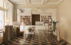
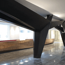
Once inside, one of the most noticeable elements is the transfer structure, composed of solid steel and manufactured by bridge builders, which is designed to resemble a series of dancers. Together with the Trojan horse-like reception desk, this creates a striking art gallery-style appeal. And rightly so for such a vast reception space. Make worked with furniture producers Benchmark on the 16m-long structure known as the Stealth desk.
Benchmark designer Steven Owens says, “The brief was to elevate a drawing showing this triangle shape. I took that on and they gave us freedom to achieve this piece in timber.”
The timber is London Plane, which grows in the parks of the capital and was deliberately chosen for its reference to the geographical location. In addition, explains Owens, “It has quite an interesting colour and structure that we felt was needed here. We wanted something with a strong defining grain to give the piece some interest.”
Although there is room for up to a dozen receptionists at a time, Make and Benchmark were keen that when not in use, the desk provided a piece of sculpture for the space. To this end, a propulsion system was developed with Isis to tidy away things like the keyboards, monitors and mice. “From our point of view,” Owens continues, “this building has such a strong impression that having clean lines was one of the key factors. Quite often reception desks get covered in IT mess, but here, at the touch of a button, it all disappears, James Bond style.”
Make also designed some wool-upholstered chairs for the reception space with manufacturer Davison Highley, which add a softer element to the interior design.
The 1950s office building has undergone a series of additions, such as lifts and staircases, to the point that Make decided the best thing to do would be to take the building back to the concrete frame. On the ground floor, it has included space for retail units, cafes and restaurants to serve both the building’s occupants and local residents and pedestrians. There is also a new development of 23 houses, offering a mix of key worker and private accommodation, at the rear of the building.
The triangular shape Owens mentions, which has been achieved on the solid timber front panel of the desk, is echoed in many facets of the building, from the metal panels on the inside of the lift to pull handles and the windows of the doors as you enter each floor. Lomas describes this as a vague visual language rather than a one-size-fits-all approach to the entire project. “Everywhere you go,” he adds, “you know you’re in this building and you get the sense
of identity.”

