 Words by Kerstin Zumstein
Kerstin Zumstein outlines the winning proposals for a rethink of our magazine’s own workplace.
The students of the BA in Interior Design and Technology at the London Metropolitan University have taken on the project of designing a hypothetical workspace for onoffice as part of their course work. For the last three months course leader Kaye Newmann has encouraged them to come up with fresh, innovative concepts to facilitate Media 10’s needs as a publishing company. onoffice set a clear brief, requesting a flexible work space that encourages creativity, productivity and efficiency, enabling good cross-departmental communication, and ultimately somewhere fun to work in.
All groups worked with a set floorplan, which consists of two equally sized spaces on separate floors. The students worked in teams of four to five people and came up with names for their virtual companies. On 16th January all ten groups presented their work to the judges. The following three projects stood out as our winners due to their inspirational ideas and design, and also because the teams provided us with a complete package of solutions to our work situation.
Team 01: Could Be
Could Be chose its unusual name to express openness to ideas and possibilities, to go beyond the familiar. This team philosophy was apparent in its presentation and the group successfully managed to exceed the brief while resolutely facilitating a publishing house’s core requirements. The initial mood board set the design principles in stone, always referring the ideas back to the main objectives, such as supporting structure, communication, wellbeing and planning.
Winning Factors:
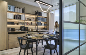
Could Be’s project bursts with original ideas. For instance, the variety of meeting rooms demonstrates imagination married with a clear understanding of the publishing profession. One example is the experience room, where staff can see their products, prints and colours in various contexts by choosing assorted projections on the wall. The idea is to experience the magazine the way the readers do, ie on the tube, in the park in New York, etc. The one-to-one meeting room is for confidential conversations or a place to take private phone calls. Especially the central archive, to be found on both floors, is a compelling solution to Media 10’s storage problems. It houses all the magazines, back issues, industry-related titles, books and other materials, while the back wall of each book rack serves as a space to present each magazine’s current flat plan (a document showing the layout of a magazine). The archive area also functions as a meeting or relaxing room, where colleagues of various departments can mingle and share ideas.
In general the walls of this office are kept white as not to clash with the colourful work materials. The reception, however, has immediate impact through bold use of colour and customised furniture to create a unique sense of identity for staff and guests alike. The corridor leading from entrance to reception is decorated with round glass portholes to display each magazine. This feature is flexible to allow space for new launch products. A possible new Media 10 office … could be!
Team 02: Fetch
Fetch developed a clear-cut concept called “green”. The main idea was to make staff happy and consequently more creative and productive by bringing the outside inside. The use of raw materials and natural light underlined by the colour green creates a tranquil environment, while playing with materials and juxtaposing rough and smooth surfaces. The flexibility of the work area, using bench desking to create an organic workspace, easily houses freelancers and mobile workers as well as growth of the company.
Winning Factors:
The convincing tree leitmotif threads throughout the project, establishing a sense of consistency – a simple harmonious backdrop to the hectic work lives of the journalists and sales staff. In boardrooms on the first and second floors, glass walls with tree motifs slide open to allow transparency or close to soundproof the room. The spiral staircase built in to connect the two floors is designed to look like a tree trunk. Fetch explained: “When people are in a park they are always drawn to sit under the tree – that imagery inspired us to pursue the theme.”
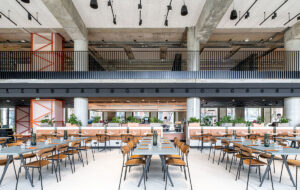
Fetch was the only team to rip out the entire lobby area, reposition the entrance and open the space up. It placed the reception in the centre of the hall, to be the first thing you see when you come to the office. With that the space has become inviting for staff and visitors, and the team has shown a healthy degree of confidence with re-working the building’s potential. On the second floor, a large staff room with comfortable and playful seating options links editorial and sales. The soft flooring in this area distinguishes it from the work floor. Partitions break vistas, achieving the same ambience as with the boardroom doors – open but intimate.
Fetch outlined a very well-structured floorplan that was especially popular with the judges because “space is money”. The team made good use of the floor size by integrating open break-out spaces while still using the workspace efficiently.
Team 03: Spectrum Interiors
The presentation of Spectrum Interiors’ project resembled a professional pitch because every element – from lighting to storage to surveillance, including “unsexy” facilities such as copy and fax machines – was well thought through. We were given options and cost-reducing alternatives for most features and the PowerPoint presentation accompanying the materials boards, work models and imagery proved a structured approach that we could immediately envisage materialising. The overall theme of the project is Pop Art – Spectrum felt that the art form is both playful and thought provoking, reflecting the work of Media 10.
Winning Factors:
Spectrum’s project shows a bold use of colour and customised glass (with a frosted effect for privacy) in the corridors and reception areas, whereas on the work floor the colour is kept simple as a means of orientation. Each editorial department is colour coded, corresponding with the equivalent sales team on the second floor. The office furniture creates a sense of flow with curves and a variety of heights (each partition gets consistently higher towards the back of the room, finishing with the managing director’s office where the partition walls go all the way up to the ceiling. This feature makes the room seem bigger and more open).
A striking feature was the confident integration of the newest technology: big interactive plasma screens to demonstrate ideas and current ventures, which serve as meeting points to enhance constructive communication among staff. Spectrum even researched an expert who could talk employees through the newest gadgets in the office. Each team works at individual desks but can turn to a centralised table to discuss their work together, without having to move into the boardroom. The use of cutting-edge furniture from leading companies shows that Spectrum is in touch with the industry. The team’s decision that it would be too expensive and time consuming to design all custom-made furniture underlines a realistic approach to the brief. The only custom-made elements are the Pop Art-inspired glass screens in the reception area and on the boardroom walls. They have privacy control (see-through only from the inside out) and visuals such as speech bubbles indicating whether the boardroom is free. Along with the chill-out area and low-maintenance exotic plants, Spectrum has designed a lively workspace based on creative and structured forward thinking.

