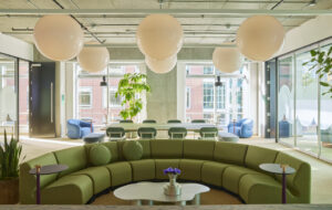
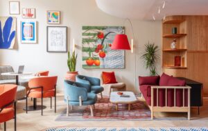
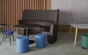
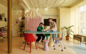
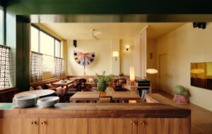
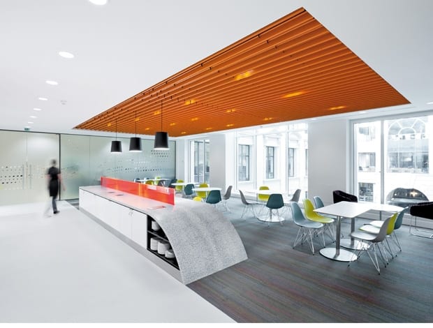
 Thomson Reuters’ new space in Vinters’ Place, with on-brand orange ceiling|The company’s dotted logo has been reappropriated on glass screens|Naughtone’s Pinch stools turn a corridor into a more useable breakout space|Flashes of orange are repeated throughout – used here in ceiling recesses||
With its stone pillars, high ceilings, marble floors, wings and grand atrium, Vintners’ Place on Upper Thames Street gives the impression of being part of ye olde City of London. This classical-looking building adjacent to Southwark Bridge was in fact built in 1991, on the site of the Vintry, which burned down in the Great Fire of London. It now offers businesses high-spec office space, Thames-side frontage and impressive views of Tate Modern, Shakespeare’s Globe and The Shard in its final phases of construction.
Entering the main atrium, a panoramic cross-section of offices can be observed through glass doors, revealing a uniform approach of raised floorplates and suspended ceilings. However, as you stare up, the slatted orange ceiling of one office on the second floor stands out.
This view is of the breakout area of Thomson Reuters’ new office. It has been expanded and newly fitted out to consolidate some of the financial data provider’s London sites, and accommodate its recent acquisitions. Interior design group Scott Brownrigg was brought on board by the company to rip out the dark blue carpets and heavy corporate signage left behind by the prior tenant, and create a space that better exploited the natural light and river views on offer.
Thomson Reuters has offices across the world, and famously occupies Reuters Tower in Canary Wharf. “We took a look at these office spaces, in particular the London, Milan and San Francisco offices, but we were given flexible reign over the space, and creative freedom over how we instilled a corporate identity,” says Scott Brownrigg’s Beth Glenn, project designer.
The corporate colour for Thomson Reuters is orange, which proved a strong starting point for the project. In the midpoint of the breakout area, ceiling plates were removed, the services behind them were spray-painted black, and the bespoke orange slatted ceiling was put in place. Orange accents in the paintwork, and citrus-coloured Vitra Eames side chairs dotted around white round tables, give the space a clean, fresh and open feel.
“This is an important space, as it bridges the divide between the existing offices and the newly occupied floor space,” says Glenn. “The directors didn’t want a gulf to form between employees from either side of the floor. Because people from different locations were also being brought under the same roof for the first time here, there was a lot of meeting and mixing of colleagues to accommodate.” Running through the breakout area is a custom-made Corian-clad island bench, which people can sit or gather at. “As it sits parallel to the Thames it is sloped slightly to suggest a wave,” Glenn explains.
The pigeon holes as you enter the new office space are made of orange edge-lit Perspex, lending a flash of neon to the project. Commissioned from Acrylicize, specialists in acrylic art, they fit together like Tetris puzzle pieces. Beyond is a touchdown area for hot desking, where the floor then opens out into a mix of open plan and cellular office space. Meeting and project rooms, with a central core for printing facilities, run down the middle of the office, allowing as much natural light as possible to reach the desk areas.
A graphic of a string of orange dots – an offshoot of the company’s circular “kinesis” logo – is incorporated into meeting room screens as well as a bespoke panelled feature wall. Orange Kvadrat textiles with imprinted circles cover the chairs in the main meeting rooms, while round ceiling recesses above a row of black and white pendant lights are painted in a similar hue, carrying the brand through the space surely but subtly.
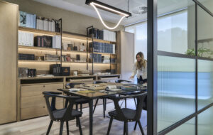
“Working with Thomson Reuters, we had access to Reuters’ full image library,” says Glenn. “We used this to pick out some atypical images of London, and printed these onto acoustic panels in the smaller meeting rooms.” They range from pictures of cavalry horses in a misty Hyde Park to urban shots of graffiti in London’s East End. In keeping with the city theme, the larger meeting areas are named after London bridges. “The office is automatically part of a larger portfolio of offices so we wanted to give this one a London stamp,” says Glenn.
“Our priorities in the project were to preserve the vantage point of the river, to keep the density of desks down, allow plenty of natural light in, create space for interaction, embed good acoustics, and ensure that the fit out was environmentally sound,” says Glenn (the project received a silver SKA rating). “We also wanted to make sure that although the brand is never shouted out, it is there running through the project.” The result is a light, airy workspace, with a cool orange twist.

