 |||
|||
Located in central Amsterdam, on the banks of the IJ river and just minutes away from central station, a 1960s icon which used to house the oil company Shell has been renovated and brought back to life. Now, the newly titled A’DAM
tower, which stands for Amsterdam Dance And Music, is the headquarters for global music company Sony Music Entertainment and is an ever-growing hub of the city’s musical culture.
As well as Sony, the tower is now the home of several nightclubs and leading international music companies, including Massive Music, Wink, ID&T and Gibson, at the heart of a city that is known for its multiple musical traditions – including Dutch techno, hardstyle, gabber, trance and various other styles of electronic dance music that have subsequently spread to the rest of the world.
Centrality was a key focus point: “It makes a lot of sense to put the building in the centre of Amsterdam; if you looked at Amsterdam on the map and put a dot exactly in the centre, that is where the tower is,” says Stijn de Weerd, partner at Amsterdam-based architecture and design studio Space Encounters, which designed the offices for Sony on the 11th and 12th floors of the tower.
 The tower is in the Nord district, across the Amstel River from the city’s historic centre.
With regards to the renovation, there were various factors that had to be taken into consideration: these included the requirement to keep the facade visible, as instructed by the Heritage Committee, which meant that both the interior and exterior had to keep its original prefabricated concrete materiality.
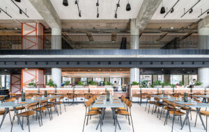
“On all the floors, the concrete is visible,” explains de Weerd. “But even if we could have changed the facade, we would have kept it like this because it has a lot of character.” Another factor was that the interior core – which in keeping with the musical theme has been designed to resemble an amplifier, and which supplies a vast space full of built-in features such as toilets and installations – also had to remain intact.
Other than the floor and the ceiling, there were minimal changes made to the building’s structure during the renovation. The result is described by de Weerd as a “monument”, with functions gravitating towards the core to allow the concrete facade construction to claim the spotlight.
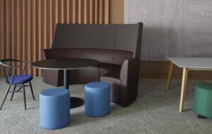
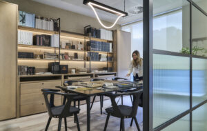
 Grey areas are designated for work and concentration.
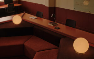
As the only feature visible from outside the building – and one the practice was allowed to change – the interior ceiling required some special attention when it came down to the redesign.The studio decided to extend and fabricate this into a visual spectacle, which was achieved by fitting numerous LED nightlights above a grid ceiling on both levels.
The strip of lights shine up instead of down, illuminating the white acoustic spray above it and enabling the “reflection of the lights” while also hiding any noticeable fixtures, says de Weerd. The main benefit of this technique is that the interior becomes evenly lit via a hyper-diffused light below, eliminating shadows rather than being a space filled with uneven spotted lights. And when irradiated with a bold and vivid hue, this can elevate the atmosphere completely – changing the scene from work to play in an instant.
De Weerd adds: “All the lights are controlled – you can programme them for an office day, so it’s all evenly lit and bright. But you can also programme for a DJ playing that night, and they can create these light patterns in the ceiling, or make purple lights, or have certain zones, or project text that you can see from the ground.That also makes it a very flexible space, which can be an office one moment and a culture tower the next.”
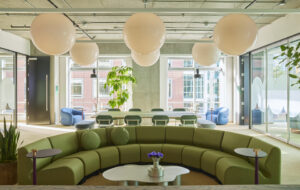
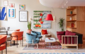
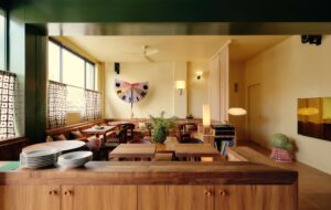
 Green is used for breakout and recreation spaces.
The music industry is commonly associated with a blend of work and play.To have a headquarters that has the ability to cater for both the working day as well as the nightlife, was vital for Sony. The A’DAM itself is open 24 hours a day and, with a hotel, bars, restaurants and a nightclub on site, it is constantly buzzing with work, music and life.
“Amsterdam has a big music culture, mainly in electronic music, which had an impact on the way we designed the Sony office,” says de Weerd. “Sony has a lot of employees, as well as musicians, who come to the building and perform there – they want to give a good impression and reel people in. It’s very much about the nightlife and the concerts. So that also had an impact on how the office would look.The office can turn into a bar, nightclub or place where you have concerts in the evening.”
Addressing the interior and choice in colour palette, de Weer says how the minimal two-tone inner workings of the building were a highly conscious decision to reflect the multi-functional approach of what goes on within. “We divided everything into two colours: grey and green,” he says. This creates flexibility with which the space “can become anything”, he says. “Sometimes you have to do serious work and you don’t want to feel like you’re sitting in a nightclub.”
The division between the two purposes are prominent: the workplace zones are luminous in light grey tones while breakout spaces are resplendent in moss-coloured or pastel-tinted green, representing what de Weerd calls a “strict separation”, and a “basic and solid foundation” for adaptable use. Although, he describes grey as a “boring” shade, de Weerd explains that “boring is good” and that there’s a reason for this: “Boring is for concentration and hard work with no distractions.”
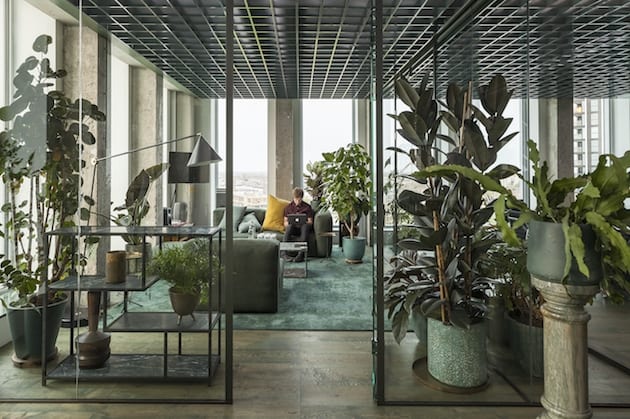
 The office offers staggering views of the surrounding city.
Colour plays an important role in design – and especially in the workplace. It’s not news that colour psychology impacts its inhabitants through the choice in interiors, but it’s important to remember that it also comes down to personal taste.This was evident through slight difference between the directors’ at Sony – some wanted to have their office in the grey area, while others wanted green.
“In the end, colour is really personal,” says de Weerd. “We always say that there are no wrong colours in the office, just wrong combinations. That also goes for materials.”
In this sense, the materiality of the project was entirely personal, too – alongside the grey and green palette, which was chosen at a very early stage in the design, Space Encounters chose a mix of different materials with opposing texture and smells, bound together by colour. In the green area there’s plenty of green marble, green aluminium, green stained wood and felt. Then, in the grey area there’s an abundance of wood, as well as natural coloured aluminium.
Since the completion of the A’DAM offices, there has been an all-in-all positive response. “We’ve seen that even after a couple of weeks, [the users] have really started to love their interiors, and they wouldn’t want it otherwise,” concludes de Weerd.
So perhaps the colour division truly does allow for the perfect balance of work and play, and the amplifier core really does spark imagination; either way, the result is a smart collection of features that formulate a fantastic renovation, and, most prominently, form the home of the next generation of music-makers.
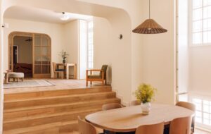
Housed in the high-rise A’DAM building, the offices aim to reflect the aesthetics of the city’s electronic music culture.