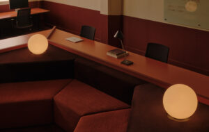
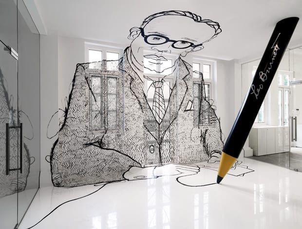
 A huge portrait of founder Leo Burnett dominates the entrance|Who needs a trophy cabinet when you’ve got a wheelbarrow? Industry awards are unconventionally displayed|Hotdesk areas are light and bright, in contrast to moodily lit meeting rooms|Staff have their own personalised apple, exhibited in the breakout space|Meeting rooms at the building’s centre are accessed by a dark corridor punctuated by porthole windows|Meeting rooms are drenched in green, Leo Burnett’s corporate colour|The company’s vaunted ‘7+’ standard is represented in the form of an anamorphic art installation|The concrete screed floor hints at the building’s former life as a shophouse||
Advertising giants Leo Burnett’s jazzy new office by Ministry of Design falls somewhere between office and modern art gallery
“Here’s what we’ve got. Here’s what it will do for you. Here’s how to get it.” One of the more memorable quotes from advertising supremo Leo Burnett, the man behind familiar consumerist effigies Tony the Tiger, the Jolly Green Giant and the Marlboro Man. Well, dear old Leo made his last sales pitch in 1971, but his company remains a global beast, with 84 offices scattered worldwide. Recently, the company’s Singapore wing underwent a radical restyling by architects and interior designers Ministry of Design.
The practice had already worked their magic for rival agency Bartle Bogle Hegarty (BBH), converting an industrial warehouse into a multi-award winning office space. So when Leo Burnett decided to set up camp on the second floor of a former shophouse in the city’s Chinatown district, Ministry of Design got the call … eventually.
“I think they’d heard of us because of our work on BBH’s office,” says Colin Seah, Ministry of Design’s head designer and founder. “But they are advertisers, right? So they expected us to pitch for the contract.”
Ministry of Design did not agree. “We said if they had seen our work and didn’t think we could do the job for them then that was fine.”
This hardline stance paid off. “I think they had tried some other companies, but it hadn’t worked out,” says Seah, and so three weeks after work began, Leo Burnett approached him to come on board. “The problem was we’d lost a lot of time. From the beginning to the end it was a sprint, just madness,” Seah laughs. Madness maybe, but Ministry of Design was equal to the challenge, completing the project in a lightening quick four weeks.
The end result is a protean workspace that could, in places, be mistaken for a modern art gallery. Leo Burnett previously occupied a labyrinthine office with the company’s hundred or so staff confined to a series of cubbyholes – not ideal for a company that prides itself on creativity.
Making the workspace more fluid and interactive was a top priority, and to achieve this, Ministry of Design broke down the floorplan into three distinct areas: an open-plan work area with hotdesks lining the periphery; a breakout and meeting space; and a large foyer and reception featuring a oversized portrait of Leo Burnett himself. These spaces encircle a central core of meeting rooms.
“We tried to create a continuous circuit around the meeting rooms in the centre. The space around the edges is to encourage chance encounters and has plenty of natural light,” Seah explains.
The white walls and furniture enhance the bright and breezy air, while the desks feature customised plywood tops coloured in a variety of shades. All this exuberance is counterbalanced by the hushed, muted feel of the formal meeting spaces. Accessed by a long black corridor that seems to whisper “focus, people”, the interiors are drenched a soothing green, Leo Burnett’s corporate colour, and punctuated by small porthole windows. Elsewhere, the exposed concrete screed floor harks back to the building’s former existence.
“We wanted to surprise and shock people, but also give them the impression they were entering an area of intense creativity”
“I don’t think we would have created something like this had they been moving to a corporate skyscraper,” Seah admits.
According to Seah, Leo Burnett was very specific about the functional aspects of the brief, including workspace for 112 staff plus all the necessary accoutrements – meeting pods, hotdesks and a bar (!).
However, the company was more flexible with the features common to all Leo Burnett offices – a portrait of Leo Burnett, his trademark black pencils, apples and 7+ symbol all had to be incorporated into the design. Granted a free hand, Ministry of Design represented these totems in a series of installations placed throughout the building that play on the often blurred relationship between advertising and art. The most arresting of these is the 3 m-high portrait of Burnett, which confronts visitors as they enter the reception. Rather than go down the traditional ‘picture on the wall’ route, an idea Seah dismisses as “so weak”, Ministry of Design combined a giant sculptural pencil with a graffiti portrait, which stretches across the floor and walls dominating the space.
“We wanted to surprise and shock people, but also give them the impression they were entering an area of intense creativity,” Seah explains. “Leo Burnett never had his name emblazoned everywhere. Instead, he had black pencils with his name on it. What better way to capture these ideals than a graffiti portrait of Leo.” Its cartoonish appeal is certainly great fun and Burnett, who believed that visual eloquence was infinitely more powerful than mere words, probably would have loved it.
Slightly subtler is the ‘7+’ adorning the patio. The symbol refers to the company’s internal method of ranking its campaigns – 7+ is judged excellent, and is the ranking that all employees aspire to. Here, the 15 m-long black painted motif is an optical illusion, only revealed when viewed from a certain angle – echoing the supposed elusiveness of the standard.
Finally, there are the apples: when Leo Burnett first launched in 1935, the world was in the grip of the Great Depression and, as a kind of metaphorical screw-you to the naysayers who predicted he would end up selling apples on the streets, Burnett provided free apples to all his staff. This motif has been retained by the company to this day and is manifested by an ‘apple wall’ displaying the workforce’s personalised fruit. Metaphors and symbolism are all well and good for designers, but top of the staff’s wish list was something more tangible.
“They really wanted a trophy cabinet to impress people with their success,” says Seah. “We thought it would be more impressive if all the awards were dumped in a wheelbarrow. It’s like them saying ‘what the heck, we can always go out and win some more.’”
The project has been a storming success, not least in the eyes of Leo Burnett’s managing director of the Asia region, who has reportedly made the office his new base. But what would Leo make of it all?
“That’s a very interesting question,” Seah muses. “Well, I think he was quite egotistical so I’m sure he would have loved the drawing of himself. Also, he would have been amazed at how much of a brand he has become.” Burnett always threatened to return from beyond the grave and take his name off the door if he felt the company had lost its creativity. On this evidence, Singapore need not fear a spectral visitation any time soon.