 Inferno’s office space retains the grandeur of its Masonic history|The reeded glass partition screens are listed, so they had to stay put|Tons of grey suit Inferno’s branding as well as fitting with the regal setting|”One of the coolest bar areas we have ever done”|DSR chairs and oversized lighting give a contemporary sheen|Meeting rooms are named after queens (including Queen Latifah and Sir Elton)||
Advertising agency Inferno’s offices sit opposite Freemasons’ Hall – the art deco HQ of the United Grand Lodge of England. Housing mysterious paraphernalia and rituals, this imposing structure makes a strange and sombre neighbour for noisy Covent Garden. The Freemasons are Inferno’s landlord, the agency being the first commercial tenant of another 1920s building, formerly the Royal Masonic Trust for Girls and Boys. These words are carved into the facade of a building whose largely Grade II-listed interior inspired architects Bluebottle and fit out company The Interiors Group.
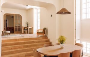
Breaking away from the stereotype of the zany advertising agency, Inferno’s new home for its 120 staff has a restrained, grand look. Wood panelling, ornate ceilings, copper-leaded windows, reeded glass screens and stone staircases contrast with contemporary feature furniture including modern white desks and Eames DSR stacking chairs.
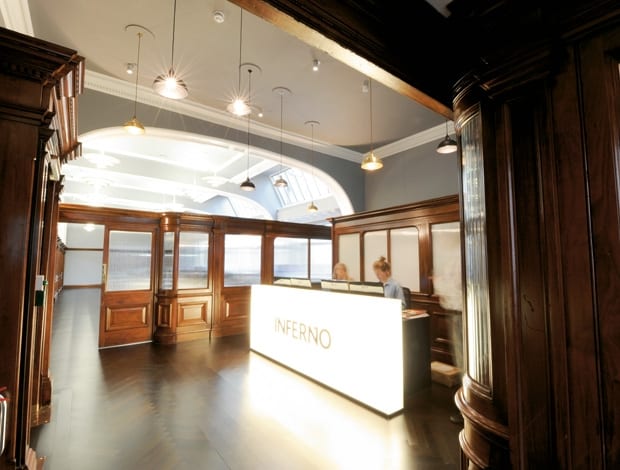
The Freemasons refurbished the building in 2009 in preparation for renting it out. They did a decent job, fitting it out with a heavy-duty glass elevator and deco-style light fittings that Bluebottle retained for Inferno’s scheme. Take the lift or ascend one flight of stone stairs and you enter Inferno’s first-floor reception through sturdy wooden doors. The dramatic reception desk is formed from a huge light box, creating a glowing contemporary counterpoint to the heavy, neoclassical mahogany screening that surrounds it. The partition screens are listed and could barely be interfered with, but Inferno did move one section to behind the reception desk, masking a storage area. A high ceiling features intricate plasterwork, which Bluebottle picked out in white against grey. Much of the flooring, meanwhile, is new: worn-out block wood has been replaced with a black-stained oak herringbone floor that sits well with the period of the building.
The reeded glass windows in the doors that lead to so many of the first and second floor spaces are emblazoned with copperplate lettering. “The wood screening and reeded glass reminded us of a 1940s New York police station, so we hand-painted names on the doors to reference that,” says David Bishop of Bluebottle. The advertising agency ran an internal competition to come up with a theme for the names. The winning concept named the rooms after queens, since the building is located on Great Queen Street. Not all of the chosen queens are of the traditional genre, however – one being Latifah, and another Elton John.
Victoria and Boudica are the two grandest rooms in the building, featuring large fireplaces and wood panelling. A large white table resides in each boardroom, lit by enormous hemispherical black and copper-coloured pendant lights. In the smaller of the two, a sculpture of an elephant head (owned previously by the agency but looking very at home here) presides over affairs, while stuffed owls and foxes stare glassily out from cabinets in the larger room.
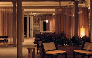
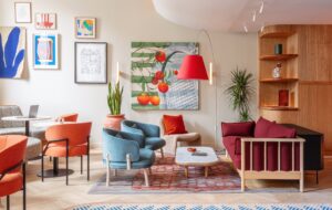
Back through reception, the visitor swings right to enter the lounge area. Here the wooden architraving continues, punctuated by dark grey walls (grey is part of Inferno’s brand palette). “We used gold and silver light fittings and upholstery to add richness to the scheme without resorting to splashes of colour,” says Bishop. “This space could have ended up looking like a private members’ club, which we avoided by achieving subtle shifts in materiality and tone. If we had had any pattern on the upholstery it instantly would have started to take on an eclectic look, which was what we wanted to avoid.” Instead, slate-topped tables melt tonally with subtle grey-suede period armchairs and bespoke cuboid furniture. “The brief really helped us because they didn’t want anything too showy,” says Bishop. “The palette is yellow, black, grey and two buff colours, which meant that the wood wasn’t too much of a challenge.” The agency’s previous brand colours of pink and white would have been an ill fit for this interior.
Bright mustard yellow accents are dotted throughout, most strikingly in the baize of the agency’s obligatory pool table, in the bar area. According to Paul Weaver, contracts director at The Interiors Group, “This is one of the coolest bar areas that we have ever done.” Smoked-glass mirrors behind the slate counters add a sense of space and light to the bar area, which Inferno’s Sonia Torosyan-Compton says is “incredibly popular with both the staff and our clients.”
Overall Bishop is pleased with the results, but he regrets the lack of some proposed hand-crafted wall graphics, “rationalised” out due to budget constraints. “We wanted to do a series of dots and lines in a different texture – something like a book cover foil – which would have looked really nice and added a further craft element to the scheme.”
The building is split level, giving rise to a quirky wayfinding solution that brings to mind Being John Malkovich in the naming of mezzanine floors ‘“1½” and “2 ½”.The main levels are marked with large 3D black and yellow acrylic numerals, which lean casually against the stairwell walls. Rising through the functional white work spaces (“white acts as a blank canvas for the creative work”, explains Bishop), you emerge into a roof space housing the kitchen and dining area, with walls painted with blackboard paint for the chalk doodles of the agency’s creatives. There is even a terrace with panoramic views over central London – a rare treat for a West End office space. “There is a sense of pride in the new offices, which are just right for us at the moment,” says Torosyan-Compton. “We have grown up and found our stride and the office reflects that.” Inferno’s interior finds a balance between the serious and the fun. It is the result of a design concept sensitively inspired by the building’s striking period features, but never over-awed by them.