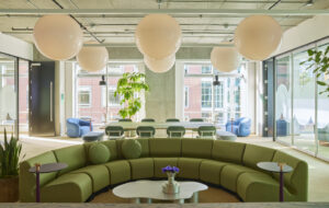
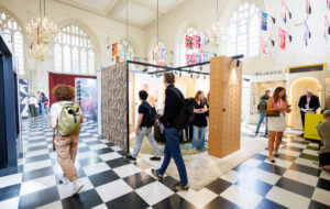
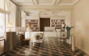
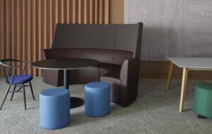
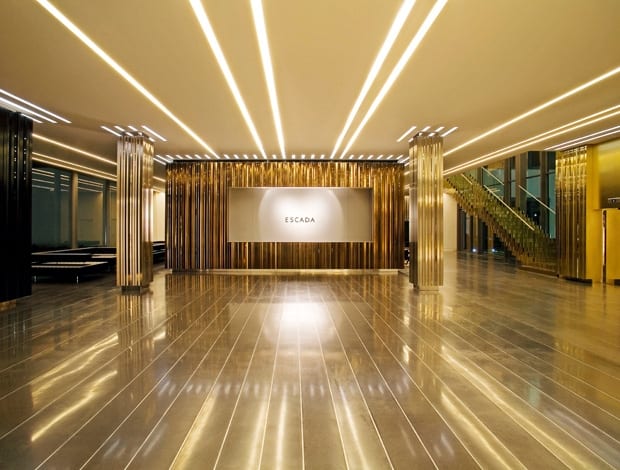
 Polished concrete floor bands in the lobby set off linear strips of wall cladding|The walls are clad with bands of mirrored glass and polished and satin stainless steel|Various tints of steel were used including silver, light gold, gun-metal blue and bronze|Bespoke leather furniture in one of the three public seating areas|Alternating bands of grass and locally sourced granite carry the striped theme into the interior courtyard||
For its new Munich headquarters, luxury fashion house Escada received a fit out to mirror the brand
First impressions in fashion can mean everything. The style of clothes and the way an outfit is assembled can tell much about the wearer. However, what really takes an ensemble to a whole new level, beyond the superficial appearance, is how well the pieces fit the body, and the little details that might not be noticed immediately: the buttons, stitching, lining, texture of a fabric. The same could be said for architecture. At first glance, the Munich headquarters for German fashion label Escada, designed by Paris-based architectural practice CARBONDALE, appears polished, structured and glossy: a closer inspection reveals exquisite, thoughtful elements that change depending on the seasons and light, and some serious attention to detail.
Commissioned to design the public areas of the building, CARBONDALE is no stranger to working with luxury fashion brands, having designed projects for Louis Vuitton, TAG Heuer, Celine and Tiffany & Co. in Europe and Asia. “The client began the project for a standard office and realised that the building’s facade and public spaces had the potential to communicate the brand,” explains Eric Carlson, founder of the architectural practice. “Escada is unique for a fashion brand because they hold their fashion shows within the headquarters building. Every season, journalists and buyers from all over the world gather here to see the new collection. The brief was to give a public face, reflecting the brand image, to an otherwise private place.”
The initial layout was reworked to make way for a dramatic new entry sequence that was to flow through the centre of the building. Spanning 75m, the scheme is composed of three zones that are structured in a formal procession, beginning with the entry court, continuing into the lobby and ending in the interior courtyard. The visual concept of the design sees a succession of linear bands (or architectural pin-stripes) that lead the visitor through the spaces, giving a rhythm to the formal procession. Inscribed on a large scale into the floor and ceiling planes, the bands are echoed in detail in the wall cladding and furniture finishes. “My intention was to create a sequence of thresholds that both unify and distinguish the three zones, creating an overall continuity and a diversity of experiences,” says Carlson. “We strived here to make a fluid spatial experience, not a fixed feeling.”
“The client began the project for a standard office and realised that the building’s facade and public spaces had the potential to communicate the brand”
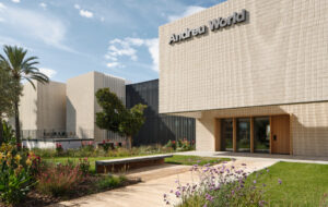
At the entry, the stripes begin as bands of textured concrete on the walkway, interspersed with an irregular edge of linear planters that, depending on the time of year, will become blooming bands of red, white, pink or violet. “As fashion is rooted in change, we decided that the perception of the headquarters should also change with each season. Therefore, we planted alternating rows of four different flowering plant species that take turns blossoming and give the entry court a distinct colour for each season”.
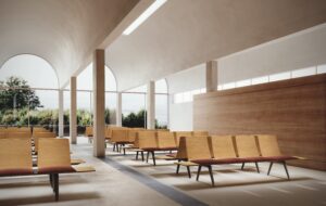
Moving into the lobby, the stripes take on a more glossy form. The textured concrete floor bands become polished, inlaid with strips of polished aluminium. Responding above, deep channels of light dart across the entire width of the ceiling.
Returning outside to the inner courtyard, what appears as a green open expanse reveals itself to be composed of alternating bands of granite and grass. The strips of locally sourced rock help to protect the grass from over-trampling and (more importantly) the high heels of the people walking across the courtyard.
The linear banding is also translated into the details and finishes, strongly contributing to the visual continuity of the spaces. In the lobby, the stripes morph into a more irregular zig-zag pattern, inspired by the jagged edge of fabrics cut by pinking shears to prevent fraying. Columns and walls are wrapped in a facetted curtain of tinted, brushed stainless steel composed of individual triangular vertical blades. Fragmenting the reflections and light, the rotating faces of the blades combine to create an intriguing new surface that changes continually throughout the day.
The zig-zag relief of the walls is echoed in the wool carpet in the lobby, which was fashioned into stripes using electric razors, continuing in the textured surface of the custom-designed furniture, an element which often characterises CARBONDALE projects. “In this case we designed a 12m long horizontal layer of floating leather proportioned like a super-stretch black limousine,” says Eric Carlson. “Three seating areas with tables are carved out of a large facetted leather block to make the furniture from the void rather than from an object.”
The issue of colour and materials was approached from several perspectives. The different coloured flowering plants, for example, offered a flexible solution for a company that at the time was in a state of flux: whereas brands are often strongly associated with a particular colour or colours. “In this case,” explains Carlson, “Escada was in the process of redefining its image and hesitant to commit to any one colour.” He describes the mirrored glass and polished and satin stainless steel used in the main facade and lobby as “hyper-reflective surfaces that reflect the products and people moving through the space.” The various tints of the steel – silver, light-gold, gun-metal blue and bronze – accentuate these fragmented reflections while contributing a strong feeling of luxury alongside the use of polished concrete, mirror and leather.
Throughout, there is very little sign of branding: the only indications that this building belongs to Escada is its name by the entry court, and a special 4m-high screen composed of eight plasma screens, sited alongside the entrance to the showroom, which displays a changing show of runway presentations. In a world of logos and copyrighted corporate colours, it’s refreshing not to be confronted with the brand emblazoned on every available surface. “This project is a kind of ‘mirror’ for Escada,” Carlson concludes. “I think it is a unique solution because it does not define them, yet it still metaphorically and literally ‘reflects’ their brand.”

