 |||
|||
A traditional view of gardening places the practice firmly among the elderly – gardening gloves in hand, strimmer at the ready, taming their marigolds in a quest to create the best of British gardens.
Until recently, the Garden Museum in London might also have been viewed this way. But following a two-year renovation of its building and a brand identity turnaround by design agency Pentagram, views like these have been heavily pruned back.
Reopened in May this year, the museum, which occupies a former church on Lambeth Palace Road, has successfully repositioned itself as representative of the diverse culture of gardening.
 The visual branding is used across a variety of publication types
With temporary exhibitions and permanent galleries displaying Britain’s wild love affair with horticulture, the renewed building offers facilities including a cafe, educational spaces, a studio and, of course, a garden – designed by garden designer Dan Pearson.
The renovation has given the museum a unique opportunity to rebrand itself as a universal tourist attraction, open to visitors of all ages and backgrounds. To help with this it brought in Pentagram.
Agency founders Luke Powell and Jody Hudson-Powell, along with Margherita Papini, the lead designer on the project, developed a new visual identity that would succinctly position the museum with a widespread appeal – while keeping bland and predictable floral themes at bay.
 The visual identity is immediately recognisable
“The museum in its previous incarnation had been quite niche and it tended to appeal to a more traditional gardening crowd,” says Powell. “With the museum closing down for the refurbishment, there was this opportunity to present themselves how they wanted to be presented and to a wider audience. That understanding was really key in deciding how to approach the identity.”
Inspired by the work of Brazilian landscape artist Roberto Burle Marx, the team at Pentagram devised an abstract, colourful and beautiful visual representation of the different types of plants and the changing seasons.
“We were really trying to create something that could be more inclusive,” Powell explains. “Rather than going down the route of the graphic baggage that gardening might have, we had to think about how we could express gardening. How could we express growth, budding, birth and the different seasons in the identity so that it has a wider appeal, and wasn’t just talking to that one audience who already understood that graphic vernacular of what a garden might be?”
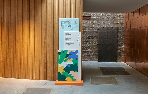
 The colour scheme helps to draw visitors’ attention to signage
From this, the team developed a design based on expressive conceptual shapes to represent the aura of a living garden – with a colour palette to match. These bright and abstract illustrations have an emotive appeal that opens up to a broader audience.
Away from the abstract, more literal icons – including a garden fork used to represent the museum – were created “so that we can also use that language to be more functional and practical”, Powell explains.
“For the website we wanted something that was very user-friendly and very functional, but at the same time we tried to keep some elements from the identity like the patterns and the colours. We wanted it to all feel part of the same system,” Papini adds.
 Practical icons by Pentagram are seen on the museum’s signage
“For the signage, we looked purely for the functionality and why it was needed – we just wanted to direct people and give straightforward information. Then the illustrations of the garden linked all of the identities together,” she adds.
Since the success of the renovation and its new identity, the Garden Museum has blossomed into a centre accommodating all aspects of education, art, workspace and entertainment, with a visual appeal to a bigger audience.
“They’ve opened themselves up to the community quite a lot in terms of workspace, and they’ve also become more able to do corporate events, such as fashion week and that sort of thing,” explains Powell. “So there’s a whole range of breadth that has been added to the museum with the renovation.”
Pentagram’s inclusive visual identity has succeeded in broadening the appeal of London’s Garden Museum

