 |||
|||
Align director Gurvinder Khurana leads me into Mendeley’s user testing room. It’s actually a pair of rooms designed for observing software testing, which the online collaboration platform, which describes itself as a social network for academics, previously hired out externally.
Having the facility onsite has provided it not only with extra meeting space, but apparently saved money and allowed it to raise its profile by inviting in the public. “We made a really conscious decision to go playful so that it was relaxing; we wanted to take away from the fact that you’re being watched,” Khurana continues. Not so sinister after all.
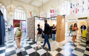
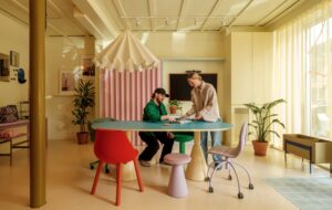
In fairness, the cosy little room we’re standing in, with its two-way mirror, geometric print wallpaper and red voile drape is definitely more 1970s retro than Silent Witness interrogation room. “‘It’s a bit brothel-y isn’t it?’ somebody commented recently,” says Khurana. “It’s playful and a bit theatrical, but it doesn’t remind me of a brothel… but then I haven’t been to one!”
Mendeley has grown dramatically since its beginnings as a small startup, and was bought by academic publisher Elsevier in 2013. Interior architecture and design firm Align was commissioned to design its new 1,850sq m of office space in London’s Alphabeta building, working with a base build not yet complete and a deadline that meant taking early possession. It worked closely with main contractor Modus to deliver the project, navigating between end-user needs and expectations and parent company design guidelines, all on what is described as a tight budget.
On entering, you first walk into a lift lobby area, bordered to the right and left by glass doors decorated with the white Elsevier tree logo. Two glass walls opposite feature full-length Elsevier graphic illustrations and flank a nook containing a royal blue velvet sofa. As you step through the glass doors on the left into the main reception, the first thing that catches your eye is Mendeley’s “M” logo with a binary starburst, above the orange Elsevier logo.
From the white Corian reception desk below emerges a three-dimensional lacquered strand of DNA, a motif that immediately indicates Mendeley’s key focus: life sciences. Three modesty screens in white-sprayed corrugated ply protect the receptionist’s privacy at the front of the desk – and hint at what is to come.

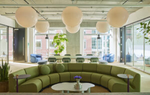
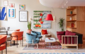
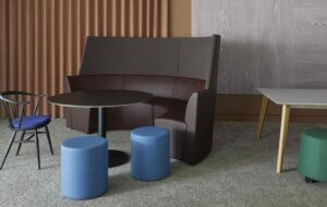
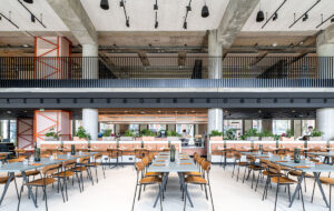
Around the corner is The Social, a breakout space for eating, drinking and relaxing, and a “town hall” meeting space with a series of tables running down the centre of the space with five different types of chair. The glass outer side of the space overlooks Alphabeta’s atrium, while running along the inner side of the space are three open areas featuring various styles of tables and chairs – and a ping-pong table – for meetings, relaxation or lunchtime overspill. They can also be screened off by corrugated ply metal-framed screens on rolling tracks – the same corrugated ply from the reception desk, sourced from Vancouver.
“It was a design challenge that worked, to give such a big space here so many functions and a flexibility that allows the workers to manipulate and define their own space,” Khurana says.
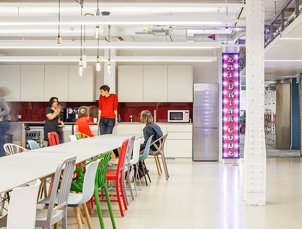
It was incredibly important to get this space right. Mendeley’s previous office revolved around a kitchen table piled high with cereal boxes. “It was a great insight,” says Khurana. “This was clearly a key part of how they worked – it had to be the focal point because they did everything in that space. So we translated that into this space; it just needed to be executed in a more sophisticated fashion.”
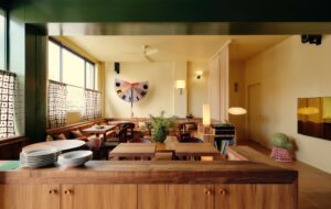
Align made sure to keep the student common room feel to the space; the area is book-ended by two rustic fairground-style signs made of hand-painted reclaimed timber with the mantra “Eat, Drink, Code”. The kitchen units are contrastingly sharp, interrupted by the building’s structural riveted iron columns, which they decided not to box off. “We believe in respecting and celebrating the original structure of the building,” Khurana explains to me.

The industrial motif carries over to the workspace beyond. In terms of storage, there are banks of lacquered raw steel lockers, enough for each member of staff. The workspace itself has three different types of write-on walls to allow a more ordered creative overflow than in the old office. “There wasn’t a single bit of space that wasn’t covered in Post-its. I’ve never seen so many Post-it notes in my life,” says Khurana.
The Post-it habit is still evident, but by no means overwhelming. Employees now have the option of double-sided sliding panels, magnetic write-on, wipe-off wall covering (which is also used in a lot of the meeting spaces) and floor-to-ceiling IdeaPaint. As a result, staff can work on coding and scheduling together on writing spaces that are immediately available without having to move or book a meeting room, encouraging a work culture that is incredibly collaborative.
Facilitating fluidity and flexibility was a big part of the brief from Mendeley. This meant planning for individual and paired working, as well as larger groups, and providing maximum variety – seated and standing workspaces, and the ability to collaborate with varying degrees of privacy in sealed-off, semi-private or open spaces. Each bank of six to eight workstations has one that can be adjusted to standing height.
A low-lit, plush-carpeted room nearby provides a time-out room and a sofa big enough to lie down on. This fulfilled a vital part of the brief: providing breakout spaces to offset the intensity of the programming work, as well as a huge variety of meeting areas, previously in short supply. “It was very much part of the brief that each of these spaces, or series of spaces, was non-uniform and had a strong and distinct personality,” Khurana comments.
Further meeting, work and breakout spaces lie beyond the main workspace on the opposite side of the atrium. One meeting room, The Lab, is deliberately styled on a laboratory theme, with blueprint-style graphic wallpaper by artist Claudia Stocker. The Lab is part of a cluster of meeting rooms, including three two-person rooms – Oxygen, Hydrogen and Nitrogen – also with science-themed wall graphics by Stocker.
They also overcome one of the biggest challenges – ensuring that, in a space that is essentially three buildings stitched together, the workers furthest from the main areas don’t end up feeling left out and losing that family ethos. By spending money on interesting meeting room spaces on a wing not near the entrances, they force people to come round and turn it into a cool place to be.
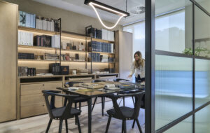
Back towards the entrances are formal rooms for meeting clients, with “concrete grey” carpets and 3D wallpaper to add texture. There’s also a “butterfly pod”– a lounge-style space with high-back armchairs and bold butterfly wallpaper.
A challenging project – but Align has confidently managed to create a gimmick-free grown-up tech office for Mendeley that is sophisticated enough to allow it to evolve from its startup roots, but still enables it to retain the familial working culture that it started out with.
This time last year OnOffice featured Align’s grown-up design for Mendeley

