 Words by Sarah Brownlee
There are unconvential workspaces, and then there are the offices of Pink Films… Sarah Brownlee takes a trip to Soho to bask in some colourful kitsch and design classics
Sandwiched in between some clip joints and a Church of England school in Soho, central London, the office of Pink Films is, I’m assured, right where it should be.
The exact location is a little old warehouse building, just off Great Windmill Street – right in the throbbing heart of production company territory. And you know that You Tube footage of a randy couple getting up close and personal on top of the Windmill club? Well, that was taken by staff based at a production company just across the way, who just happened to be looking out of their window at the right time, or the wrong time, you might say. “This is where we exist – here in this square mile,” says Pink founder and director, Karen Cunningham. “It’s full of production companies, facilities houses, recording studios…”
Pink itself specialises in TV commercials and represents some of the industry’s best-known directing talent including Michael Geoghegan, Marc Charach and Pat Holden. Recent projects include a Hellmann’s ad for global advertising agency Ogilvy & Mather, one for the Royal Marsden Hospital on cancer and a Sainsbury’s commercial. Altogether, Pink is one successful production company, with an awesome reputation and many awards to its name, and yet its recent office revamp is far from pompous. Playful is far more like it.
“We’re a creative organisation and it’s important that the office looks creative,” says Cunningham. “For the most part what we do doesn’t take place here. Our actual jobs (the filming) happens outside this office, but we needed somewhere for the in-between times to do the prep work, and that’s why I wanted it to feel like an extension of home rather than an office.”
It does look like an office. The kind of office everyone dreams of working in. Except, perhaps, those with an aversion to bright colours, bonkers objects and bold patterns. Cunningham herself is aware that it may not be everyone’s cup of tea: “It’s hard to say what my favourite thing about the office is because, for example, these tables on their own I probably wouldn’t like that much. I wouldn’t have imagined they’d go with a flock wallpaper either, but all together everything really works.”
Designed by her brother, Daniel Poole, Cunningham is under considerable pressure to like what she sees, but insists she commissioned him for practical rather than nepotistic reasons. “I just love everything he does,” she says. “He did tell me what he was going to do with the tables initially and I said, ‘Oh, I don’t like the sound of that,’ but then I thought, ‘You know, I’ve asked him to do it and I shouldn’t start getting involved.’ We deal in talent here at Pink and I’ve learnt that you get the best results when you just let people (be they directors, producers or designers, in the case of Poole) do their own thing. If you trust them to do something you’ve got to let them go with the flow.”
Going with the flow seems to be something that Poole is rather good at. He is probably still best known as a fashion designer – if you were into the dance scene in the Nineties you may well have one of his jackets, or perhaps a T-shirt embazened with the dp logo – but about ten years ago he flowed into the world of interior design. He works mostly on high-budget residential projects – mansions, loft apartments and the like – but his approach to interior design in general is experimental, just like his clothes were.
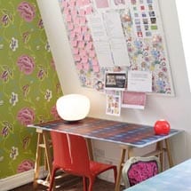
The Pink project is no exception. Take the much-talked-about tables, for example, which were made with the help of Nottingham-based company Photographic Interiors. “They used to print a lot of my clothes, but they moved over from screen printing to digital printing about six or seven years ago,” Poole explains. They specialise in printing images that can be applied to everything from Paul Smith bags and wallets to table tops, although the graphics themselves were designed by Poole and Darren Cleary. “The scale of their machinery allows you to get a nice big drop on a table like this,” says Poole, pointing at the vast, surf board-shaped object that dominates the meeting room. “Because the results are photographic and permanent the limits are really just a question of imagination. The fashion these days is to have plain desk tops, but in the past you would have had them with mosaic tops and wood insets.”
This is Poole’s first stab at office design, although he did have input into the office’s previous revamps. The closest he’s come to getting his teeth into the discipline is designing fashion showrooms and his own studio in Soho, where he was based in the Nineties. “I designed it myself and it was quite eclectic,” he grins. There was a big pond right in the middle of it – a big pond with lots of statues, old furniture and vintage Singer sewing machines. In 1996 Poole decided to change the studio completely. He got Tom Dixon to design the furniture for it and the vibe became much more “spacey and modern.”
“I made this fabric with holographics of floating ecstasy tablets on it and used it on a bench – I think it’ll be worth a lot of money by now,” adds Poole. Sounds a bit risqué, doesn’t it? But then, this is the man who used to make clothes for the The Shamen, among other dance/pop combos.
There are relatively naughty elements to the Pink scheme too, the naughtiest of which is probably the London Toile fabric by Scottish design duo Timorous Beasties, which instead of depicting wholesome scenes from 18th-century rustic life, shows London at its dirtiest, urban best – complete with tramps and druggies. The Designers Guild wallpapers – Fioravanti and Anichov – and a Barbara Hulanicki print from Habitat’s VIP collection were also thrown into the mix, adding to the deliberately mismatched aesthetic, which the open brief allowed for. “When they first took on this office about ten years ago their situation was very, very different,” Poole says of Pink. “They really needed to impress people. They wanted to appear powerful and business like, but now they’re well established with a good reputation they really just wanted to create an environment that was nice to work in.”
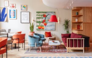
Because of budget constraints the layout of the office was pretty much left alone. One large, central space houses the reception desk and a large communal table while the meeting room and smaller offices run down the sides. All of the rooms have the digitally printed tabletops, although some are glass rather than laminate, and the sane hotch potch of wallpapers and seating – the more traditional of which was re-upholstered in Designers Guild fabrics. You’ll probably spot a few classics too, like the Philippe Starck chairs in the reception area, which were originally designed for Café Costes in Paris, the Ant chairs by Arne Jacobsen (painted turquoise) as well as some Pop classics and Fifties Diner chairs, which are super comfortable and “do the ergonomic job brilliantly”, according to Poole.
Herman Miller would doubtless turn in his grave at the mere thought of it, but while the scheme is about as far from the conventional office fit out as you can get, including the lack of proper chairs, it is perfectly suited to Pink, and was deliberately engineered to be so, down to the selection of the decorative objects.
Far from simply being a collection of cartoonish junk, everything was chosen to give out a certain message – from the robots (a personal passion of Poole’s since his days working as costume designer for the BBC’s Robot Wars) to the spooky hairdresser’s dummies.
“They all make a connection with pop culture,” Poole explains. “It’s so important that people coming to the office see that Pink knows what’s going on and what is of interest in popular culture, because it’s a big part what they do.” Hence Poole has got away with dressing the meeting room mirror with stickers as opposed to painting it nicely.
Altogether, it’s about the most informal meeting room you’ll ever come across. Underneath a shelf laden with awards sits a redundant merry-go-round horse. Its positioning is a deliberate contrivance that says, “Yes, we’ve won all these awards, but actually we don’t take ourselves too seriously,” says Poole. The horse was found at an exhibition at Kempton, and everything else, including the fabulous retro TV in reception, was bought at either sales or markets.
“Everyone that comes here loves it,” says Cunningham of her brother’s creation. “The motorbike couriers especially. And I like all the colours because they just make people feel good.” It’s these therapeutic qualities that prompt Poole to use colour again and again in his projects. “I’ve always liked working with colour,” he says. “I got the very first Clothes Show award for export for these bright orange suits I made. Yuppies on acid suits we called them.” It all makes for a pretty colourful story, never mind the project.


