 Words by Helen Parton
BDGworkfutures’ fit out for the new Grey Advertising HQ in Clerkenwell is a subtle, wood- and glass-filled space with theatrical touches. Helen Parton went to take a look
Ever wanted to punch Kate Thornton? Beat up Anna Friel? Thought Fay Ripley had it coming? The (fictional) results of these and other celebrities taking a good beating, blown up to near billboard size is the first thing that hits you when entering the interiors of Grey Advertising’s new Clerkenwell HQ, designed by BDG Workfutures and located within the Johnson Building.
They’re part of a campaign by Grey on behalf of charity Women’s Aid to raise awareness of domestic violence. Their impact is not diminished one iota by the brand spanking new interior, which is just how the client wanted it, explains BDG Workfutures senior designer Scott Compton. “One of the things we were asked was not to make it anything that overwhelming, as it was more to do with making a gallery space,” he says. Some of the materials on the ground floor are of a distinctly industrial bent – the pillars for instance have been stripped back to their original building render so they resemble concrete and the flooring is a simple European oak. “We went through a process of considering concrete and stone for the floor,” Compton says, “but in the end we went for wood as the underfloor air-conditioning required a material that we could easily access.” Otherwise, the other main material in this part of the project is glass, which provides that shop window effect on the front of the building so beloved of the advertising industry, and indeed how Grey’s previous home of 30 years on Great Portland Street looked. “What we did was keep the floorplate of Great Portland Street, but continue it on a bigger scale with the double height space so what you’ve got is just one step up,” explains Compton.
Glass is also used on the balustrading at the entrance and on the new staircase to the mezzanine level – great thick slabs of it, the foie gras of the glazing world. Understandably, this glass was one of the last elements to be added to the scheme, which was on site for a total of four months. Combined with the brushed stainless steel of the handrails and the oak underfoot, it feels understated yet with a quality of finish. “Often when you bring clients though to the lift areas, it almost feels like you’re taking them round the back, so with the staircase we wanted to make the experience a bit more theatrical,” Compton adds. This set up replaces the staircase that was previously located on the other side of the floor, and during the project BDG also stripped back the balustrading on the mezzanine level.
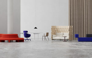
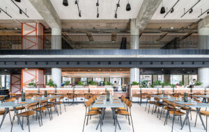
We are joined at our chunky wooden table by facilities manager Lorraine Waller in the meeting area on the ground floor. Compton continues, “The main brief was how the staff use the canteen and the reception.” The constant flow of advertising types meeting and greeting clients, or maybe just lured by the breakfast pastries that are on display in the kitchen area, demonstrates the significance of this part of the project. While the Wagamama-style seating lends itself to several informal gatherings at one time, it also performs another important function. “There isn’t anywhere that can hold 60 to 80 people and they really wanted a space that can hold that many for a talk or presentation,” explains Compton, to which Waller interjects, “The space is really uplifting, really bright and clean, and for a big presentation we simply move the tables and the benches neatly fit away underneath them.” A large black curtain can be drawn across to close the space off and Waller explains that this can happen as often as a couple of times a week. If need be, the whole floor can be locked to external visitors, who can use the Johnson Building’s main reception instead. The plasma screens, which as we speak beam out satellite TV, along with the serious-looking sound equipment station means they have the audio-visual expertise to underpin the space’s formal meeting capability.
We walk across the ground floor, past the subtle orange lettering on the outside of the building, which unless you were looking out for it you might miss when strolling past. “They didn’t want to have a lot of graphics in the window,” explains Compton. The orange accent colour is continued in the oversize planter near to the cluster of designer chairs in the small waiting area. It is also visible in a strip of perspex along the length of the bar counter, which is made from Durat so you can’t see any of the joins as well as being one of the most sustainable materials around. There’s an identical orange strip along the reception desk. “We found this supplier who constructs boats out of fibreglass and he made us this desk that has completely moulded curves,” enthuses Compton. “The lights underneath the desk are made of special LEDs. They’re in one long strip, kind of like fairy lights, but more modern to give a more consistent look.”
Ascending that custom-built staircase to the mezzanine, there is a curved wall where more of Grey’s work will eventually be displayed on a large scale. Moving along the corridor, there’s a series of black-and-white photographs from other campaigns, and here some of the lighting is recessed under the half-a-metre-thick wall instead of the ceiling, which again emphasises that sense of theatre. Leading off the corridor is a series of colour-themed meeting rooms, which look out over the reception area. These range from formal meeting space through to totally relaxing lounge areas and all the shades in between. There is the white room with its Paul Smith striped task chairs, which splits into two, the blue room with high tables and bar-stool style seating for short impromptu catch ups, and the green room – the most used according to Waller – which has moodily lit low seating.
In common with many areas of the building, Compton is keen to emphasise what has been tackled here in terms of the air-conditioning. “The Johnson Building’s main air-conditioning system is tailored for an open-plan environment. Therefore building enclosed rooms presented a challenge to the design scheme. We overcame this by introducing bespoke air grills to the doors and ceilings.”
Grey occupies half of the ground, first and fourth floors, plus the whole of the fifth and the sixth, the latter of which consists of larger meeting rooms. The finance team takes up half of the lower ground floor. The building’s construction – a 1930s building that has been reconstructed and extended by architects Allford Hall Monaghan Morris, with a glazed, full-height atrium – means that you can easily see other firms working there and it can’t have been easy to stamp a sense of continuing and dramatic statement into the scheme. Instead BDG has introduced subtle features such as the coloured sphere manifestations on the 14 offices of the creative team on the fifth floor, which are meant to resemble a ball bouncing along the floor. They are in keeping with the spherical grids found elsewhere in the building, and as Waller quite rightly points out, “work especially well given that everywhere else is so neutral in colour.”
For this area, explains Compton, “The creatives are two to a room and they wanted a place where they can say the most ridiculous things to each other and not be embarrassed, somewhere to concentrate and where they can still see out.” This is, after all, a client who lives by the maxim “Ideas are everything. Didactism doesn’t work.
Conversations do” and is responsible for such quirky gems as the Lenor advert where the girl deliberately stashes some stray knickers in her boyfriend’s car to get the duvet to herself. Waller also explains how eventually the space outside the individual offices on this floor will be used for breaking out and brainstorming. “This kind of space is not about hierarchy, as you can see with the manager’s offices, which although bigger than the creatives’ double up as six person meeting rooms.”
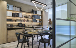
Below, on the fourth floor, is home to the firm’s knowledge library and also a series of perspex working spaces by Beyon, custom designed by BDG. This is where the account teams sits and houses a mixture of workstation space with plenty of room for inspirational objets trouvés and reference material. The moveable office system is designed to balance both teamworking and the need for privacy. Elsewhere the workstations’ generously proportioned pedestals and provision of locker space mean some serious thought has also been given to storage. Adding some more colour to proceedings, the partitions between the desks are either black, silver or orange depending on department.
There’s a refreshing lack of pretension in this scheme given that the client is an advertising agency – there are no superfluous gimmicks or over-the-top statement pieces. It almost seems – whisper it – like a normal office full of normal working people. Albeit one with some very scary-looking ladies in the window.