 Once Piero Lissoni’s protégé, Marc Krusin is slowly but surely moving out onto the international design stage. Knoll’s world launch of Krusin’s new desking system together with Lissoni studios brings the young designer to London, where Kerstin Zumstein tries to puzzle the pieces together.
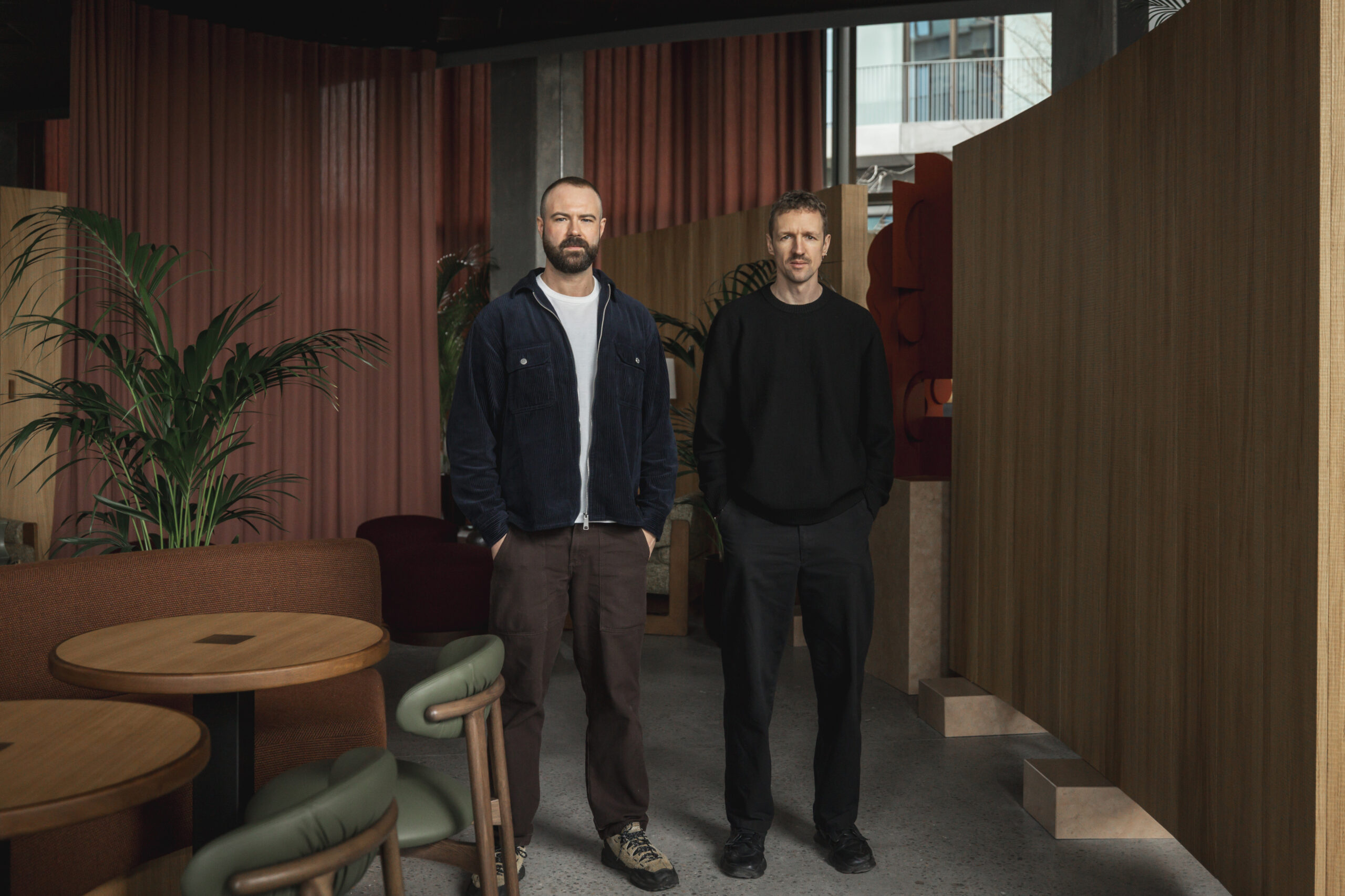
You wouldn’t think it seeing him communicate with Piero Lissoni à la Milanese (fluent Italian and the body language to go with it), but Marc Krusin was born in London – in Hampstead in 1973 to be precise – and went on to study design at Leeds Metropolitan University. Initial work placements at the studios of Fred Scott and George Sowden led him to finally begin his career in Milan, where he has been working for and with Lissoni for a decade this year.
While Lissoni’s style is easy to grasp (see onoffice issue 01) and famed for its clean simplicity, Krusin’s designs on the other hand are more enigmatic. His first success was a doggy bag that was selected for Milan’s Opos exhibition in 1999 and he has designed many popular patterns for Omnidecor, an Italian producer of acid etched float glass. He has worked on chairs for furniture companies like Viccarbe (Wrapp low chair) and Liv’it (Misfit stacking chair) where he is listed among designers such as Philippe Starck, Patricia Urquiola and Jeffrey Bernett.
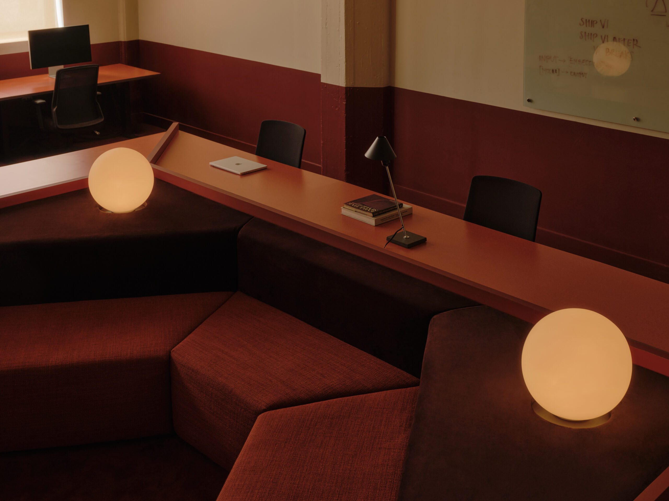
And then there’s WA, the new desking system for US office giant Knoll by Lissoni and Krusin – the first time Krusin has been jointly attributed in the design process. It consists of modular table and storage units and, with its straight lines and clean laminate finishes, is very Lissoni – it’s a struggle to distinguish the Krusin contribution. “In essence, WA is like a Lego system,” he explains. “The graphic nature of the units allow the end user to rearrange the elements into endless constellations, creating a modern flexible workstation.” He evidently has a strong bond with geometrical forms and describes himself as “an interior designer with a mathematical head”.
In 2004, Krusin founded his own company, Klay, that specialises in “objects of natural materials influenced by world cultures”. An example is Brikabrak, a stackable plant pot made from Tuscan terracotta – not exactly comparable to a white laminate desk system, but the geometrical block pattern relates both products in a graphic way.
“I find my own style is developing quicker in my interior design projects and installations,” says Krusin. “My patterns are all based on mathematics and come to me naturally.” He seems to feel more at home with his three-dimensional patterns, rugs and exhibition installations. “Designing a product is a painful process,” he exclaims. “It’s a constant compromise of your creativity. Lissoni can kick and scream because he’s proved himself, people know that it works, but I’m nowhere near that point.”
Klay was born out this frustration, alongside the influence of Krusin’s Mexican wife. “My designs are inspired by monumental Mexican architecture, Mexican artisans and craftsmen and their use of natural materials,” he says. Cross-cultural influences seem to run throughout his practice. Back in 1998, he co-founded the group Codice 31 with five designers from varying ethnic backgrounds that collaborated on a series of projects. Krusin says he has become more Latino during his time in Milan but is still very British when
it comes to his social conduct. “I don’t interrupt people when they’re talking and tend to respect time and punctuality.” There is a constant ring of humour in his voice, and he has a charismatic presence.
Knoll’s WA system is Krusin’s chance to make a name for himself in the office furniture world. It’s also an important move for the US company that was in desperate need of a new system product. Interestingly enough, Knoll decided after years of US-focused productions to look to Europe for this vital launch. Graham Jones, MD, says: “For the first time in ages, we started with a blank page to create a product and Lissoni’s studio leapt out among the shortlisted firms because of its trademark of very clean, simple surfaces and technical efficiency.” Lissoni immediately got Krusin involved with the project. “The dream right from the start was to be able to clip furniture together,” says Krusin. “Everything had to be clickable, attachable, movable, adjustable – not to mention the legal requests and requirements.” To achieve this, a rail has been placed 360º underneath every tabletop so each piece of the system can be clipped together seamlessly – storage to unit, table to table, regardless of angle, ultimately aiming to fit into any space, but especially designed to fit the architecture of today’s office new builds.
Krusin points out that no tools are needed to rearrange the configuration of tables and storage bits: “While most traditional American desking systems may give the user constellation options they have hundreds of ugly bolts and holes.” This product in contrast looks clean and simple. It can do everything, while cleverly disguising its multi-functionality. In fact, the system looks so simple it almost seems plain. But Krusin feels that too much form can become overpowering. “Bizarre shapes become a bore with time. This product blends in. It doesn’t dictate how you should work but enables any work style.” The Lego element clearly relates to the idea of play in the office. Bold colours and break-out play rooms have become more frequent – especially in Europe – ever since Google first showed that this approach can enhance staff productivity. With WA the soft parts, such as a giant mouse pad and armrest, are a playful way to provide a “harmonious interaction point between user and product,” as Lissoni explains. They are also part of a trend to accessories furniture (see RH Form’s task chair accessories in onoffice issue 06).
From a visual point of view these optional soft parts add blocks of colour to the systems (with the tables and storage units in white or black but the soft parts in yellow and red). It needs pointing out that all parts are rectangular, which is part of the graphic nature of the product. Krusin explains: “The graphic identity of the product is found in the horizontal and vertical plane. Rather than looking at details such as a leg or a drawer, the system consists of colourful graphic blocks.” And these blocks can be moved and stuck back to together, or as Knoll marketing director Trent Baker says, “The elements can and should be played with.”
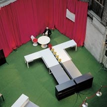
Knoll put the idea of play at the heart of its launch. Based on the tangram, an ancient Chinese puzzle that allows geometrical forms to be put together in endless configurations, always creating a new picture, the Knoll launch played with the possible visual constellations of the WA system. The tables and units were arranged in the form of a human body, best visible from above – an unusual angle to view the system, made possible by the stunning Clerkenwell venue with its three floors and open atrium space.
The product name WA, meaning harmony in Japanese, was also played with graphically. “It’s interesting to see this launch layout,” says Krusin. “We would have gone for something more architectural.” But it demonstrates the furniture’s flexible nature. In comparison to Lissoni’s Asymmetrical system for Tecno, which has more style and an air of the executive about it, the WA system clearly has different ambitions. Facilitating freelancers, frequent travellers and the modern day flexible worker, this system can be anything from bench desk to cluster to cubicle. And it clips so easily, like a toy. But do people really move their furniture around all the time? Do FMs want to play Lego? When you think that in reality most people fail to adjust even their task chair correctly, will they really shift, click and clip their furniture into various different shapes? Just thinking of all the crap that collects on my desk every week, moving it around to accommodate each freelancer that comes in could prove a logistical nightmare and a mess. Krusin admits: “People are lazy about looking into the various functions of a product. The beauty of WA, however, is given in the strapline: the simplicity of complexity. It’s so easy to use and can do anything you want it to – even stay put.”
The dichotomy of simplicity and complexity is often found in Lissoni’s designs; it’s what makes him so popular today. Asking him about his connection to the product, Piero Lissoni runs his fingers around the edge of a square soft part and says: “I like to design a space in a space.” That’s the architectural dimension both he and Krusin aspire to. “To me the WA system is like a Babushka doll, one piece in the next and so on – there’s room for endless connectivity.”
Whether an FM will play with the system or not, its sharp design will work regardless. The US market may not be quite ready yet to see the potential of the simple system, which is probably the reason why Knoll launched it in Europe. But the system does provide the flexibility and backdrop aesthetics that the European A&D are currently looking to place in mid-range projects.
When asked to highlight his input, Krusin is tentative, saying, “I’m simply a young designer who was giving a helping hand, I’ve merely injected some elements.” It seems he has that same modesty that shines through in Lissoni
(who claimed in onoffice issue 01: “I’m only a cleaner”).
The thing that really marks Krusin out is his particular blend of styles and cultural influences, along with that mathematical, geometric fixation – a kaleidoscope of designs, a puzzle picture perfect.

