 |||
|||
Psychology of Colour in the Workplace, a one-day exhibition by König + Neurath, brought commercial designers to Margate’s Turner Contemporary gallery in October. The manufacturer’s thought-provoking demonstration of the effect of colour on mood and productivity, enlisted the help of global trend expert WGSN to present colour theories and suggestions for their application in workplace design.
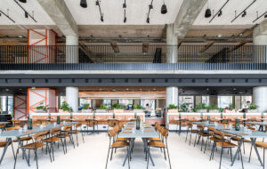
Three office settings in different colour palettes were used to explore the themes of the day. The commercial architects and designers viewed a room at a time, reflecting on the thoughts and feelings stimulated by each one. The spaces have been created using the same pieces of furniture (a selection from K+N plus its event partners Chat Board, Artemide and Vorwerk), in order to emphasise the effect of the colours.
After the room partitions were removed and the exhibition space revealed in its entirety, Gemma Riberti of WGSN addressed the audience, revealing the psychological theory behind their responses and the potential benefits of colour in the workplace.
Riberti applied the principles of colour psychology, the analysis of the impact of colour on human emotions and behaviour, to the three rooms. She also highlighted current trends shaping the use of colour in the workplace, including the domestication of the office.
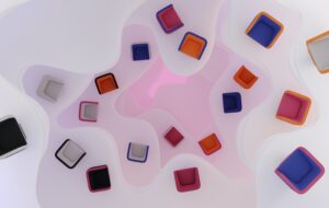
The three palettes that have been chosen offer the opportunity to explore very different colour groups: warm and cold; emotional and rational; physical and intellectual.

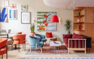
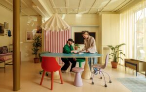
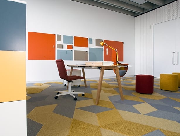
The first room, “warm” in reds, oranges and yellows, brings a sense of “energy, optimism and enthusiasm” to the space. “This was a very stimulating display, and these are high-wavelength and emotionally intense colours, ideal for detail-oriented tasks, brainstorming and socialising,” says Riberti.

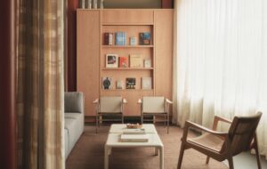
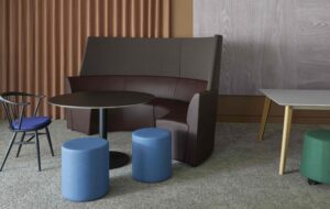
The second room, using various hues of blue, demonstrates the very different benefits of “cold” colours. Riberti describes blue as a “safe” colour for office design, “the most commercial for workspace interiors, commonly accepted as one of the most productive colours”. Its links to intellectualism and reassurance make it ideal for production and processing.

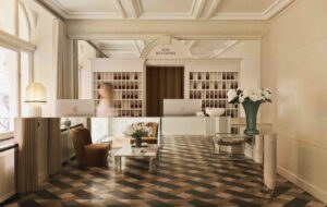
In the centre of these two contrasts is the neutral room with its white and grey palette: “White has a modern and cool appeal but many want warmer, cosier and more personal spaces,” says Riberti. “White has an antiseptic feel that can limit stimulation and energy – and the glare that it creates can be quite intense, straining the eyes.”
Displaying the neutral room between the warm and cold colour schemes presents it as “a provocation of thought, where people entering the room become the element of colour, the revitalising detail of the space”. A neutral scheme such as this one can make a workspace itself subside, allowing users to bring the space to life with their personalities and accessories.
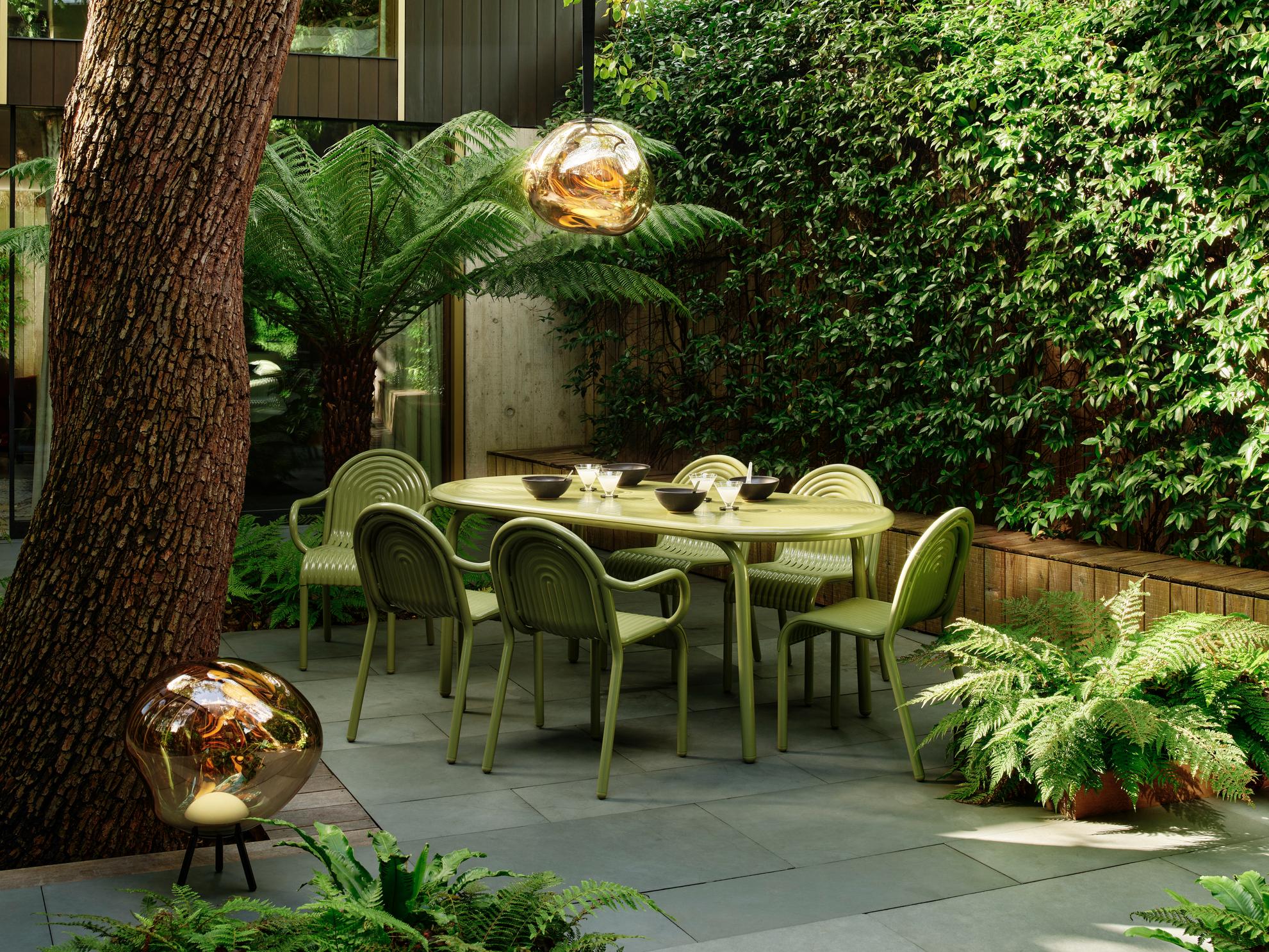
Riberti highlights popular colours that weren’t explored in the three rooms, including the use of green in office design, its links to nature often seen as a response to the ever-growing role of technology in the workplace; and the increasing use of pastel colours in a response to the ‘homely’ office. She also notes the positive effects of colour zoning, a technique that is increasingly used in workplace design.
It’s certainly food for thought, but there is no rulebook for the use of colour in the workplace – the psychology of colour is based upon the emotional responses of the individual. “The key is to balance and layer a selection of complementary and contrasting tones,” Riberti suggests. “People will always have different reactions to colours, so using a good variety and contrast of colour, to refresh and stimulate staff, is perhaps the most effective approach.”
Does an office with orange carpets have more productive workers than one with grey? A recent event explored the psychological effect of designing with different shades