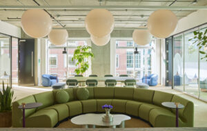
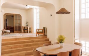
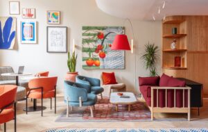
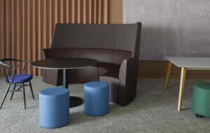
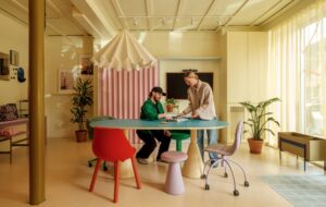
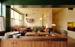
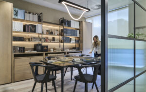
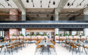
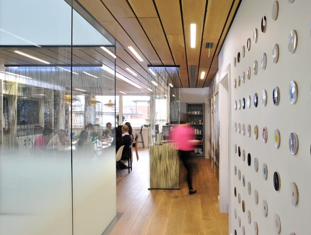
 Natural imagery is referenced in large-scale graphics|Circular motifs give a subtle nod to the company’s logo|The central table is for presentations and social get togethers|Vitra chairs and Louis Poulsen lights fulfil the brief for a ‘European feel’|Fruity curtains play off against classic modernist and mid-century furniture|Bright colours are carefully present, but not dominant||
Resonate Interiors creates Japanese pharmaceutical company Shionogi’s European headquarters using bright colours and playful details.
Choosing the round window may be synonymous with kids’ TV for a certain generation brought up with Play School, but the option of a circular window was important to the grown ups at Japanese pharmaceutical company Shionogi. There is no reception in this workplace, which is on the fifth floor of an office block on Kingsway, central London. Eagle eyes might spot the company’s circular red logo on some specially made cushions, but the dominant feature here is another circle, this time realised within a screen made of Armourcoat polished plaster, representing nature and flow.
“They didn’t feel the need to sell the brand and therefore the interior doesn’t reference it directly,” says Pernille Stafford.
Stafford, having worked at Scott Brownrigg and TP Bennett for a number of years, has now struck out on her own, heading up Resonate Interiors, which is responsible for this project, for just over a year. On an otherwise unassuming wall opposite the window there is a set of mismatched Strata tiles, which according to Stafford “creates a talking point and resonates with the client as the idea of the circle of life”.
The circular theme continues on several scales, from the portholes in the ‘quiet booth’ doors to the cut-out door handles on the sideboard in the boardroom, a design trick replicated in the kitchen cupboards. “The chairman is very interested in the design details,” says Stafford, and Resonate, for its part, was keen on getting the smaller things right too, taking care of items such as crockery and plants as well as the bigger picture.
Natural imagery such as lavender and willow are referenced in large-scale graphics, a nod to the ingredients found in Shionogi’s products (the company makes pharmaceuticals for several health sectors, including infectious diseases, allergies, oncology and women’s health). A large-scale image of some mushrooms sitting on spongy moss fills a wall of the (non) reception area, while a sunflower motif blown up to abstract proportions frames the doorway of the boardroom.
Elsewhere, birch twigs are encased in semi-transparent glass screens that back on to the central atrium space serving both as artwork and as a way to delineate the space. Even the aloe vera plants are not just for decoration, apparently ensuring papers don’t pile up on various surfaces on which they sit.
“They were very keen to get a European feel,” says Stafford, so along with certain concessions to Japanese culture, such as a rice oven in the kitchen, there are lots of design pieces created a little closer to home. Vitra chairs, all different, sit around the central trestle table, a veritable who’s who of designers who have worked with the Swiss manufacturer, from Verner Panton to Jasper Morrison. Louis Poulsen PH5 lights hanging above, and a linen curtain in an exuberant Josef Frank pattern, represent Scandinavia; the latter also provides an acoustic barrier. Mulberry fabric on the banquette seating in the boardroom keeps the British end up.
The trestle table is the heart of the office, literally and figuratively: it is symbolic of the growth of the business from one person sitting at a kitchen table to a workforce of more than 40. A screen next to the table provides company updates and is the focus for presentations, but also features photography, including some by Stafford herself.
“The brief was also to make it more of a home,” she says, hence the inclusion of plants and fun accessories on the bookshelf around the table to give a more domestic feel. The existing ceiling and flooring were removed from this Cat A scheme and replaced with timber, which also helps keep things homely.
Having previously been located in serviced offices in Hammersmith, this was a chance for the company to evolve from its start-up phase and create somewhere the workforce could properly come together. The table is a place not just to meet, but where lunch is served for everyone daily. It’s no surprise to learn that when they’re not engaged in serious pharma business, this harmonious bunch of employees find the time to practice yoga in an adjacent snug area. The fact that half of the spec is given over to social space is testament to the emphasis that Shionogi places on interaction. As well as a place for sustenance and reflection, the nearby external balcony gives employees a geographical point of reference with rooftop views of the capital.
In this project, bright colours are carefully present but not dominant: the same shade of red that matches the company’s branding can be found in the odd Eames chair in the boardroom (which like the main working area benefits from a wooden ceiling) or in the quiet rooms. There are some splashes of bright yellow among the Senator desks, courtesy of the dividers in the workstation area, while Paul Smith fabric graces the padded top of the pedestals, as well as panels in the quiet rooms. It’s fitting that Smith’s signature stripes were chosen, since he is one of the best examples of
a British creative making it big in Japan.
As well as colour, there’s quite a bit of textural interest in evidence too. Dalsouple’s distinctive dimpled rubber surfaces – more commonly used for flooring – are used for the doors of the quiet rooms, and the diamonds of resin that make up the freeform screens can be adjusted to give visual privacy to the various teams in the workstation area.
“It’s quite colourful and playful; they didn’t want to be grown up and staid,” says Stafford. Maybe not so far away from child’s play after all.

