 Sid Lee took the geometry of the triangle as a starting point for the fit-out|The interiors is full of contrasts – cavernous and cramped, black and white|Plywood and bold graphics push Red Bull’s links with skate/street style|Working areas are gimmick-free compared to the playful public areas|Angular pods break up large spaces in a pleasingly irregular way|Graphics stretch over both the walls and the floor|Private office spaces play on Red Bull’s sponsorship of extreme-sports events|Winged wonder: mosaics turn the men’s room into something heavenly||
As a client, Red Bull certainly has form when it comes to setting the pace in workplace design. In the UK alone, its work with Jump Studios set a benchmark for the playful workplace in the mid-noughties which was all ping-pong tables and slides, while a few years down the line, they surprised us all with a more pared-down, austerity-chic look courtesy of MoreySmith.
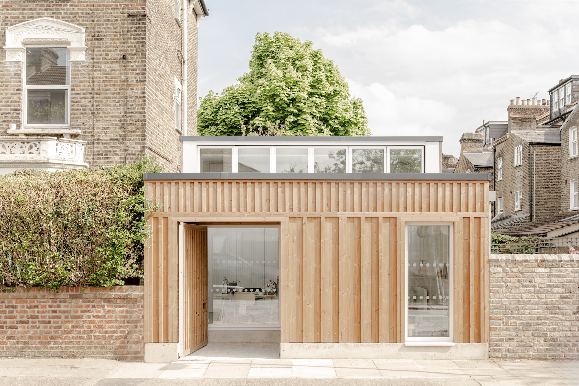
At its new headquarters in Amsterdam, Red Bull has continued to push the design boundaries, this time courtesy of Sid Lee Architecture, which fought off competition from two other firms to win the commission. The practice began work on the office, which can be found in the Noord district of the Dutch capital, in the spring of 2009, and completed it just shy of two years later. This part of town is redeveloping significantly, attracting arts organisations and media companies such as MTV Europe.
Sid Lee Architecture thought long and hard about the idea of “work” and “play” in this office. As project design architect and senior partner Jean Pelland explains: “One of our main goals was to separate those two things, and we did that through the architecture of the building.” This is a significant move forward from the idea that every inch of the office is for playing while you work, inevitably a reflection of the economic times we live in. But a welcome one, too, in some ways. Like teenagers, don’t all office workers function a little better with some boundaries?
That’s not to say Pelland’s rhetoric is entirely without hyperbole, as he continues: “When we designed the inner space, we aimed at retrieving Red Bull’s philosophy, dividing spaces according to their use and spirit, with two opposed and complementary hemispheres: reason versus intuition; arts versus the industrial city; black versus white; the rise of the angel versus the mention of the beast.”
The headquarters is an old shipbuilding factory and faces a crane and a disused Russian submarine. Picture-postcard windmills and tulip fields it ain’t. It’s no surprise, then, that the scheme has a rugged, industrial feel. The building has three bays, each of which has a dedicated function, in this case, public space and the managers’ offices together with the workstations.
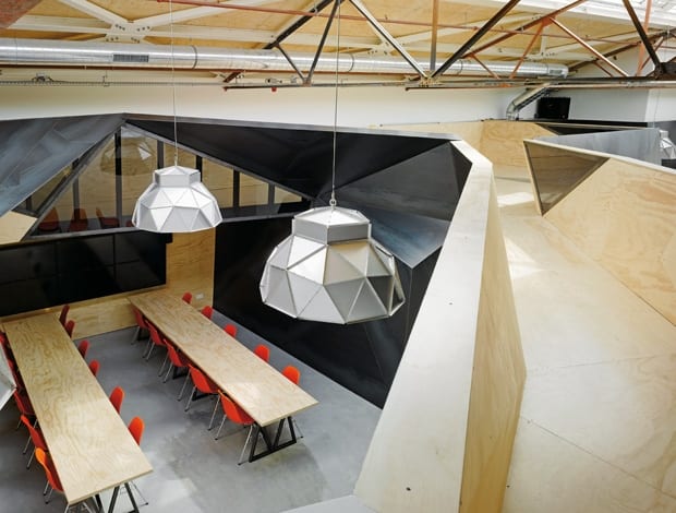
This project has some striking internal architecture, all based on the geometry of a triangle, which can be seen on everything from the walls to the industrial trusses across the bays to the modular furniture to the metallic suspended lighting. Elsewhere, the light comes from a series of skylights that run across the full span of the building. No excuse for Seasonal Affective Disorder given the amount of illumination here, that’s for sure.
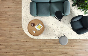
In the public space – also known as “The Beast” – the structure helps create a dichotomy between what is open and what is closed. A closed-off recording studio sits next to a more open “playground”, which features video screens and a bar, while elsewhere nooks and crannies created by the various levels and angles means private work can take place alongside more collaborative spaces. “It works very well and is very popular,” says Pelland. “People find it very easy to find their own personal space there.”
Similarly, the workstation area – or “the arena” – contrasts functionality with what has been dubbed “the stratos”, a foreign object contained within it. Located in the middle of the space, the stratos is a perforated black metal box behind which is a glass-enclosed meeting room. The architects liken it to “a meteorite that has fallen through the atmosphere and absorbed the spirit of the place where it landed.” It is also a tribute to Red Bull-sponsored 120,000-foot jump by Austrian base jumper Felix Baumgartner – a slightly more tangible inspiration.
Such features show the company’s keenness to associate itself not just with the sticky gold liquid it sells, but also with the street and extreme sports it sponsors. Leading on from this there is a theme of resourcefulness within the interior in homage to the BMX bandits who can build a ramp out of simple bits of wood, or the skate punks who view every piece of street furniture as an opportunity for a stunt. Hence, the main hall becomes “the landing” and the staff restaurant becomes “the dive”.
This also ties in with the idea of multifunctionality too, as users are encouraged to make the various areas into what they want them to be. The benches in the resting room double up as storage and the furniture in the common room can be transformed into a place to party when all piled up.
The internal structure’s materials are simple: plywood and raw metal plates. This is in contrast to the playful graphics that cover ceilings, walls, floors and even furniture within. These were developed by Sid Lee’s Amsterdam studio, which worked in conjunction with the practice’s main Montreal base. The graffiti again echoes Red Bull’s desire to be aligned with sports and street culture, which is why a karting track snakes down the walls and floor of the resting room, and a piece of trompe l’oeil depicts massive speakers in one of the supposedly quiet rooms. In the managers’ offices, meanwhile, BMX riders or skateboarders jump across the walls. If the results weren’t quite so irrepressibly cool, the effect might be the architectural equivalent of your dad dancing to the Black Eyed Peas at a wedding or a buttoned-up TV presenters asking viewers to “join in the debate on Twitter”.
A highlight has to be the “holy shit list” imagery in the toilet. If you can get over the puerile pun, behold the Renaissance fresco-style mosaic design depicting the craziest things these Red Bull types wish to do. At first sight, this office looks a little gimmicky. How can this jutting beast of a structure in an oh-so-fashionable district possibly be practical? But it is. Not only is it light, but there are plenty of places to meet and the desks are pretty normal (albeit clustered around a box that looks like it fell to Earth). Jean Pelland and his team are quite insistent that this was an office for working in, not navel gazing.