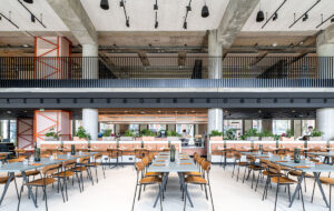
 Bottle wall LED visuals by Acrylicize|Stuart-Haygarth’s artwork is reminiscent of soda bubbles|Double-sided heritage wall by Acrylicize|The rooftop garden with views across central London|A mismatched informal workspace|The in-house coffee bar|Every employee has their own desk, but there’s a range of alternative working environments|Classic Coke bottle pendent lamps hang over the coffee bar counter|Cut-out can artwork shows the breadth of Coca-Cola’s numerous brands|Coca-Cola’s dining area|Classic Coca-Cola crates||
MoreySmith’s design for Coca-Cola’s new office on Wimpole Street, London, incorporates a range of historical and contemporary visuals that relate to the mega brand, without slapping the logo everywhere and painting it red.
Undoubtedly a great opportunity, designing offices for US drinks giant Coca-Cola must also be quite daunting. No Johnny-come-lately, Coca-Cola is one of the most recognised brands of the past century, its iconic red and white logo an enduring symbol of American culture and Western capitalism.
“We didn’t want to paint the place red and slap Coca-Cola on everything,” says design director Nicola Osborn of MoreySmith, which masterminded the design of the new space. “But we did want to offer the office’s 300 or so employees far more exposure to their brand, and celebrate its rich heritage.”
She adds that the company’s previous location in Hammersmith was a relatively anonymous workspace; for this new central London HQ, MoreySmith may have kept its promise not to paint everything red, but Coke’s logo and an abundance of other imagery are evident in the communal spaces, with historical and contemporary visuals mingled together.
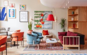
MoreySmith had a loose rein that included crafting the creative brief. The result is an eclectic space that involves a huge variety of building materials, including exposed brick, timber, tin (on the ceiling), parquet, lino, reclaimed hardwood and ceramic tiling. “We wanted to create a very tactile environment and give layers of rich quality within the design to create an interesting and inspiring space to be,” says Osborn.
Osborn adds that the unusual construction of the four-storey building at 1A Wimpole Street heavily influenced the architect’s design strategy. Divided into two sections, the front is an Edwardian block, appended with a larger segment behind it in the 1980s, and arranged around a lightwell.
Solving a challenging 2m difference in floor levels between the two segments has resulted in MoreySmith creating a dramatic intervention that runs up the line between the two building sections for the first three storeys.
The front part of the building houses reception and a cafe, and the back the main workspaces. At the dividing line, MoreySmith sent a huge hole through the first and ground floors, creating lateral and vertical visual connectivity between the two parts of the building. Hanging through the large perforation is a specially commissioned artwork, reminiscent of soda bubbles, by sculptor Stuart Haygarth.
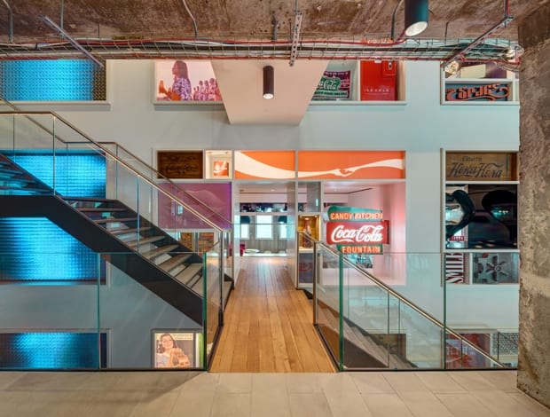
An exposed brick wall now runs up one side of this chasm to the third floor. The wall, painted to remind us of the brand’s pre-billboard advertising, blends with a vast, double-sided feature wall that was created with art and design outfit Acrylicize. Viewable from both sides of the building, the wall showcases the drinks company’s brand imagery, featuring alcoves containing Coca-Cola artefacts and “brings the brand’s heritage alive,” says Osborn. It offers a strong identity to the office – without going overboard.
One of the few specifications that Coca-Cola made was not to have a dropped acoustic ceiling. “Whatever clients hated most about their last office is what they really rebel against for any new design,” says Osborn. MoreySmith ripped out the much reviled dropped ceiling, which was donated to schools, and delivered a bespoke solution that meets the space’s acoustic specifications by using felt acoustic rafts made of reclaimed scaffold planks.
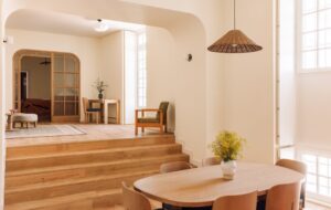
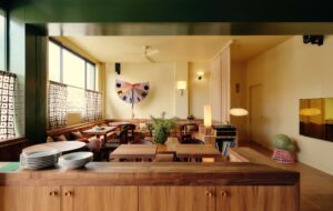
Light-coloured timber floorboards run through the open plan office areas, while the cafe is defined using recycled oak that MoreySmith worked on to create a warm, aged feel, “as though it has been here forever,” says Osborn. MoreySmith also specified bespoke mini-parquet flooring using recycled wood, which Osborn describes as having a “very domestic” look.
The parquet runs through the Home Hub, a cosy breakout space located at the front of the building. As Osborn explains, “a lot of Coke’s staff work from home some of the time, and we wanted the Home Hub to be a nod to that flexible culture, so it is a very ambient and soft and textural space.”
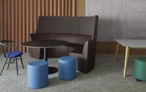
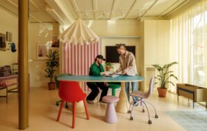
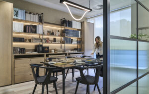
Unlike many contemporary office schemes, every employee has their own desk. “Hot desking doesn’t suit human behaviour,” attests Osborn. “But as well as having their own desks, we have created lots of working environments to let people move around the building and make choices about where they want to work. That is the best solution.”
The desks are by Herman Miller, and MoreySmith specified the finishes in white, with timber and lino elements. “The lino is very warm and hardwearing, but because it marks, it will have a bit of life to it.” According to Osborn, there is no clear-desk policy in place, although staff will be provided with generously sized pedestals in which to store their stuff and to provide an extra seat for visitors to their desks.
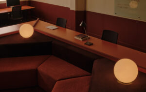
Coca-Cola holds its events on the fourth floor, which features rich reddish hardwood floor (made from jarrah, a type of eucalyptus with a similarity to mahogany) reclaimed from a closed-down Edinburgh art gallery. This space also features a bar with mirrors behind it. But instead of going down the obvious route of using famous Coca-Cola engraved mirrors, “which are very Victoriana,” Osborn says, “we wanted to create a contemporary version – so the imagery we used is minimalist and brings in some of the modern adverts to feel fresh and new, and to symbolise the future.”
Providing a rationale for the office’s eclecticism, Osborn says: “The fact is that when we are in the office every day, we tend to become a bit complacent about our workspaces, so it is nice to create opportunities for people to say, ‘Oh! I’ve never noticed that before.'”

