 Should a globally recognised brand be experimenting with thorny concepts such as duality and juxtaposition, interpretations of which might cast altered perceptions of that very brand? Is it safe for one icon to be rubbing shoulders with other icons? Can fresh, unfocused ideas be bred, cultured and pruned in a space that doubles as a gallery showcasing formalised and approved ideas?
These aren’t questions in a first-year philosophy exam. Rather, they are reactions experienced when visiting the new office environment of Saatchi & Saatchi Canada in downtown Toronto, designed by Bartlett & Associates.
Visitors enter the office past a translucent glass panel into a spacious reception area, where they are greeted by a large, sculptured, metal deer’s head mounted on a forest motif wall of rough wooden slats, and a chunky slab of walnut atop the reception desk. Turn around, and below a soft glow of light – as if plucked from the floor of the Saatchi Gallery of Contemporary Art in London – is a brilliant red Vitra Heart Cone chair, a physical and intentional evocation of Saatchi’s signature heart-shaped Lovemarks brand image.
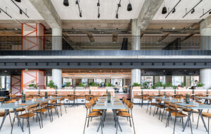
Standing in one spot, a visitor can immediately pick out a cavalcade of iconic modern design references: chairs by Eames and Hans Wegner, Buttercup Rockers from Blu Dot and Jamaica Stools by Knoll are scattered throughout the public spaces, while Carrera marble-top Saarinen tables anchor arched, white-mesh frames above a white-leather banquette, and are backed by dogwood branches in window planters that reinforce a dominant “made in Canada” theme.
This regionalism is carried into the materials. The rough-textured walnut slats first encountered at reception reappear as walnut veneer for the workstation surfaces, in the wall panelling and custom tables in two breakout rooms (which also feature tranquil, full-wall forest murals reminiscent of a 1970s doctor’s waiting room), and in monumental boardroom sliding doors. Walnut is again revisited as moulded plywood in the Eames and Wegner chairs.
But the oversized deer’s head staring at the Lovemarks homage says it all. The pairing is quixotic enough to raise at least a few eyebrows, yet despite the potential pitfalls of such a synthesis, the result demonstrates a successful interpretation on the part of the Bartlett team of Saatchi’s attitude, exemplified by challenging elements of irony and engagement (often in a literal interactive sense).
This might seem at odds with the typical corporate sensibility of order and specificity, but when viewed through the lens of “duality”, things begin to make sense. Saatchi sees this clash of icons as symbolic of the value of juxtaposition, and as any physicist will tell you, energy comes from the collision of bodies – and energy is the most vital element of a good ad agency. This is why Saatchi has made a name for itself embracing juxtaposition. As the late Paul Arden (whose two brilliant tomes It’s Not How Good You Are, It’s How Good You Want to Be and Whatever You Think, Think The Opposite came from what he learned at Saatchi & Saatchi as creative director from 1977 to 1992) said: “Energy – it’s 75 per cent of the job.”
But this is a workspace after all, and Brett Channer, chairman of Saatchi & Saatchi Canada, didn’t just want all the effort put into a front-of-house that blows the socks off a client, but leaves the creative brains to toil at uninspired stations.
He gave Inger Bartlett, principal and founder of Bartlett & Associates, four guiding principles – democracy, transparency, collaboration and inspiration – that speak as much, if not more, to the value of people. Bartlett translated these concepts into a layout that encourages group effort and teamwork, allows for impromptu meetings and imbues a hip sense of energy to the open workspace.
Tools to encourage cross-pollination and support among creative teams include a beer tap in the cafe (another nod to the Canadian motif), flat-panel plasma screens scattered throughout the public spaces, and games such as virtual golf and bowling played on a Nintendo Wii console in the boardroom.
The interplay of icons on all levels – branding, people, furniture, ads and energy – creates an acute manipulation of space expectations which Bartlett conducts as a series of moments that make you look again, with unexpected situations you may or may not notice. While there is playfulness in this approach, there is also an attempt to direct the visitor through the space. Bartlett employs a cinematographer’s skill at directing the eye – and where the eye goes, the body follows. A visitor wants to explore the office, and is encouraged to interact with the various surfaces and spaces, just as Saatchi’s business method involves the client in the creative experience.
However, while they wanted transparency to show that there is no hierarchy, they also needed some privacy. So Bartlett developed a spaces-within-space effect through custom-designed, low-cost scaffolding that plays a dual role as the backbone of industrial-chic workstations and frames to display client banners. The geometry of the scaffolding provides an architectural rhythm to the space, reflecting Saatchi’s dynamic flow of creative ad concepts for clients.
And all this occurs in a surprisingly spare 836sq m tableau. A traditional office space within a painfully anti-cool office building was gutted to the bones, leaving only polished concrete floors and clear white walls upon which to build the egalitarian command centre. “The surprise of coming across our loft style of office in a traditional tower establishes an important creative first impression,” says Channer.
The impact has been considerable. Recognition for the offices include the Lester Dundes Award from IIDA New York, Best of Competition 2008 from the American Society of Interior Designers and an award from the Association of Registered Interior Designers of Ontario.
But more importantly, Channer enthuses that “our pitch wins have improved to about 75 per cent”. Since the design was completed, Saatchi & Saatchi Canada has won five major clients including fast-food chain Wendy’s, retail food chain Kroger and medicine manufacturer Buckley’s. “There is much better work coming out of the agency and we are now making really good money,” adds Channer. If collisions bring cash, they must have done something right.

