 Words by Helen Parton
London-based architects Urban Salon designed the new offices for communications agency Edcoms, making the most of the spectacular skyline views, found Helen Parton
Waterloo. Run-of-the-mill workplace design was defeated. Urban Salon won the war. We’re eleven floors up in the Capital Tower building, high above the south London sprawl in the offices of EdComs, a communications agency that deals primarily with the education sector. Today the place is packed with children and adults engaged in a seminar, which provides the perfect opportunity to see that all-important user-based interaction. I’m with Urban Salon’s co-founder and director Diana Cochrane and senior designer David Germond, who are explaining how they got involved with this £200,000 project completed last year.
Cochrane explains the origins of the project: “It had originally gone to a much more traditional way of procuring an office: design and build and they [EdComs] had got a company which was going to design the whole thing and move them in, and the timescale and budget were reasonable. But when that company asked them how far apart they wanted the logos to be in the carpet, they suddenly thought: everything else is fine about this process, but what’s it going to look like and feel like? Is it going to be a nice place to work? After they started asking those sorts of questions, they eventually came through to us. Design and build is one way of procuring an office, but I think it inherently involves people making decisions about materials, which are based on cost.” EdComs is allied to advertising agency Bartle Bogle Hegarty, with whom Urban Salon have enjoyed an ongoing relationship for a number of years, and it was this connection that made them the natural candidates for the job.
We had perfectly nice offices in the old building in that they were pleasant and comfortable,” explains Martin Finn, managing director of EdComs, “but when we started working work with Urban Salon, we started to think about what was really appropriate for the brand.” “They’d never done this before and they were quite open about that,” says Germond. Cochrane adds: “People think that inherently the process then becomes more expensive and more protracted, because it’s not a one-stop-shop, but you just have to reassure people that we’ve done this before and that it’s not always actually the case. We were able to have conversations about design and that’s when people get interested. We built a succession of models and they were able to see the decisions being made. The client was definitely going to have more of a choice about how the space was arranged and the materials that were going to be used.” In terms of design, the main thing with this project was making the most of the views. A fortuitous decision to take this particular floor rather than one lower down meant it would have been a shame not to make the windows a major feature. One can see out of all sides of the building, which not only affords fantastic natural light, but also provides the opportunity to showcase neighbouring buildings and landmarks. Urban Salon was keen to exploit this by angling internal walls so that employees and visitors are treated to the best of the local skyline from as many key vantage points as possible. The workstations are also northerly facing to avoid glare on computer screens, while the meeting rooms are positioned on the southerly side. That’s not to say this multi-tenanted, 1970s building didn’t have its limitations.
“It’s an empty square box and you can’t really mess around with anything. The trick is to make it a bit more interesting,” says Germond.
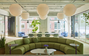
“Things like the ceiling grid really couldn’t be changed without starting from scratch and spending an awful lot of money,” adds Cochrane. “That’s something that wouldn’t really have been financially viable. Instead, with the light fittings, we replaced the original gold louvres with silver ones, putting in more efficient lighting that complies with today’s standards.” The difference with the rest of the building is marked, and despite the startlingly scarlet reception furniture downstairs, the overall greyness of the structure is hard to disguise. “On all the other floors, they have kept the same carpet, whereas we’ve got this blaze of yellow and green,” says Finn, describing the immediate impact you get from leaving the lift and entering EdComs lobby area. Little wonder this floor’s known around these parts as “the posh one”. Cochrane says that as far as the chosen palette was concerned, “We felt we couldn’t put white anywhere. Almost all the colours had to work with the view. I guess we also went for shades of green in the end because they’re quite relaxing: they’re not greys or blues or standard corporate colours.”
rban Salon worked on achieving a subtle divide between the public and private areas. To do this, it worked with design consultancy Graphic Thought Facility to develop a bespoke series of panels of glass partitioning with white strips and a vinyl backing along the main thoroughfare. The same technique is also repeated on a pillar near the kitchen, this time with a burnt orange colour, which creates textural interest and an accent of colour that is repeated in the kitchen seating. The kitchen area itself is far from your usual white, forgotten about corner with its mix of turquoise cupboards and royal blue rubber floor. “It’s designed to look more like a domestic kitchen,” says Cochrane, “We purposefully chose different colours for the surfaces, so that it seemed as if somebody had made a conscious decision about colour.”
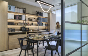
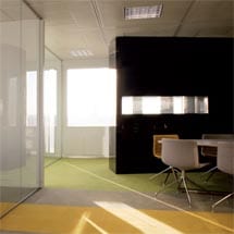
A discrete library area was created at the end of the main navigational route to house and showcase the company’s research publications. “It was designed as an internal room, like a little black box,” explains Cochrane. Here too, through the black laminate, you have a good view out to the local landscape. In the meeting rooms, Urban Salon has included a plectrum-shaped table, a design created in-house which has been used for other projects in the past. Indeed striking tables are something of a “signature dish” for the practice, which was responsible for hip advertising agency Mother’s everyone-together-at-the-table approach to team working, discouraging hierarchies and engendering creative working.
Flexibility was also a key criterion – some of the meeting rooms can divide up or open out depending on the size of group using them. There is also a room designed for focus groups with one-way glass separating the adjacent viewing room, and research of this kind is an area of its business EdComs is keen to grow. The seating in the reception area and the kitchen was also custom designed but for the workstations. The client preferred to bring over the furniture they had from their previous premises. “Most of the time, we design all the furniture ourselves, but in this case, we just changed the colour of the back partitions. There’s no point pushing people towards something that isn’t right for them,” says Cochrane. Communication is a major part of the client’s business, so the design of the offices had to be seen to be creating a dialogue. To this end, rails have been affixed to the walls where posters and other visual information can be changed on a regular basis, plus in the reception area, there’s a large TV above the grey painted reception desk. “We were often finding ourselves having to explain to clients the full extent of what we can do and the screen means we can use the time people are waiting in reception to showcase our capabilities,” adds Finn.
EdComs’ own clients range from the Department for Education and Skills and other parts of the government through to blue chip clients including BP, working on initiatives such as Active Kids for Sainsburys. Although Finn admits they are not in a business where a high design office is mandatory and they are the largest player in quite a small market, they nonetheless have a certain competitive message to get across.
Cochrane says, “We always talk about what sort of car a client would be, and I think they are a Citroen or a VW – reliable and comfortable. We’ve done a lot of advertising agencies where they want something fabulous for clients to see, but here it’s more about their being a big company, but not too big, and creating the feeling that you’re in safe hands.” Finn adds: “We are in the education sector, which is laden with values and it’s important that our brand has real meaning. We are rigorous, extremely approachable and friendly and we are delivering not just thinking. The environment has really helped to clarify that. I think we’ve ended up with a very modern design and quite a bold statement.”


