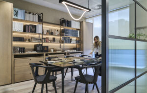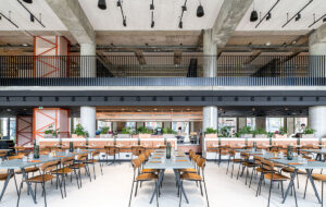
 When global American pharmaceutical Johnson & Johnson took a floor of the landmark Starrett-Lehigh Building on the Hudson River, New York it was a seismic step for a major company.
Despite having its headquarters and consumer division across the water in New Jersey, when it came to establishing its own design office, it wanted it to be somewhere in close proximity to the type of talent it aimed to attract and retain. When the 15,000sq ft floor was discovered and secured, Johnson & Johnson chief design officer cum ex-client Chris Hacker bought Lalire March architects on board to make the most of the raw industrial space it had come to occupy. “This was always going to be a project that rested on the existing aesthetic of the building” Christopher March the partner in charge of the project explains. “We wanted to tread light as we intervened, and avoid taking what was there and bending it to our will.
“Our treatment was quite conceptual; fortunately the client gave us a very free hand, and was open to different ways of thinking. At the same time we shared a firm fidelity to design principles, such as sustainability, reusing and recycling, and original design pieces, over replicas or knock offs. There was a lot of collaboration.” This is the sort of dream client relationship you hear about from architects a lot more often than you see the results to authenticate.
In this case, each of the extolled principles seems to play itself out in the reception area; and first contact point for the brand. Firstly is the untampered industrial nature of the space, with a polished concrete wall to ease the transition between the rest of the building, that is undergoing a refurb, and the relatively finished J&J hallway. Then there is the nod to design classics, with a red Italian Living Divani sofa and blue Womb chairs by Eero Saarinen.
In contrast to these, yet in keeping with the pretext, the coffee table that sits between them is made from stacked surplus plywood table tops, from a temporary work space that the J&J design team were inhabiting before. The brand’s credo is inset on the surface of the top table, ingrained in a “subtle and graphic way”. Then there is the vintage J&J signature above the bespoke reception desk. “Many people will remember seeing this sign driving along the highway to New Jersey as children, someone on the project was driving past and saw a demolition crew dismantling it, screeched to a halt and rescued it.” It now takes ‘reclaimed’ pride of place above the reception desk. “It’s amazingly textured from being repainted many times over the years, but it’s iconic to the brand.”
Embodying the collaborative nature of the project, a commission by Boston-based conceptual artist Rachel Perry Welty, “was something J&J wanted to do”. The finished artwork ties in well with both the interior design and the brand as a whole; the artist has covered the reception wall with a detailed history of Johnson & Johnson packaging. The replica packaging is exploded onto the wall and includes everything from miniature band aid to Tyenol to Johnson’s baby care, it creates a curious constellation. “It has that “Ah-ha” moment as you draw nearer to it and realise what it is made up of,” says March.
Part of the motivation behind the new offices was to bring the design for the different families of products in-house. Previously a lot of the branding and packaging for products was farmed out. The new design office has a studio-like atmosphere. The design team are based at the back of the floor in an area with open plan benching. “They wanted to tear down the walls between designers, so it was easier to soak up what was going on.
The workstations catering for other teams on the floor (including the Neutrogena cosmetics group and J&J’s media team) are based on Lalire March’s own workstation pattern. “The client saw it and liked the simplicity” March says. “The design expresses the materials as they are, the plywood has no edge banding, it’s not finished off. The tabletops are made of linoleum, which is a sustainable material, and nice to work with. The shelving is painted red to bring warmth to the area.”
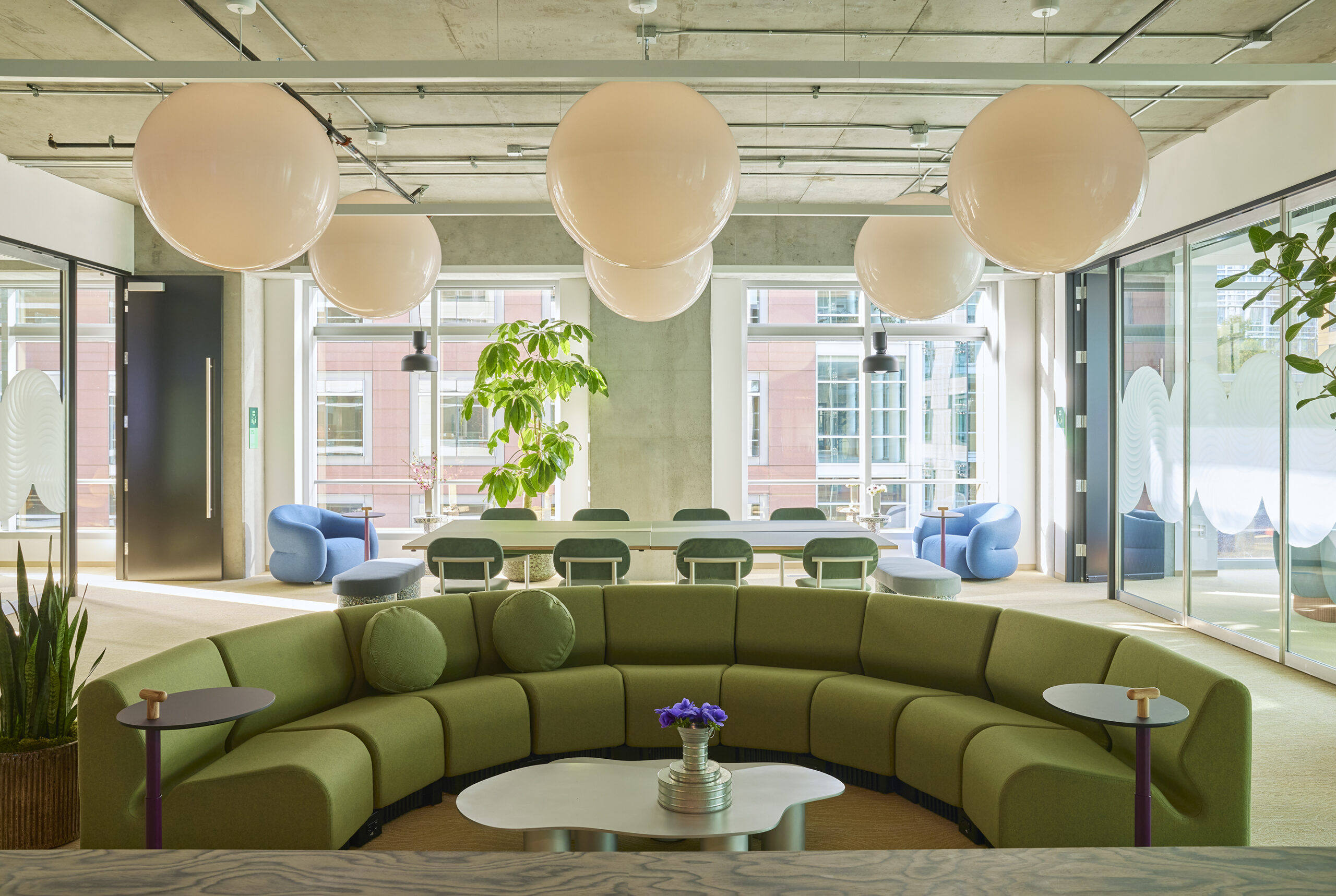
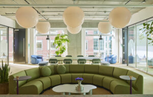
The space Johnson & Johnson took had two sides of windows in a continuous strip creating enviable, uninterrupted views; because the structural columns are pulled back, and everything in the design stops short of the windows so every employee gets natural light. One corner space within the plan however, defined by a kink in the shape of the building, has a particular magic. In this case, the area, which could have been poached for executive offices, was given to everybody, forming a shared gathering space for informal or impromptu meetings. “It would have been unfair to position any one team here over another”. Utilising their ‘tread lightly’ approach, the original concrete ground of the corner space was polished back, bringing to the surface an earlier spillage of steel filings, giving the new floor a dull glitter. “The concrete was unstained so it actually gave a really clean finish, and bought out some of the history embedded in it” March explains. The lights were both custom made and off the shelf at the same time. “We wanted something different, these are the electrical parts of helical flouro lights from the hardware store.” With no shield for the light they accentuate the pared back look. The coil curtains, or ‘chain mail’ that drapes from the ceiling is wire, woven together to create a veil, or closure if the space is to be divided off for events. “It’s not anywhere near opaque or sound proof, but is there to define the area” March explains. Tables transferred from the temporary workspace are reused in this space. “The artwork that overhangs the space is something the curatorial group had in storage for a boardroom that didn’t eventually get used” March explains. “It’s called repurposing – the architectural term for re-gifting – giving away presents you didn’t want or need.” Alongside sculptural 1930s mushroom cap columns, and against a Manhattan backdrop, the repurposed piece now forms part of a highly desirable package.


