 Words by Rebecca Burgess
The relationship between architect and client can be a love affair or a battleground. For graphic design firm Turner Duckworth and architects Jensen & Macy, their mutual respect gave birth to a stylish new office in the heart of red brick San Francisco, finds Rebecca Burgess.
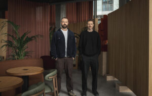
When David Turner, of the international and hugely successful graphic design firm Turner Duckworth, approached Mark Jensen, of award-winning Jensen & Macy Architects, it was as an unusually prepared client.
Turner had extensively researched the work of Jensen & Macy, specialising in residential, retail and commercial projects across Europe and the US, downloaded photographs of past projects and put them together as ideas for his new office building, a two-storey warehouse in the historic Jackson Square district of San Francisco.
“People often come to us with photos from books and magazines to illustrate what they are looking for. But David Turner did something that I’ve never had a client do before. He took photos of my work that he found on my website and formed a collage of elements from my previous projects that he liked,” said Jensen, who found this visual exercise very flattering.
“I did research in architectural magazines and on the web and the projects I found immediately appealed to me,” said Turner. “I saw strong ideas executed with great attention to detail and very creative use of practical, often inexpensive materials. Their work felt very carefully edited, authentic and unpretentious, but there was also a sense of joy and creativity in it.”
Since they started in 1994, Jensen & Macy has endeavoured to deliver elegant, cost-effective and environmentally sensitive design. And this was what Jensen brought to the Turner Duckworth building, which although already used as office space when the company bought it, was crowded and dark.
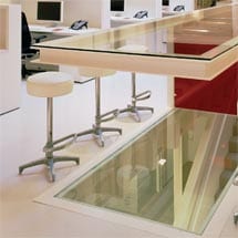
The building is now filled with natural light flooding from a skylight in the roof through a glass cantilevered table and floor to the basement, with open space and private offices, finished in off-white and red glass.
“It was a building filled up with brick and private offices, which was literally like walking into a maze, so the first thing we had to do was demolish it back to the shell,” Jensen said. “The client definitely had functional criteria. He wanted some private space but also to keep the loft feel – the quality of the space was important not just for the employees but also for the image projected to his clients.”
Working in the development of brand identity, Turner wanted his company’s approach reflected in the design of his office space. “We create clear, conceptual solutions to problems and then sweat the details. We tend to be down to earth and straightforward and fanatical about quality design. We also needed flexibility because we are growing and hiring new people,” he said. “And we wanted a collaborative environment, something very open, but with the ability to keep our work confidential.”
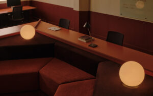
A cantilevered glass table was crucial in achieving this effect. People meet around it, it acts as a “bar” for parties and also opens up the basement. “We wanted a ‘white paper’ look so that the environment would not compete with our ever-changing design projects, and we wanted to keep the whole thing beautifully simple.”
However, Turner was also keen that the office would not lack personality. “We wanted people to come in and say, ‘Wow, cool space’.” The “white paper” effect also appealed to Jensen. “I make an analogy to what a client does in their work. I have always been a graphic design fan and intrigued by the use of white space and how important that is,” said Jensen. “White space often gets filled with stuff, so you have to be careful that it is kept unspoilt.”
On this occasion, the meeting table, while being the project’s centrepiece, also served to make the statement of the white space. “David wanted to use the basement for extra work stations but there was no natural light so we created an opening in the floor to let light in from the skylight topped with a glass table, which has three different uses,” explained Jensen, “For circulation and light, and as a focal point – it is a convivial and aesthetic area as well as a meeting table.”
The concept for the project was conceived during a series of client meetings. “Nothing was preconceived. It all came from dialogue,” said Jensen. “Not everyone is up to carving a hole in the centre of the concrete floor of a building they have just bought!”
The skylight was already in place. However, Jensen cut everything back so its light could flood the building, which he decorated in an off-white colour to create warmth. “It looks like pure white but it’s off-white – when you don’t have pure white to read it against, it seems pure,” he said. “We were covering a lot of different materials, such as exposed wood, concrete walls and steel braces for earthquake protection, and pure white would not have covered the defects.”
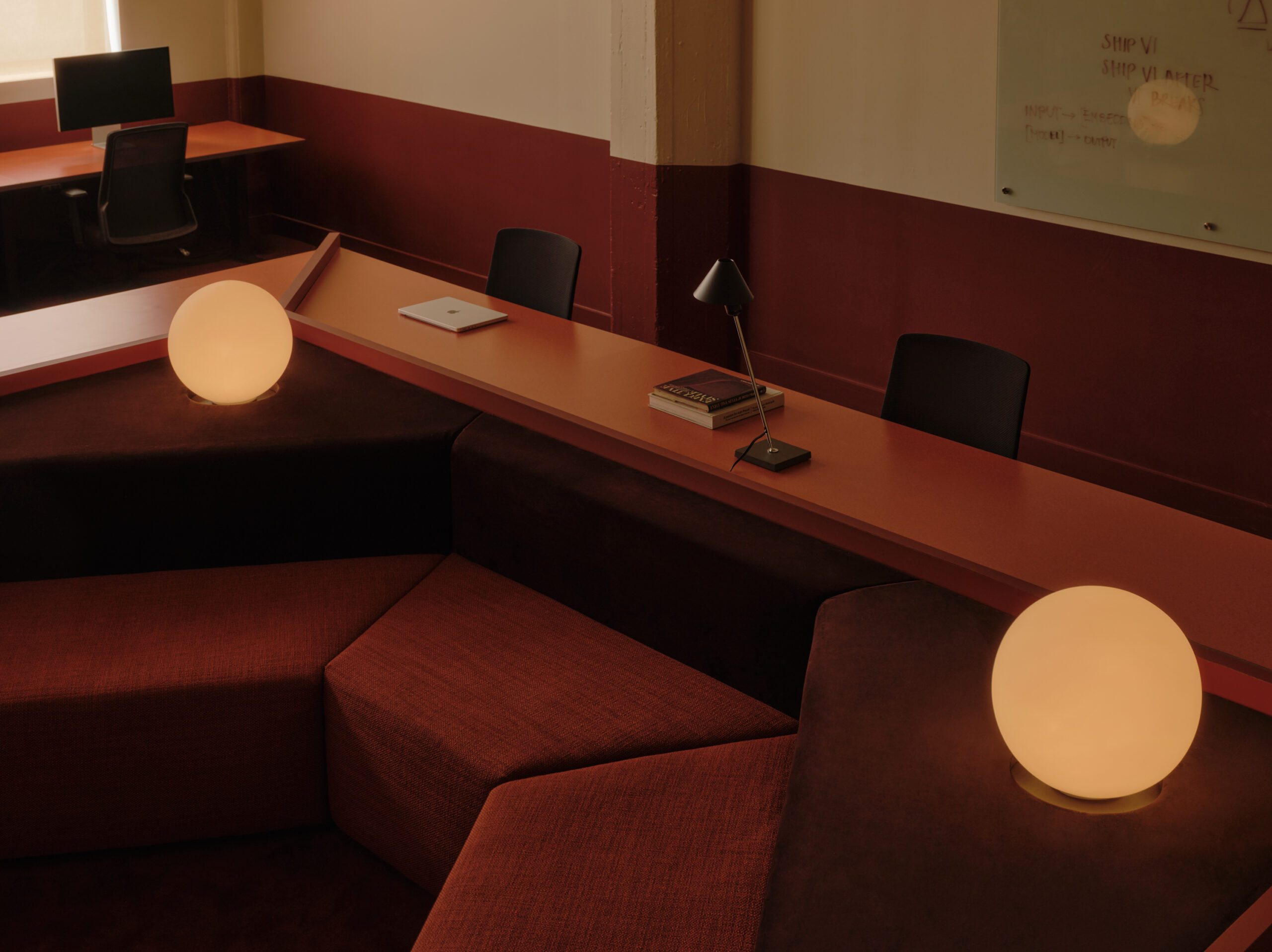
Then for a “punch” factor, red glass was used for the walls of the mezzanine conference room and guard railings on the central stairs, mirroring the red on the company’s branding. The translucent glass serves the double purpose of creating private zones – “at first glance it looks like a wall,” said Jensen – but also partial visibility, as it changes during the day when it’s backlit.
The only closed space in the building is the conference room on the mezzanine and two closed offices below it. However, low partitions allow sufficient privacy to make calls. Having designed office space before, during and after the dotcom era in San Francisco, Jensen noted how the trend had moved from one large environment to recognising that people needed space in which to retreat. “I think it’s about striking a balance between collaboration and privacy,” he said. “Everyone talks about ‘telecommuting’ and working from a laptop in Starbucks but there are also good reasons for people to come together and work together. It’s about allowing for that combination without it being an impossible place to work. And from what I’ve heard, we seem to have struck the right balance here.”
On an environmental level, the lighting meets the strict energy codes of the State of California and the materials are sustainable. “The main thing is that we salvaged and preserved an old building that others would have knocked down and tried to redevelop,” said Jensen.
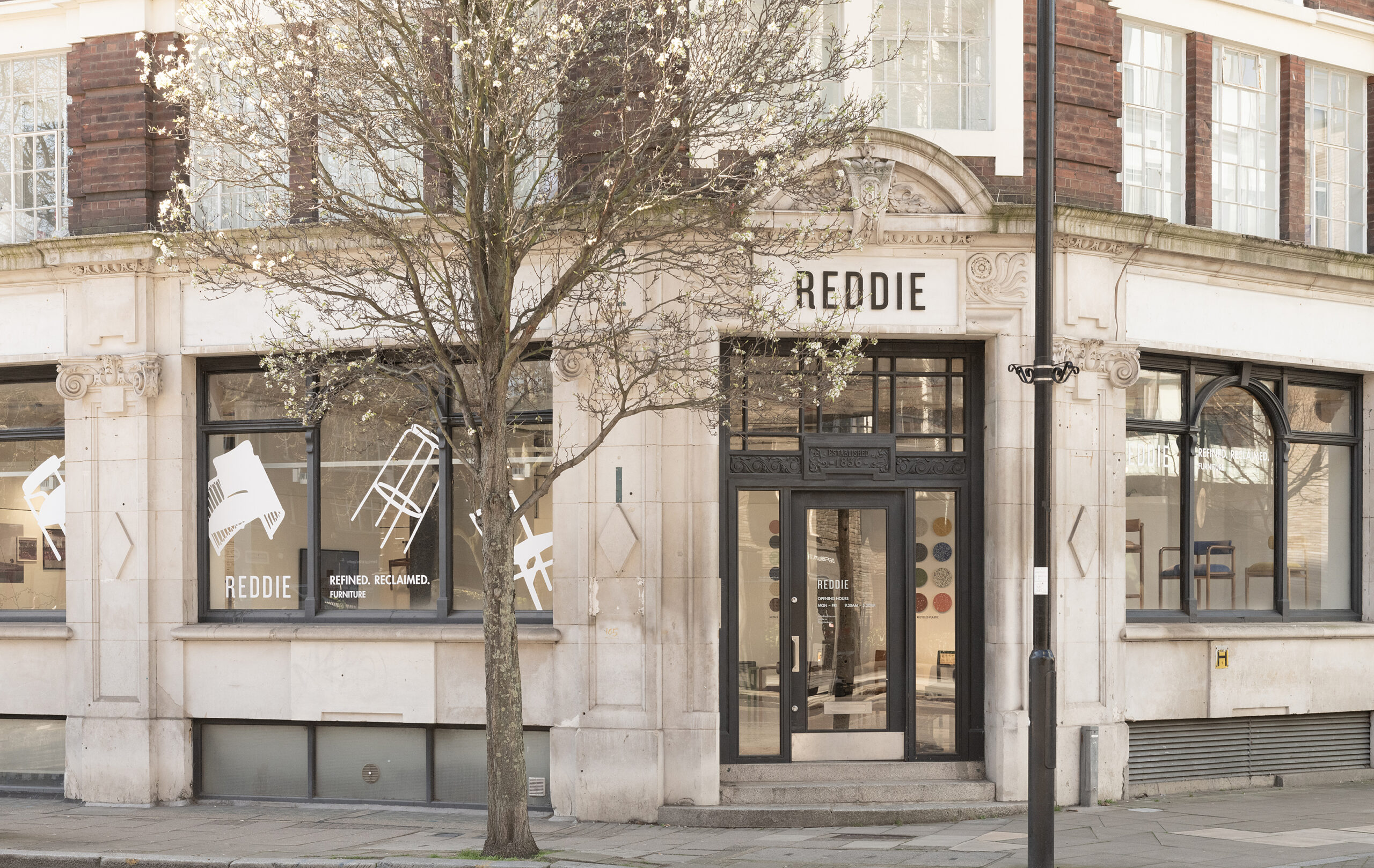
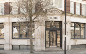
In fact, because of the building’s age, they were forced by city planners to preserve its veneered brick facade, even though it was not original. Jensen decided to neutralise it by painting it white, while the wooden trim and moulding framing the windows were painted black, to resemble store fronts in London, where Turner Duckworth has a satellite office. For Turner, whose clients include Neal’s Yard, Ebookers, Tate & Lyle and Dockers, the $450,000 cost of the project was worth it. “The most impressive way it has exceeded my expectations is what it has done for Turner Duckworth’s brand image,” he said. “It’s hard to quantify, but I know the design reflects who we are so well that it’s more powerful than any new business presentation.”
His employees love working in the new office, and clients do come in and say, “Wow, cool space” and ask to meet there. “The company has been energised. We’ve been able to grow to three times our size within the original design. As a work space it functions exceptionally well, creating a collaborative atmosphere but giving everyone their own space,” said Turner. “And when we have a party the place becomes an even cooler nightclub than it is a design studio.”
The only difficulty he has encountered is the sound interference between the meeting room, offices and studio. Yet Turner recognised this when approving the “frameless” glazing design: “We chose aesthetics over function, but it actually has an upside because hearing the buzz from the studio keeps up the energy level in meetings.”
At the end of the project, Turner pulled out the collage of ideas he’d first approached Jensen & Macy with and concluded: “It’s not far from what we were looking for!”

