 Words by Elizabeth Choppin
When a media company moved to bigger premises, they were concerned not to lose the energy of their former offices. The result, says Elizabeth Choppin, was much closer to home than they had thought
When MediaCom, the advertising planner and media buyer for some of the world’s biggest companies, decided to move its UK headquarters into a considerably larger building, a two-pronged dilemma presented itself.
How could the buzz and energy of its old space, situated over two floors, be transferred to six storeys of an office block? And how would the new offices support MediaCom’s identity as a multi-national corporation while at the same time preserve the informal, funky image so important for its business?
The answer, according to London-based pracice ORMS Architecture Design, was to blitz the new space (a 52 year-old building in Holborn) with the concept of domesticity and home – plus a dash of drama for good measure.
“We intentionally did not look at other offices,” says John McCrae, one of the directors of ORMS. “The question in this case was how do you make it not like an office environment? We were trying to upset the corporate feel of the building. The idea was to say, ‘Retreat to it as though you were moving home. You have actually moved to a bigger, better home.”
MediaCom ran the risk of diluting the vibrancy and cosiness of its old offices in the new building at 124 Theobalds Road, with its cold marble finishes and glazing. What they asked for, quite simply, was that the design should enhance relationships amongst staff and with clients.
“It was about the people,” says McCrae. “That’s as much as they knew they wanted – and they had a building. They didn’t believe this building could actually work for them – they were really worried about it.” Yet the company was at bursting point in its previous space and needed room to expand and grow.
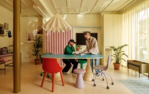
ORMS rose to the challenge. The scheme is a combination of bold use of colour and scale alongside the strategic placement of communal spaces. This manages to deliver the required impact for MediaCom’s high-profile clients as well as a fairly homely environment for its 520 employees to interact, promoting a culture of knowledge-sharing.
“Staff are essentially what helps us win business and what helps us keep clients, so it’s all about these relationships,” explains MediaCom marketing director Karen Blackett. “The core concern for us was that it feels intimate, because it is such an imposing building. It was also about ensuring that people feel a part of the team.” “When they say ‘People First’ (the start of the company’s tag line), they really do put them first. They encouraged us to bring the organisation to the front,” says project architect Ana Monrabel-Cook. Because MediaCom’s departments are separate and now spread out over more space, the design is meant to knit them back together and maintain the spirit of integration that is key for staff.
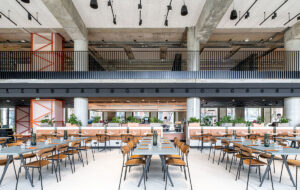
This was done on each floor by concentrating break-out spaces, tea points and meeting areas around the periphery of the central atrium, which extends up from the ground floor reception to the top of the building – effectively coaxing people out of their separate departments into an accessible and highly visible hub. “Whilst you make a cup of tea, you can see people passing by and have a chat with them. It feels more domestic. If you’re on the furthest side of the building, you have to come here to make a cup of tea. There is nowhere else you can do that,” says McCrae.
Inspiration was drawn from hotels and private houses – even the organised chaos of a Marrakech marketplace influenced the design. Wall graphics with key words for each area and a timber “racetrack” – a circular walkway connecting communal spaces that replaced dull carpet flooring – serve as orientating devices for staff. “Before the timber was installed, it looked like a labyrinth,” says Monrabel-Cook. “When you came out of one door, it felt exactly the same as if you had come out of another door.”
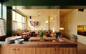
Along the east side of the atrium, glass has been replaced with open walnut frames, much like balconies. “You can hear the activity of the atrium on every floor, which is quite important because of the company’s shift from horizontal to vertical,” says McCrae. “From the lift you can see activity, you can see the organisation.” A cafe spills out into the ground floor of the atrium adding to the buzz and energy of the building.
Much of the existing building was not changed – ORMS opted to focus the design, and 50 per cent of the budget, on finishes. “Rather than spend money in the ceiling, we decided to concentrate our efforts and resources on the things that you touch, the things that you really see, the things that you sit in,” explains McCrae.
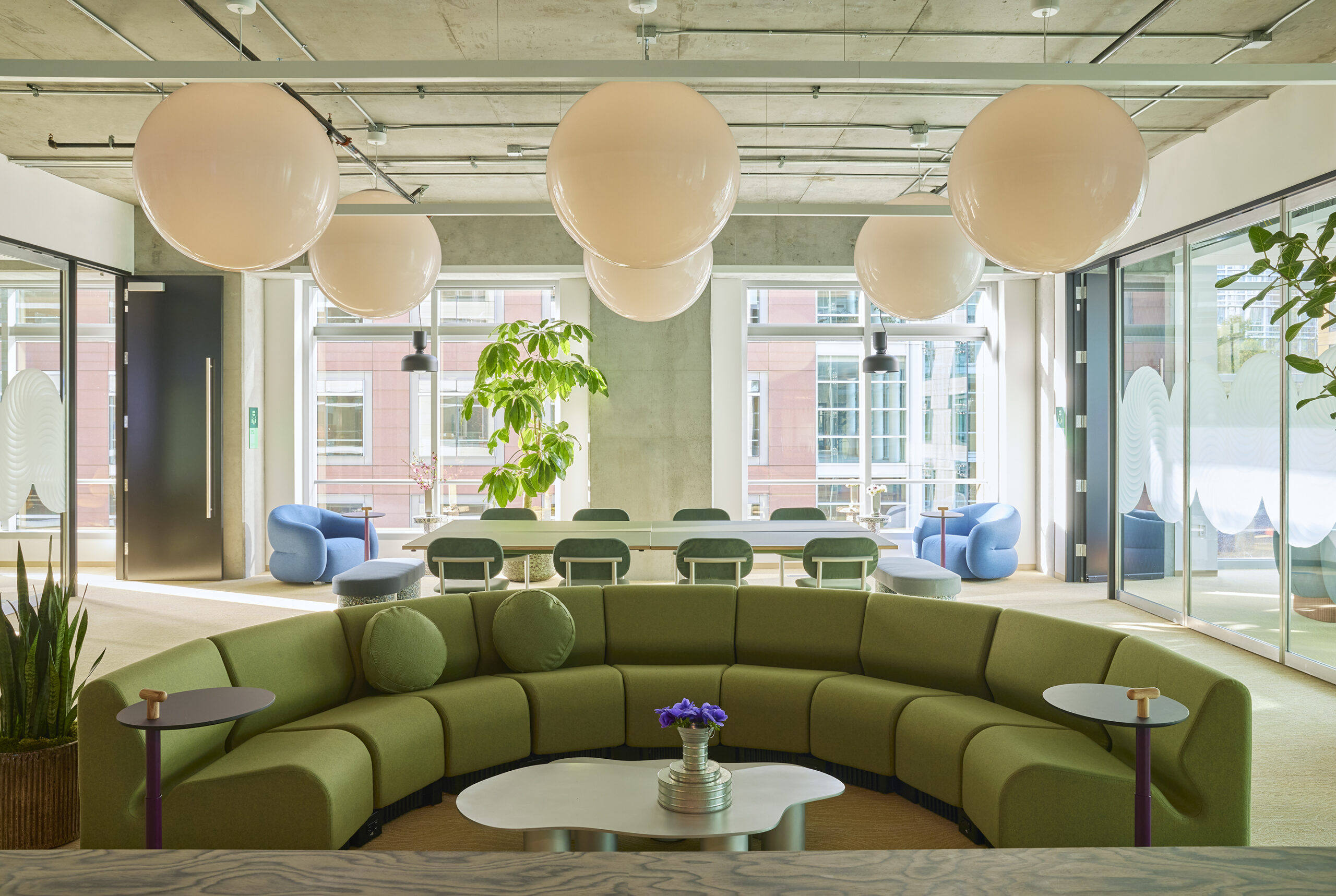
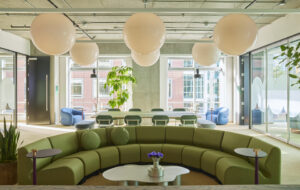
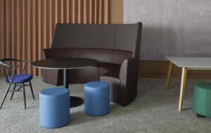
On every floor, the break-out space sits next to the glass panels of the north atrium wall. It is divided into three zones: two formal meeting spaces – with Maximo couches and floral patterned Egg chairs – sit on either side of a more informal area with leather benches and stools upholstered in bright fabrics. Felt-upholstered partitions for postcards or messages flank the entire space, adding to the the feeling of a lounge. “This is where you might have a team meeting or get away from your desk, but again, it is the most public bit of the building instead of back in the corner,” says Monrabel-Cook.
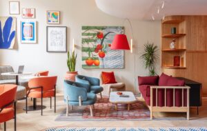
With varying degrees of subtlety, the company’s branding is reinforced with accents of colour – shades of purple, red, pink and grey – in the entrance hall and throughout the open-plan offices and break-out spaces. “The choice of the colour palette is so that it doesn’t date within 12 months,” says McCrae. “It’s not the latest lime green or bright yellow. The idea is to make it quite a sophisticated palette.”
So carefully selected hues of orange, green and yellow are applied sparingly in meeting areas and key meeting rooms to avoid an overly corporate message. “One of the core things we said to ORMS was that it needs to be warm,” explains MediaCom’s Blackett. “Colour was quite important for this – we did spend quite a bit of time making sure that we do reflect MediaCom’s style guide, but that we also make it warm and intimate.”
After the move in December, an initiative called Pimp My Area was launched to encourage departments, via a competition, to personalise their spaces, which were designed simply with clusters of white work stations. “Although we’ve created this interior with this look and ambience, we still wanted people to feel as though they could put their own stamp and personality on it,” says Blackett. The results – ranging from wall graffiti and yellow flocked wallpaper to illustrated self-portraits – make unified, central areas even more crucial.
Another key aspect to the design was about client experience, including capacity for business pitches starting at the front door. An oversized, black acrylic lampshade, the underside of which displays a lit diagram of MediaCom’s offices around the world, looms in the entrance hall and immediately informs a client of the scope of the company.
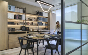
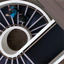
An aubergine carpet catwalk leads clients through the entrance hall before they are whisked up a white, spiral staircase to the formal pitch rooms – an experience which is meant to parallel a walk down a VIP carpet. “It’s quite theatrical – but that is part of what they are about. It’s about how they communicate to the people and the clients,” McCrae explains.
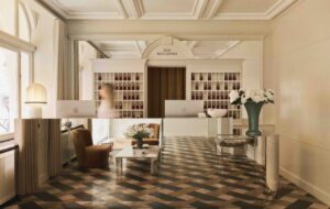
Meet and greet pods have replaced the imposing reception desk, and gigantic planters and picture frames on each side of the space play on the theme of home – albeit with a bit of tongue-in-cheek.
The idea of a domestic picture frame is woven throughout the building in reception, work areas, the cafe and the corridors. Pictures of clients hang in an eclectic mix of frames resembling what might be found in a family home.
Blackett explains: “You know when you go to somebody’s house, you always have a bit of a nose at the photos on the mantelpiece. This was trying to create that sort of atmosphere so you feel as though you are looking at our family album.”
The combination of grandiose and domestic flourishes is meant to represent this duality within MediaCom. “It is to give the impact that this is a huge organisation. It’s global, but it is also very personal,” says McCrae.
A lack of security machines to pass through, or a visible security desk of any sort, allows the space to feel more like the lobby of a boutique hotel than a corporate office building.
“When we walked into this building, you had a reception desk and it felt that you had to go behind the scenes to have a meeting,” says Monrabel-Cook. “We wanted to bring a bit of that informality back in, which is what the meeting spaces, the cafe and the break-out spaces are.”
All in all, says Blackett, the design has received glowing feedback from both staff and clients. “Clients love it because we’ve thought about how we work with them and we were able to design the space around them,” she adds. “It has increased productivity, it has increased creativity and it’s comfortable.” One can only remember how the company’s tag line finishes: “Better Results”.
As for staff, with an average age of 24, plans are underway for a bar in the east wing. A home away from home then.


