 Words by Indigo Clarke
London-based practice FAT designed the offices for advertising agency 10 in a high-intensity, post-modern “village” style, but it took some adjusting to, found Indigo Clarke
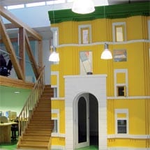
With a workplace interior that resembled a technicolour children’s book illustration, few companies could have boasted more vibrant and unique surrounds than 10 advertising agency in Antwerp, Belgium. Designed in 2002 by London’s idiosyncratic architecture practice FAT (Fashion, Architecture, Taste), the fairytale backdrop, beloved by the company and its employees, proved stimulating indeed – to the point of distraction.
Existing inside a one-time gallery space conceived by architect Georges Baines, FAT’s interior resembled less an office than a theatre set, complete with miniature building facades that looked like cardboard cut outs, a bridge, faux hedging and a “town square”. Using Italian piazzas as a conceptual point of departure, the diminutive buildings playfully referenced the work of luminary architects Gian Lorenzo Bernini and Andrea Palladio. Concepts of expected scale were thrown out of the window as were conventional colour levels and combinations. Bright yellow and white were splashed across one picturesque facade, while ersatz vegetation vied for attention on lime-green floors and azure beamed from a second-storey wall – a sight not for the faint hearted, but boldly following the vision of the award-winning FAT practice. Well known for its controversial and acclaimed 2004 Blue House in London, FAT has also worked on a diverse range of projects throughout Europe, including interiors and social housing.
“The concept was to create a world inside the 10 building,” explains FAT co-founder Sean Griffiths. “They had bought an old purpose-built exhibition space and wanted the interior completely re-designed to reflect their company’s image. Using the concept of ‘interior urbanism’ we designed two main zones for the space connected by a bridge and a ‘town square’ with a basketball pitch. We played with scale – the buildings are miniature so that when you walk around you feel like a giant. It’s a surreal Alice in Wonderland experience.”
To generate a distinctive space that expressed the agency’s culture and identity, FAT’s three architects “wanted to create an office that would look like no other in the world, that would be fun to work in,” says Griffiths. The space they conceived was a collaged environment with multiple areas as opposed to one static interior. Rather than design formal meeting spaces alone, FAT aimed to foster communication and idea sharing in the company through the introduction of areas where contact between members of staff could develop informally. “We thought meetings should happen by chance because in creative industries so many of the best concepts arise naturally – rather than on cue in a boardroom,” explains Griffiths. To allow for this information sharing, the “urban interior” was designed to be explored and wandered through so that people could bump into one another spurring happily accidental conferences on the staircase, bridge or in the central town square. This design concept envisioned the office as a stimulating, non-conformist environment. “We wanted to break down the boundaries between work and play – to make an environment that is practical and functional, but also playful and inspiring,” says Griffiths.
But a few years down the track and FAT’s playful incursion has been somewhat toned down. From extreme colour on all sides, the office now boasts two shades: black and white. When it comes to colour, 10 found a little really did go a long way. “FAT’s design reflects our personality because it is a space like no other and we are really happy about that,” explains 10 Advertising’s managing director Denis Ghys. “But in terms of colour it was too surreal and overcharged – screaming out loud.” The Belgian company did the unthinkable and dramatically altered the architects’ artistic vision – all in the name of a better workplace atmosphere.
“We took away some fun by removing colour – but everyone is more satisfied with the space and it’s definitely improved productivity. People here just couldn’t concentrate with all that colour, they weren’t happy, it wasn’t zen,” reveals Ghys. “It’s a shame the space had to lose some elements of its original design, but staff are happier now and having it painted black and white has not destroyed the overall effect of the remarkable interior architecture. It is now a lot more serene, it looks almost cubist with variations of tone creating a sense of space and volume. Where before it felt like a scream, it is now a very positive smile.”
What 10 didn’t change was the original design of the space, which took into account various roles and departments in the company as well as spatial considerations to allow for employees to mingle and interact informally. FAT designed a peaceful white picket fence enclosure to house the accounts department while conceiving the bridge overlooking the entire space as the creative domain. “The bridge is a space we are very proud of, it functions in an interesting way,” explains Ghys. “It is manned by the creative department and is unique in that it is both an open-plan office with a large communal desk and also a separate work environment that hovers over the rest of the office space looking down on all the other staff.” The creative team has found the space effective – they are connected and involved with the rest of the office – and it is distinct enough to feel free to work independently, exchange ideas and move around the shared desk at will.
The town square idea, originally conceived as a flexible space, has maintained its original purpose. Though the basketball pitch that once adorned its floor was painted over during the duotone frenzy, it still functions as a space to inspire people to “take a bit of exercise and perhaps bump into and chit chat with colleagues,” says Ghys. It is also a showroom for new products including a car for a recent pitch.
Although colour may have been a necessary casualty in the name of concentration, the outlandish realisation of a village within the 10 workplace continues to send the right message. “What we do for our clients – our role as a communications agency – is to reflect and predict what is going on outside, what’s happening in the world,” explains Ghys. “We wanted our office to be an ideal and different environment that would express visually what we are all about – bringing the outside inside.”


