 Having hovered in an innocuous-looking doorway that leads up to Hooper Galton’s offices, it’s not until later that I discover its true cultural significance.
Look closely at the sleeve artwork for David Bowie’s album The Rise and Fall of Ziggy Stardust and the Spiders from Mars, and you’ll see the pop icon posed in this bit of Heddon St, located just off Regent Street. It’s now home to a variety of places to eat, drink and be merry, from the sophistication of the Absolut Icebar and Momo to the post-work drinks heaven (or hell depending on your point of view) of Strawberry Moons. Nicely secluded off the tourist trail by day, I certainly wouldn’t want to try and get any work done around here late on a Friday night.
Up a couple of flights of stairs, myself and architect Sam Cooper are surveying the results of his work under his own practice, E2 Architecture + Interiors. “The brief was to come in and touch the existing fabric as little as possible,” he explains. “The building is in a conservation area, part of Crown Estates, and they are very stringent in their requirements.”
To stay within the boundaries of what this particular landowner wanted for the late 19th-century building, a bespoke system of perimeter trunking was installed along the walls of the project. This then negated the need for a raised floor, and while not as aesthetically enthralling as a large statement reception desk or a set of designer bar stools, it is nonetheless an integral piece of interior architecture, of which Cooper is rightly proud.
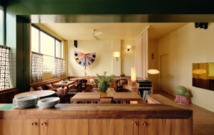
The vertical surfaces are a combination of timber panelling and exposed brickwork, the result of removing the original panelling from some areas to make good others and cleaning up the brickwork left behind. This is undoubtedly workplace design on a budget, but the architect has been clever enough to disguise structural necessity as a contemporary-cum-industrial feel.
The large light that fits perfectly in the break-out area of the main space, for instance, was not in fact specified for the project but instead was part of the fixtures and fittings that Hooper Galton brought with them, providing an area with an air of semi-domestic calm, where the creatives can retreat to.
The lighting suspended over the workstations is also both functional and part of the aesthetic. “Being open plan, the interior is quite dominated by the structure of the building,” says Cooper. “The fit out has to then break down that rhythm without implying a grid.”
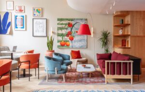
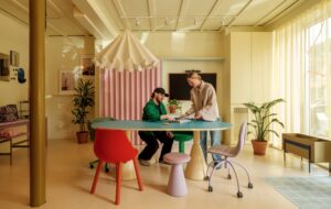
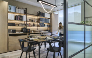
About a third of the sash windows in the project were released so they could provide natural ventilation. To supplement this, a new air source heating system provides cooling as well as heat for the office; replacing the old gas-fired system with something that is far more energy efficient. “One of the things they wanted was to be as sustainable as possible in terms of energy use, and use natural and renewable materials,” Cooper adds. More furniture brought from their previous offices, this time with a retro feel, fills a break-out area on the upper floor, reached via a spiral staircase at one end of the space. Cooper designed the table in the adjoining meeting room himself – impressively big enough for team meetings or client presentations.
Elsewhere, he is also responsible for the design of the bright red desking on the lower floor. These are composed of extremely thick MDF with the pigment running all the way through, and over time it is hoped that the desks will develop an attractive patina. Flooring materials also keep to the green ethos, including recycled tyre underlay and a sisal carpet.
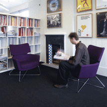
Hooper Galton has such strong branding that Cooper, who spent several years at architecture firm Jestico + Whiles before deciding to go solo, has wisely decided not to challenge it with what has been achieved in terms of workplace design. Even before you walk through the door, you are greeted by the first in a series of “delicious monsters” – the firm’s logo and also its philosophy. “Original ideas – monstrous, in that they’re big enough to be unmissable” goes their corporate blurb. A large monster artwork dominates the wall on the upper floor adjacent to the stairs and prints from various campaigns, including Spanish wine brand Campo Viejo, New Covent Garden Food Company and National Express, adorn the walls all around the office.
If not a blank canvas, then Cooper’s interior interventions are hardly the architectural equivalent of the look-at-me work of a Young British Artist. Tellingly, there’s a tongue-in-cheek client compatibility test on Hooper Galton’s website, and the first question suggests that if you’re looking for a Damien Hirst sheep’s head floating in a tank of formaldehyde as a reception centerpiece, then this agency isn’t for you. If it’s energetic ambience, however, “the words ‘heaven’, ‘made’, ‘marriage’ and ‘in’ spring to mind. Your place or ours?” Location-wise, I would have thought there’s no contest.

